Your Data Quality Assessment May Have a Blind Spot.
The reason my doctor makes more money than I do is that a description is not a diagnosis, and a diagnosis is not a treatment. I have a neighbor who can talk your ear off at a party about his latest rash. This is one of his favorite subjects, although it does not seem to engender long-term friendships. His most vivid descriptions, which give him great satisfaction, don’t get him any closer to a cure.
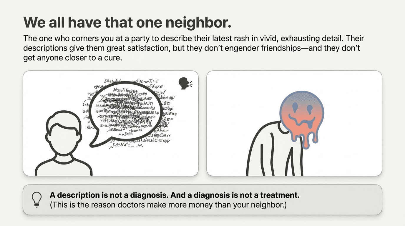
This is a crucial distinction for data quality, and one that the smartest people often seem to forget. Take traditional data quality dimensions (accuracy, validity, etc), which, like my neighbor, give you a lot of information that you don’t necessarily need to know. (An equally valid point is that data quality, like skin conditions, is a subject that won’t get you anywhere at social gatherings, but you already know that.)
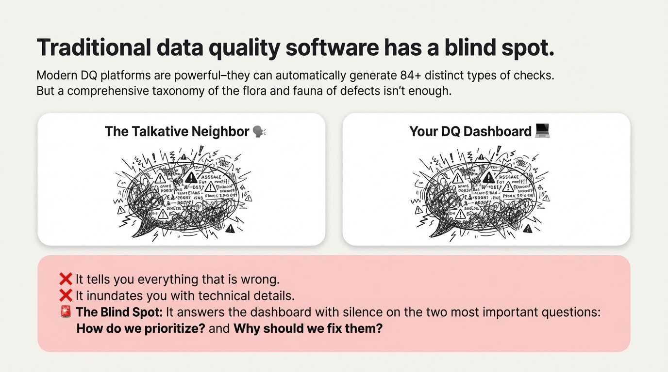
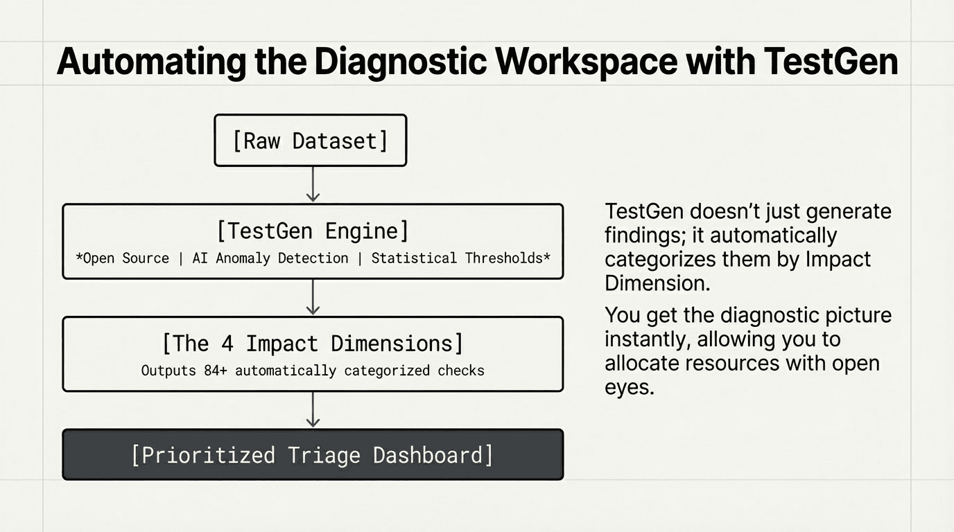
This is part of a larger issue that our company has struggled to figure out as we’ve worked to implement our data quality software, TestGen, in a range of corporate settings. It’s very nice that our app identifies a wide range of data quality problems automatically. But what are people supposed to do about it? Essentially, data quality software becomes the kind of very talkative person you really want to avoid at parties.
We’ve worked hard to make TestGen as easy as possible to implement. It’s reached a point where you can just point it at a dataset and automatically generate a lot – I mean a lot – of findings. We have 84 distinct types of checks across our platform, and the results they generate will give you some crucial information about the state of your data space. And some less crucial information.
The questions we weren’t answering: how to prioritize problems? Why fix them?
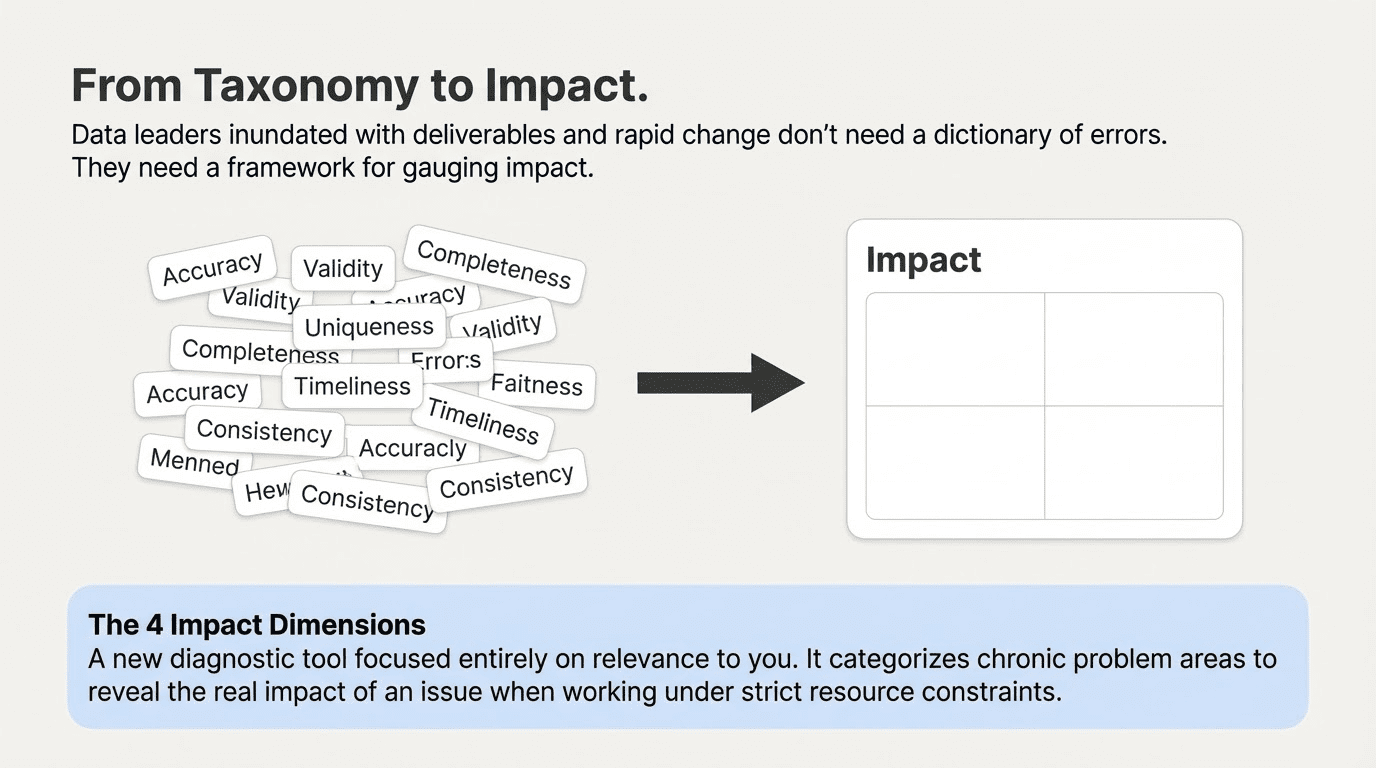
This is not self-evident in a world just inundated with data, with deliverables, with deadlines, and with rapid change. The canonical DQ Dimensions were designed to be a comprehensive taxonomy of the flora and fauna of defect types. But data leaders need a framework for gauging impact and prioritizing action.
I hereby propose another way of organizing DQ problems – one that is surprisingly useful, because it’s all about relevance to you. We’re calling it the Impact Dimension. We think it’s useful when you’re working with resource constraints – and who isn’t? Most useful of all, it offers some telling insights on the mistakes we all make when prioritizing problems by risk.
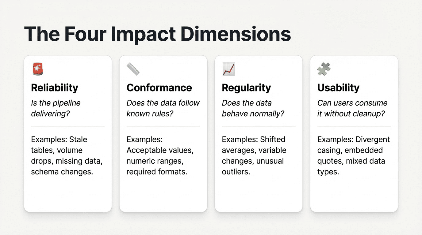
The four Impact Dimensions focus on four chronic problem areas that data issues signify. They turn your data quality testing into a diagnostic tool to gain visibility into the real impact of a problem.
- Reliability: Is the pipeline delivering? This would include tests for stale tables, volume drops, missing data, and schema changes. Reliability is most directly under the control of the data team, the most urgent dimension, and the most likely to receive attention.
- Conformance: Does the data follow known rules? This would include acceptable values, allowable numeric ranges, required values and acceptable formats. Conformance issues are also urgent, with clear feedback loops from downstream consumers when failures occur. They typically have clear fixes once a problem is discovered, but may require collaboration with upstream teams to solve.
- Regularity: Does data behave normally? Have average values shifted, has variability changed, are there unusual counts of outliers or shifts in missing value counts? These tests are more ambiguous – they are signals rather than rules. They require investigation, but can be sensitive to unanticipated, hidden problems that could otherwise have a significant impact.
- Usability: Does data presentation follow expected standards? Can users consume it without cleanup, wrangling, or misinterpretation errors? Usability issues manifest as divergent casing, embedded quotes, mixed data types, or technically accurate but inconsistent representations. Usability issues may not be errors themselves, but they’re pernicious because they cause errors and inefficiency downstream.
By building out data quality tests for each of these categories, your data team can identify key areas of need for quality improvements and key teams of stakeholders to bring them about. TestGen’s tests are automatically generated per Impact Dimension, but even if you roll your own, the results can help paint a picture of the unique DQ challenges of your organization.
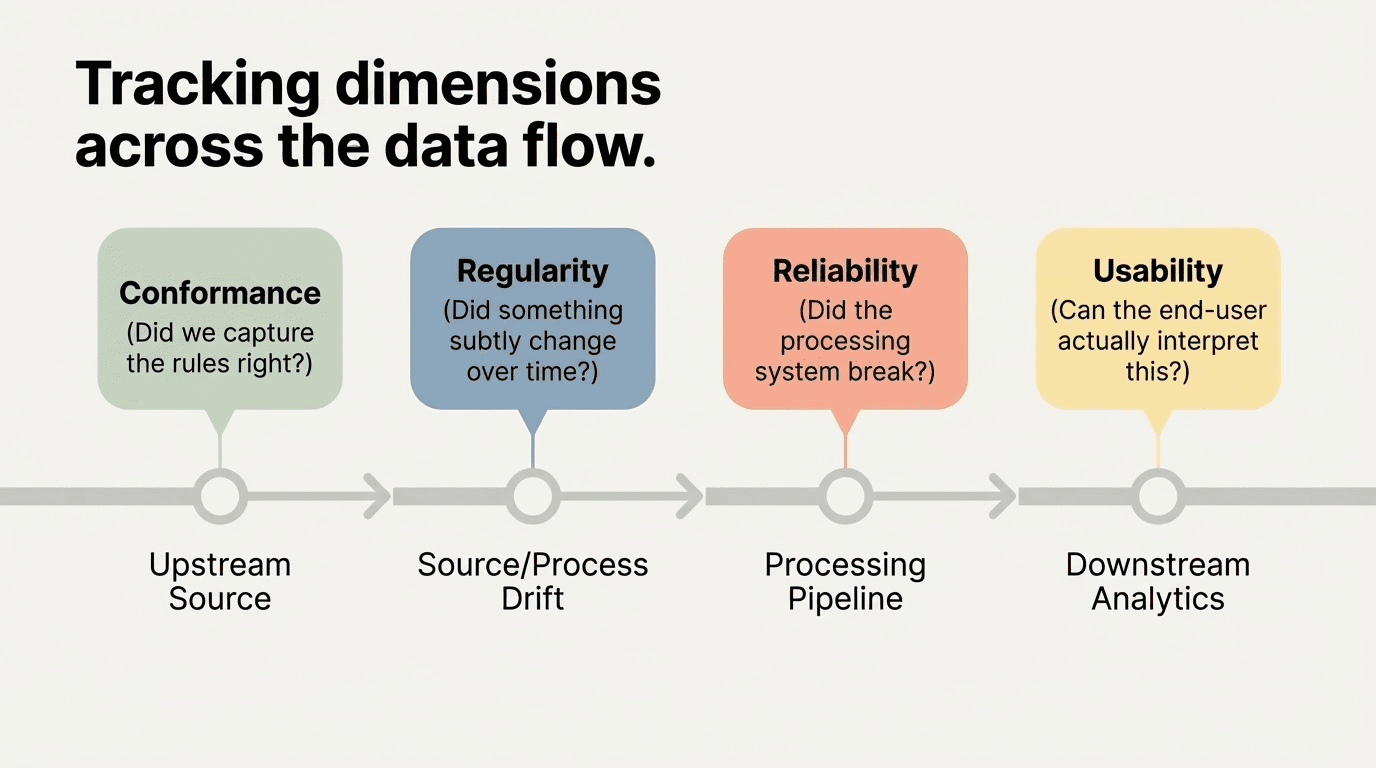
One useful application: You can track where along the data flow each dimension’s problems tend to surface. Conformance issues are tied to upstream source data, the focus of most traditional data quality efforts. Reliability issues relate to the data processing pipeline. Regularity issues may signal source or process problems, or even legitimate data drift that can break a downstream analysis. Usability issues impact downstream analytics and results.
In several organizations we work with, we’ve found that Reliability and Conformance issues get the most love. Reliability issues have the shortest feedback loop, and the big fails can be highly visible – from a systems perspective, they’re almost self-correcting. Conformance issues draw significant attention from data consumers, who demand fixes, but the process can be slow and painful – damaging trust in data teams and resources.
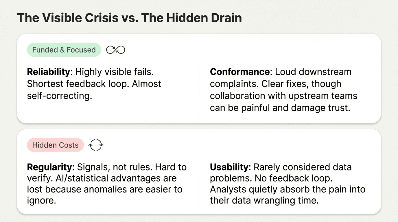
Sophisticated AI and statistical tools exist to uncover Regularity issues, but these results are harder to verify or even explain to non-experts. The result? Their advantages are lost, because they’re easier to ignore. Usability issues are often not considered data problems at all. They don’t directly impact data engineering teams, and downstream analysts typically consider data cleansing and wrangling part of their jobs. No effective feedback loop even exists to highlight and address these problems. They’re rarely corrected.
Now consider the cost of these issues to your organization. The cost of Reliability and Conformance issues is well-understood, attributed, and funded. Not so for Regularity or Usability issues, which may just be rolled into the cost of analysis, racked up to debugging time, or feature engineering. Hidden costs are real costs. They’re still incurred, just charged to the wrong budget.
And of course, the greatest cost of all comes when these issues are caught too late or missed entirely, leading to bad analyses, multiplied by faulty models and data products, leading to bad decisions that may never be traced to their cause.
How do you measure the cost of intervention at each stage? The Juran/Crosby framework posits that every dimension has a cheapest intervention point. In Juran/Crosby, if you peg the cost of prevention at 1x, the cost of assessment is 10x, the cost of internal failure is 100x, and the cost of external failure is 1000x. When you realize that every dimension has a cheapest intervention point, the implications are revealing.
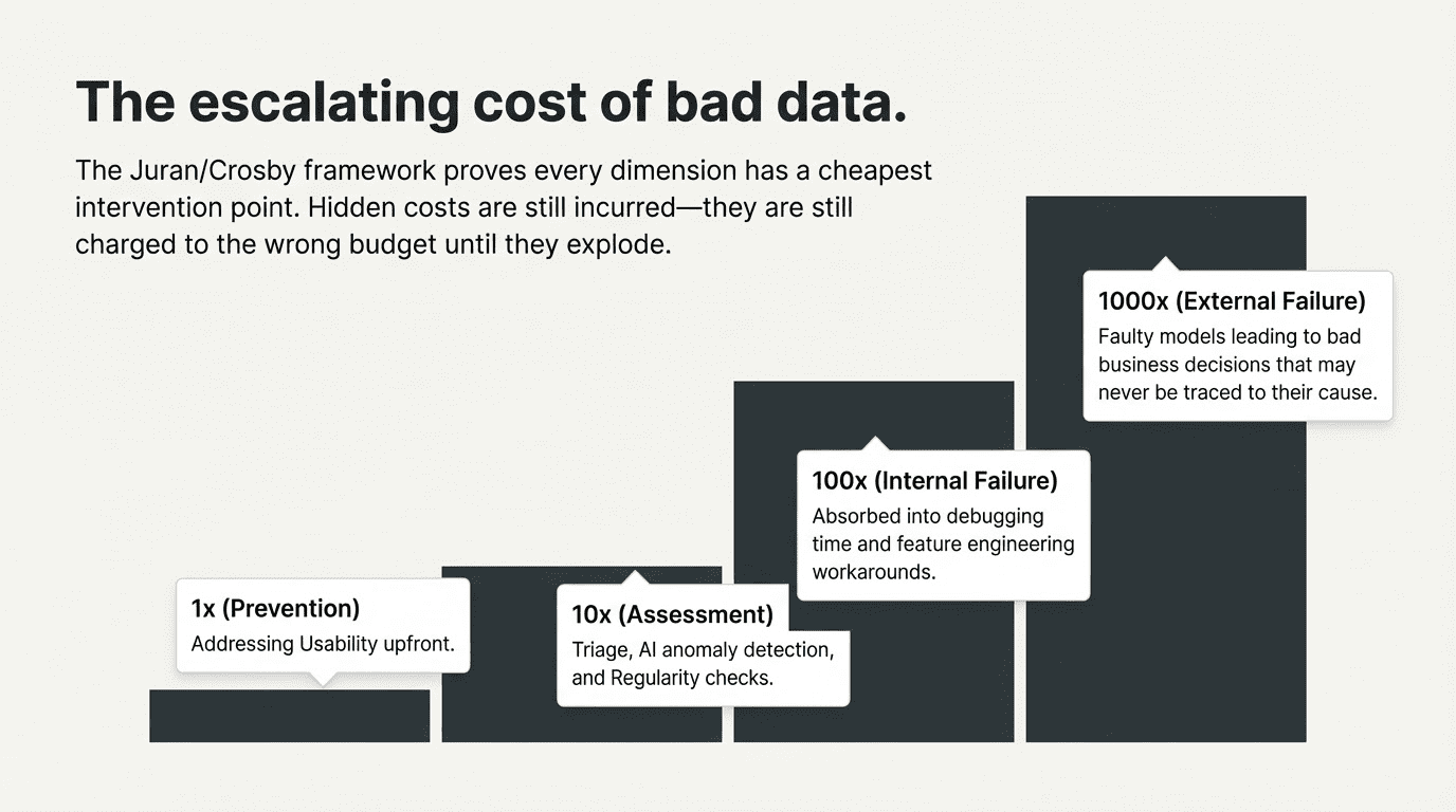
For instance, there’s a lot of new tech for identifying Regularity issues out there. TestGen leverages anomaly detection, using AI and statistical thresholds to flag a range of potential issues. This is exciting, because Regularity tests are one of the few ways to guard against the unknown unknowns in a data process.
You can write a great Conformance test if you know exactly what you’re looking for. But today’s data moves at business speed, and static standards can’t always keep pace with developing needs and shifting requirements. Data Quality means managing risk, not just enforcing rules. Regularity tests are so valuable because they guard against surprises – hidden costs that can eventually explode in your face.
The problem, once you’ve uncovered a signal, is that you have to make a very visible investment in the triage to distinguish real problems from false positives. Many leaders find it hard to make the case for resources to follow up. The Regularity Dimension gives these issues a name, allows you to track them, and helps companies make these resource allocation decisions with open eyes.
Another great example: Usability issues are ubiquitous. But managers typically deprioritize them as trivial, easy targets for end-user workarounds. From a cost perspective, the fixes are so obvious, and the cost of prevention is so minimal compared to the cost of downstream failure, that it’s a crime these issues aren’t addressed upfront.
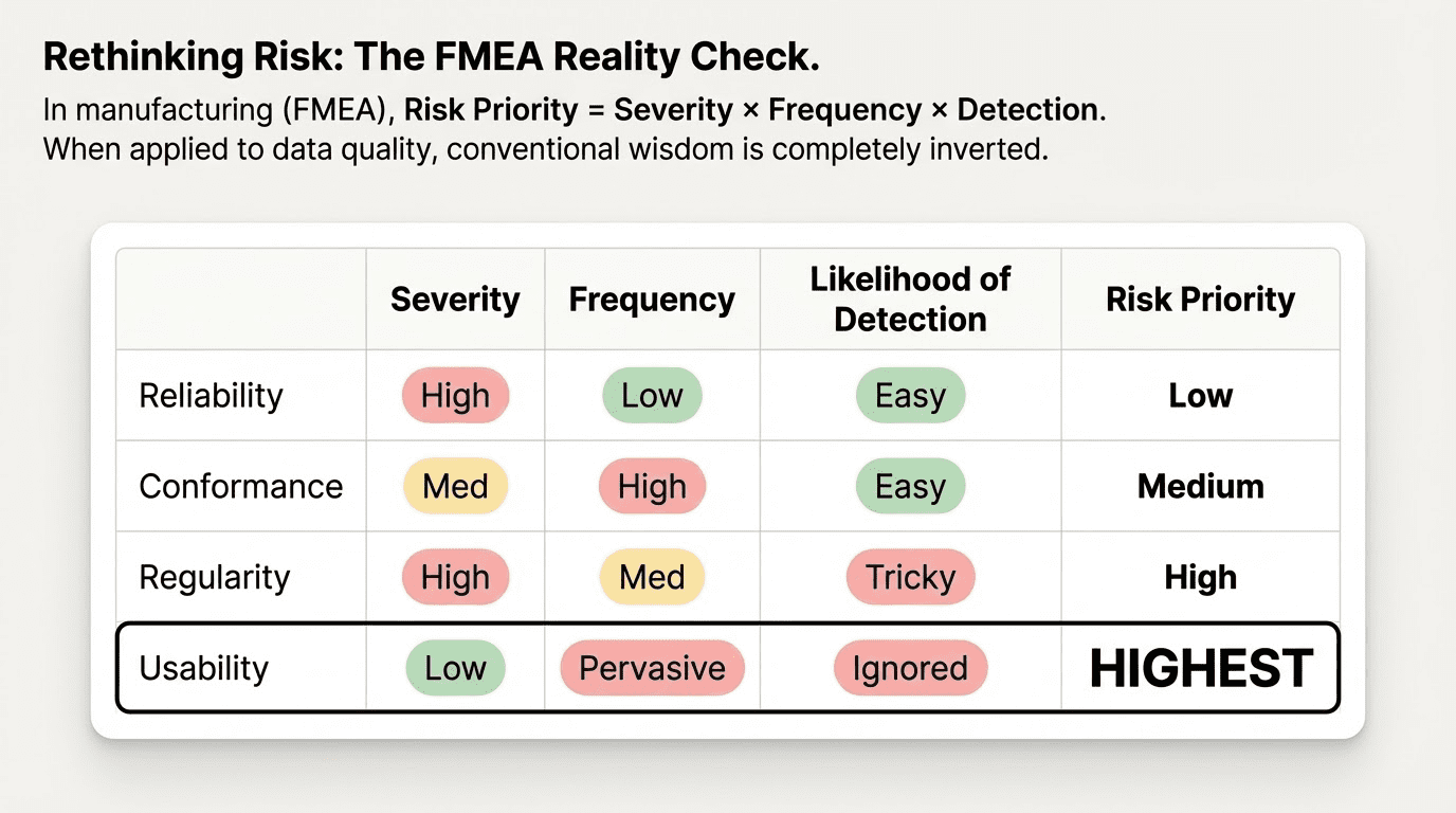
You can directly quantify this. In manufacturing, the FMEA quality framework calculates a risk priority by multiplying severity by frequency by the likelihood of detection. Using our Impact Dimensions, we can apply this to data quality. Reliability issues actually score low – while severity is high, frequency is relatively low, and problems are easier to detect. Conformance issues score a little higher: Severity isn’t necessarily as high as a failed pipeline, and detection should be easy, but the frequency of problems is higher. Regularity issues may be less frequent, but severe when they occur, and they end up scoring higher because they’re so tricky to detect.
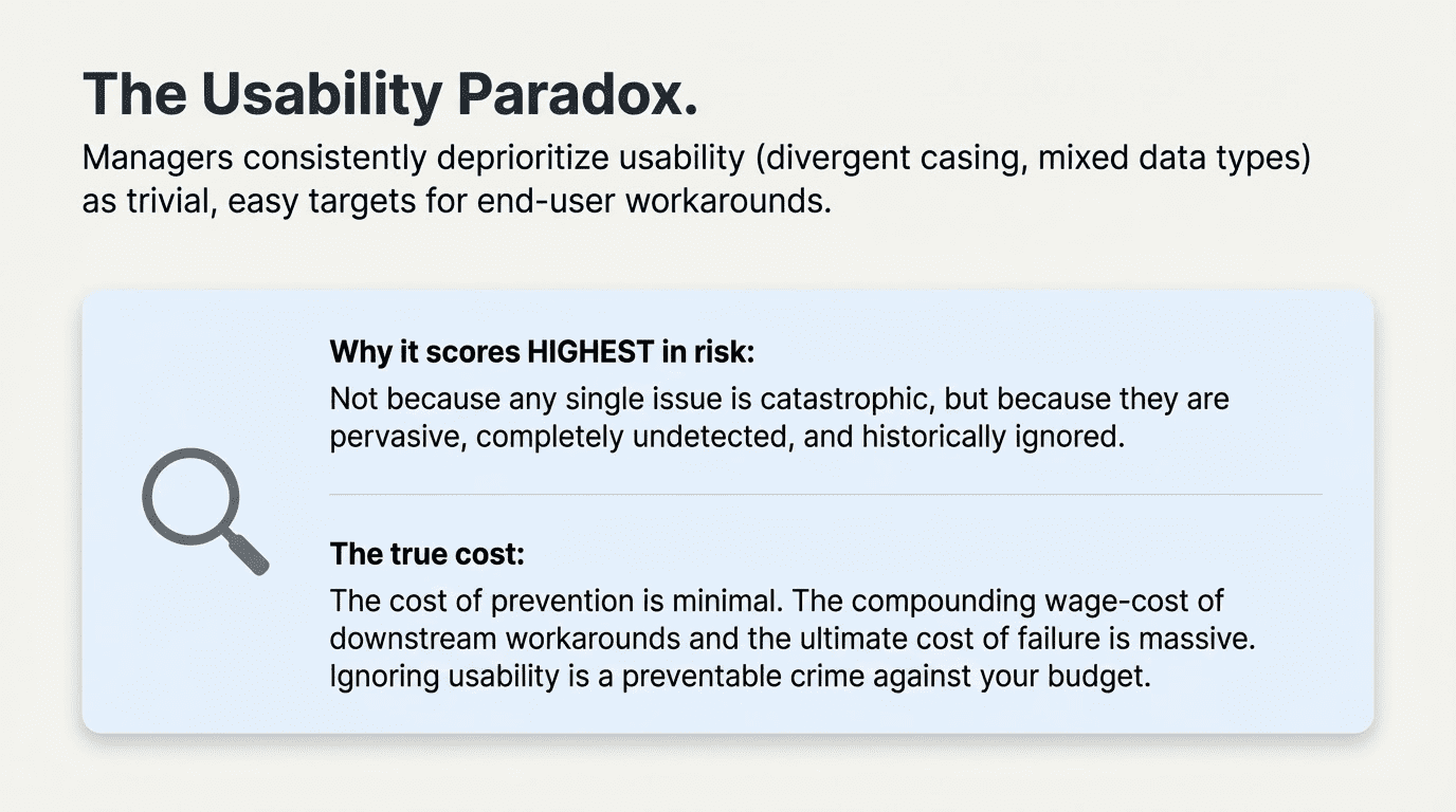
Surprisingly, the highest Risk Priority score may belong to Usability issues, not because any single issue is severe, but because Usability issues are pervasive and typically left undetected and ignored. Considering the impact on the wage-cost of workarounds if they’re identified and the cost of failure if they’re not, again, it’s a wonder these issues are so often trivialized.
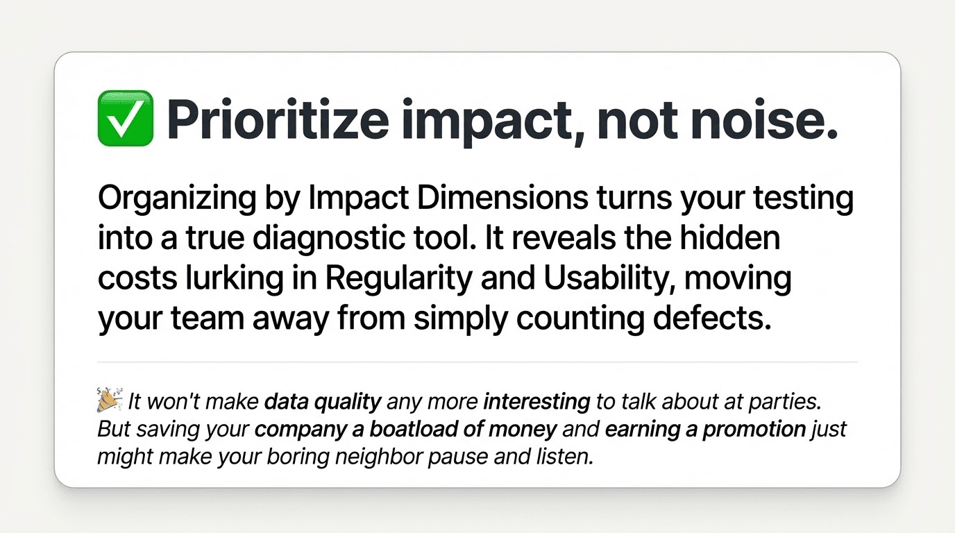
The bad news is that none of this will make data quality any more interesting to bring up at a party. On the other hand, if you happen to mention how you re-prioritized some of your team’s most pernicious problems, saved your company a boatload of money, and earned yourself a plum of a promotion, even your pesky neighbor might take a breath and listen.