In this exciting webinar, Christopher Bergh discussed various types of data quality dashboards, emphasizing that effective dashboards make data health visible and drive targeted improvements by relying on concrete, actionable tests. He highlighted the importance of selecting dashboard types based on the data landscape and stakeholder needs, advocating for an iterative approach and showcasing their open-source software.
Core Philosophy of Data Quality Improvement
Bergh shared his viewpoint that an empowered individual drives data quality improvement, focusing on a specific customer, starting small, iterating with data operations principles, and providing concrete remediation actions. He stressed the importance of measuring quality to demonstrate value and extend influence.
The Significance of Data Quality Dashboards
Bergh explained that dashboards are essential for making the often invisible health of data visible and enabling targeted improvements. He mentioned that various terms, such as reports or scorecards, exist, and effective dashboards should align with stakeholder needs and the data landscape.
Six Types of Data Quality Dashboards
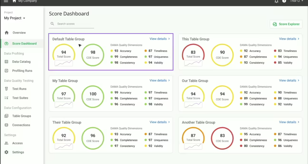
Bergh introduced six types of data quality dashboards: dimension-focused, critical data element (CDE)-focused, business goal-focused, data source-focused, data consumer-focused, and ticket-driven workflow. Each type serves a unique role in driving changes in data quality.
-
- Dimension-Focused Dashboards
Bergh described these dashboards as providing a broad overview of data quality across standard categories, facilitating consistent evaluations. However, he noted challenges such as being too abstract, failing to align with stakeholder needs, and not resonating with business priorities.
-
- Critical Data Element (CDE)-Focused Dashboards
Bergh explained that CDE dashboards are essential in regulated industries, focusing on critical identifiers and financial values to ensure compliance and mitigate risk. They are effective when CDEs are clearly defined and directly connect to business needs and regulatory mandates.
-
- Business Goal-Focused Dashboards
Bergh highlighted that aligning data quality with specific organizational objectives, such as customer acquisition or cost reduction, can drive change by demonstrating the impact of data quality on business outcomes. This approach makes data quality more strategic and relevant to business stakeholders.
-
- Data Source-Focused Dashboards
Bergh discussed how tracking data quality metrics by source can foster accountability among suppliers and help data teams identify and address problematic origins. He emphasized the importance of providing specific feedback to suppliers to encourage improvement.
-
- Data Consumer-Focused Dashboards
Bergh explained that dashboards tailored to data consumers, such as data scientists relying on specific data elements for modeling, can help them advocate for better data quality. By focusing on their needs, data consumers can become allies in driving data quality improvements.
-
- Ticket-Driven Workflow as a “Dashboard”
Bergh presented the idea of using tickets to measure and track progress based on the number of tickets created and resolved, as a method to address data quality issues. This shifts the focus to actionable tasks and operational progress, although it requires well-defined issues and a ticketing system.
Framework for Choosing Dashboard Types
Bergh provided guidance on selecting the appropriate dashboard type based on factors such as the data landscape, the clarity of CDE definitions, the presence of clear business goals, the nature of data sources, the existence of vocal data consumers, and the suitability of a ticket-driven approach. He advocated for multi-dashboard strategies to address the diverse needs of various stakeholders.
Actionability of Data Quality Dashboards
Bergh stressed that effective data quality dashboards must be based on concrete actions derived from data quality tests or hygiene test results. Scores should be traceable to these underlying actions, enabling users to understand what needs to be fixed.
The Equivalence Principle
Bergh introduced the concept that data quality test results, workflow tickets, and a dashboard are interconnected. A dashboard can be viewed as a collection of potential tickets, and each ticket should be supported by tests, ensuring actionability and traceability to its root cause.
Iterative Approach to Building Dashboards
Bergh recommended an agile, iterative approach to building data quality dashboards, emphasizing the need for constant refinement and responsiveness to stakeholder feedback.
The full webinar is available here.
For those who enjoy reading, we also have a blog post that delves into the ideas in more detail.

