Bad data derails operations, misguides strategy, and burns the trust you spent years earning. A dashboard is how you see it coming, and how you get somebody else to fix it. But not all data quality dashboards are the same. What you should build depends on who you are trying to persuade, what they care about, and which tables they touch. This post covers the six types, what each is good for, and the exact point where each stops working. Your dashboard can be organized by data quality dimension, Critical Data Element (CDE), business goal, data source, or data consumer, or it can run off ticketed workflows. (updated August 2026)
You will also hear these called reports, scorecards, or assessments. Same artifact, different room.
The six types at a glance
| Dashboard type | Who it is for | The question it answers | Reach for it when | Where it fails |
|---|---|---|---|---|
| 1. Dimension-focused | Governance, CDO | How healthy is our data against completeness, accuracy, timeliness, consistency, uniqueness? | You need one broad brush across a lot of data elements | Scores are too abstract to act on, so it becomes a check-the-box exercise |
| 2. Critical Data Element (CDE) | Compliance, risk, finance | Are the fields that carry real consequence correct? | A regulator or auditor already told you which fields matter | Picking CDEs is hard when nobody external defines them, and impossible before an AI model tells you which features matter |
| 3. Business goal-focused | Executives, funders | What is poor data costing us against a named objective? | You are asking for budget or executive attention | Business goals move faster than the dashboard tracking them |
| 4. Data source-focused | Data engineering, vendor managers | Which supplier or upstream system keeps sending us bad data? | You take feeds from multiple external providers | You can measure a vendor but you cannot make them care |
| 5. Data consumer-focused | Analysts, data scientists, report owners | Is the data behind my model or report trustworthy? | A specific team owns a specific deliverable | Every team wants their own, and dashboard proliferation follows |
| 6. Ticket-driven workflow | Data quality leads, engineering managers | Are we actually fixing anything, and how fast? | You want to prove progress and unblock a backlog | It measures work done, not data quality |
One size does not fit all. Most organizations end up running several of these, because the right dashboard is the one aligned to a specific customer’s goals. Which brings up the question you should ask before building anything: who is my customer for this data?
What has to be true for any of this to work
Every one of the six types rests on the same set of assumptions. They are worth stating plainly, because a dashboard that violates them will be beautiful and ignored.
Data quality improvement starts with one person deciding to drive it. Not a committee, not a mandate from above. Somebody who cares enough to keep pushing. That person works through personal influence rather than authority, because they almost never have authority over the teams whose data is broken.
They pick a specific end customer and serve that customer first. Not “the business.” A named analyst, a named executive, a named model. They start small and iterate quickly, using DataOps practice, because a dashboard shipped in two weeks that covers one table group teaches you more than a six-month program that covers everything and lands after the reorg.
Every finding they publish comes with a concrete, specific remediation action. Not “consistency is at 70%” but “these 412 rows have a customer ID that does not exist in the master table, here they are.” And all of it gets measured continuously rather than once, because a one-time assessment tells you where you were, not whether you are getting better. That continuous part is the whole reason dashboards exist and the reason you are reading this.
None of it requires buying anything. Open source covers the profiling, the test generation, and the scoring, which matters because “we need budget approval first” is where most data quality initiatives quietly die.
1. Data Quality Dimension-Focused Dashboards
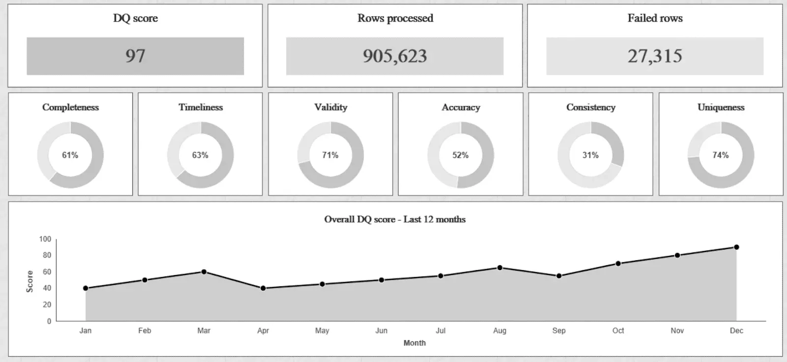
The first type of data quality dashboard emphasizes data quality dimensions. Data Quality Dimension-Focused Dashboards are designed to evaluate data through fundamental quality dimensions, such as completeness, accuracy, timeliness, consistency, and uniqueness. These dimensions provide a best practice grouping for assessing data quality, though the dimensions themselves fall flat more often than governance decks admit. By scoring each dimension individually, these dashboards offer a grouped view of data quality issues, enabling targeted interventions to address gaps.
The percentage of missing values tells you about completeness. Deviation from an authoritative source tells you about accuracy. Track whether updates land on business timelines and you have timeliness. Teams usually render these as heatmaps, pie charts, or bar graphs so a stakeholder sees compliance per dimension at a glance. A retailer might watch profile completeness to confirm marketing actually has the email addresses and phone numbers a campaign needs.
Benefits and Challenges of The Data Quality Dimension Approach
Data quality dimensions get treated as foundational principles for evaluating and improving data quality. They give you a defensible, almost scientific way to assess data, and they are genuinely useful as a broad brush across a lot of elements. They are also too general for most real problems, which limits how much they actually change.
Here is the reason that matters, and it is the sentence to keep if you keep only one: this is about influence, not science. A dimension score is a measurement. Your job is not to measure data quality, it is to get somebody to fix it. Those are different jobs, and a number that is rigorous but unpersuasive fails at the second one no matter how correct it is.
The issue lies in the abstraction of these dimensions. For example, a metric like “completeness” is essential to data quality, but defining what “complete” means in a specific context can vary widely. Is completeness about filling every field in a record, or is it about having the fields critical to a particular business process? Similarly, “accuracy” often assumes the existence of an authoritative source for validation, which may not always be available or practical to implement. Without contextual specificity, these dimensions risk becoming check-the-box exercises rather than actionable frameworks that help organizations identify and address the root causes of data quality issues.
“The DAMA Data Quality Dimension dashboards are crap. They do nothing to motivate people to make improvements to their data.” – Senior Data Quality Person, Financial Services, DataKitchen Market Research 2024
Moreover, relying solely on DAMA dimensions tends to produce dashboards disconnected from an organization’s or its stakeholders’ unique needs. A dashboard filled with generic scores for completeness or consistency may look polished but needs to resonate with the teams responsible for acting on the insights. For example, a business executive might struggle to connect a “70% consistency score” with the operational goals they are trying to achieve. Similarly, data teams might struggle to determine actionable steps if the metrics do not highlight specific datasets, systems, or processes contributing to poor data quality.
While the DAMA dimensions provide a starting point, the key to impactful dashboards is translating these principles into concrete, tailored insights that directly address the organization’s challenges and objectives. Narrow the scope, tie each metric to an outcome somebody can act on, and the dashboard stops describing data quality and starts improving it.
2. Critical Data Element (CDE) Data Quality Dashboards
Critical Data Element (CDE) dashboards focus on essential data elements crucial for business operations or regulatory compliance. These dashboards prioritize high-impact fields such as financial values, key identifiers like customer IDs, or data required to meet regulatory standards. By narrowing their scope to these critical elements, CDE dashboards enable organizations to allocate resources efficiently and address data quality with the greatest impact. For instance, a bank might use a CDE dashboard to monitor the accuracy of customer credit scores, which are vital for regulatory compliance and effective risk modeling. Another example is an analytics team that wants to focus on the data that goes into the weekly report for the executive team. This targeted approach ensures that limited resources are directed toward improving the data elements that matter most to the organization.
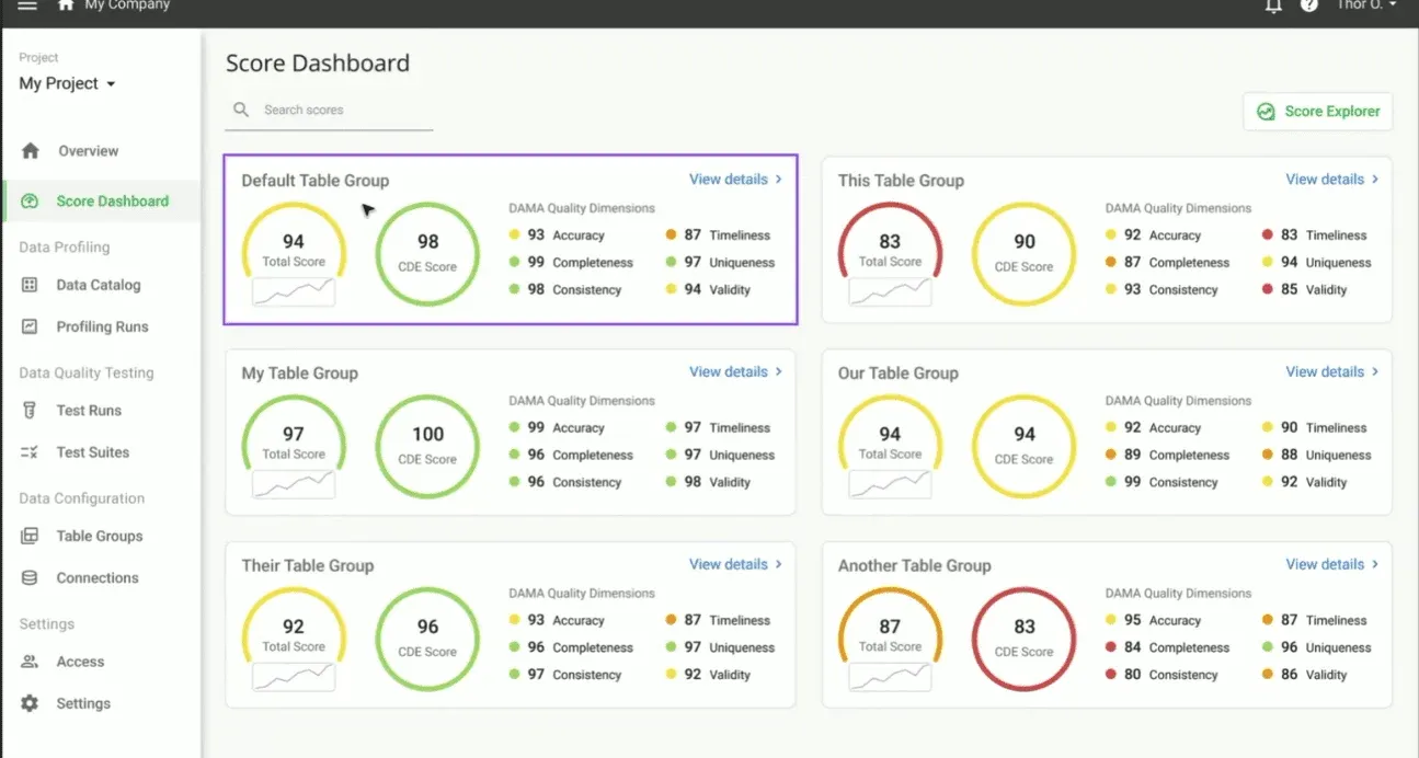
An example of a data quality dashboard with CDEs from DataKitchen’s DataOps Data Quality TestGen Open Source Software.
Benefits and Challenges of The CDE Approach
Critical Data Element (CDE) based data quality dashboards are highly effective in regulated industries such as finance, healthcare, and utilities, where organizations are mandated to monitor and report on the quality of specific data elements. CDEs are often clearly defined by regulatory bodies or industry standards in these industries. For example, a financial institution may need to ensure the accuracy and completeness of loan application data to comply with anti-money laundering (AML) regulations. The specificity of these mandates makes it easier to identify CDEs and prioritize resources to ensure their quality. CDE-based dashboards in such contexts serve as powerful tools for compliance, risk mitigation, and operational oversight, providing clarity and focus on what truly matters.
“We have had amazing Data Quality Improvement, aligning everyone to improve data based on CDEs. We have corporate goals on CDE data quality. Why? Because we MUST do them for compliance reporting to the government. We focus our Data Quality reporting on CDEs.” – Senior Data Quality Leader, Large US Bank Services, DataKitchen Market Research 2024
Outside regulated industries, agreeing on what counts as a CDE is the hard part. A regulator prescribes the important fields for you. Without one, you decide internally, which means aligning business leaders and data engineers who mean different things by “critical.” Marketing wants customer segmentation data. Operations wants inventory. With no external criteria you get long debates and three inconsistent answers.
Another challenge in non-regulated industries is the dynamic nature of business priorities. CDEs may shift as market conditions, organizational goals, or technologies evolve. A retail organization, for example, might initially consider transaction data as critical, only to pivot toward prioritizing clickstream data for e-commerce analytics. This fluidity requires an iterative approach to defining and managing CDEs, which can be resource-intensive and complicated to operationalize within a dashboard framework.
AI work breaks the CDE model in a more fundamental way, and it is worth being blunt about. A predefined CDE list assumes you know in advance which fields matter. With predictive modeling and AI readiness you do not. You find out which features carry the signal after you have trained a model, and you need clean data to train it in the first place. That is a genuine circular dependency, not a planning failure. The practical escape is broad automated coverage across the whole table rather than a hand-curated list of twenty fields, so that whichever features turn out to matter were already being tested. Picking the fields that matter without boiling the ocean is the subject of critical data elements: your shortcut to data governance that actually works.
CDE dashboards still work outside regulated industries if you handle this deliberately. Set up a transparent process for naming CDEs, pull in cross-functional input so the list is not one team’s opinion, and revisit it when priorities move. It takes coordination. What you get back is a targeted approach that pays off even where no regulator dictates the terms.
3. Business Goal-Focused Data Quality Dashboards
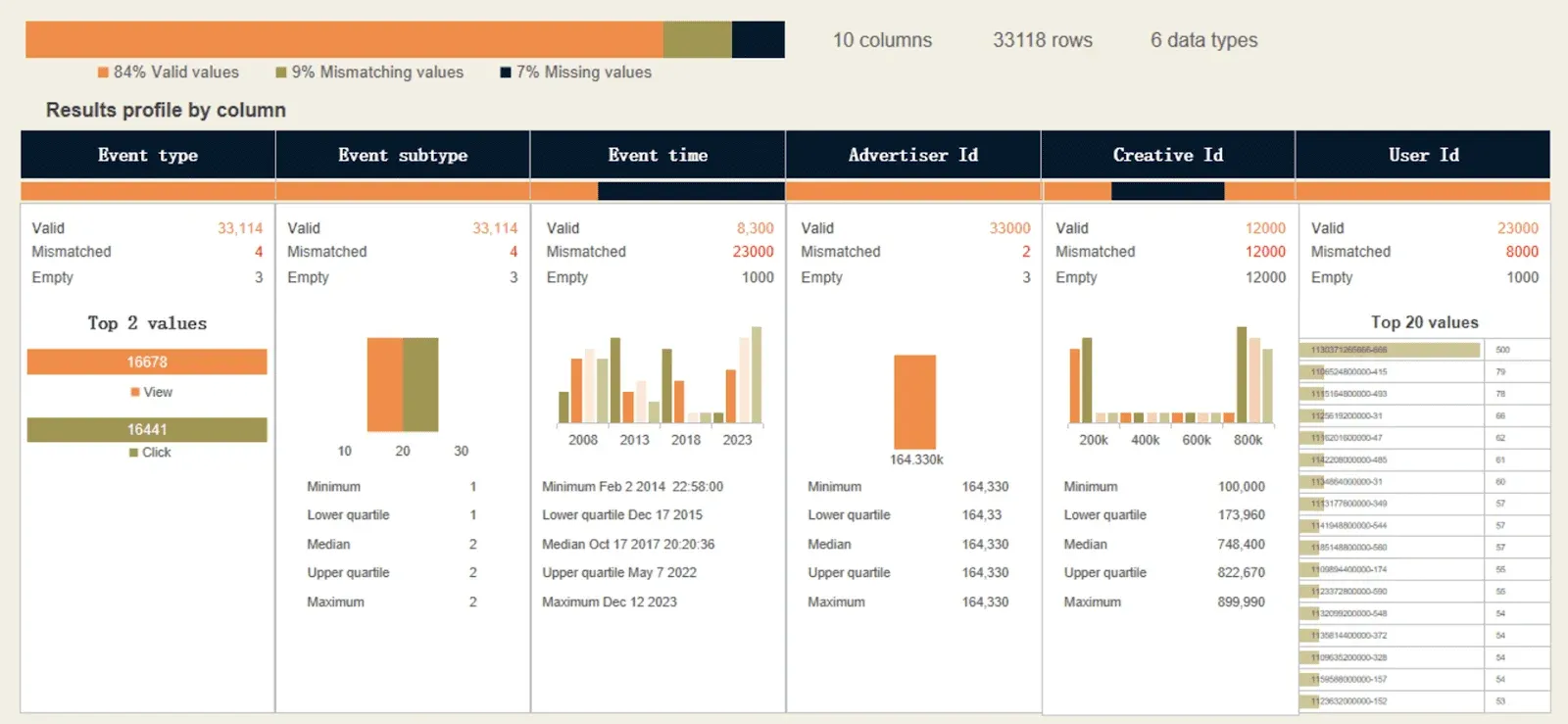
Business goal-focused data quality dashboards link data quality metrics directly to specific organizational objectives, such as quarterly revenue goals, yearly cost savings targets, or specific revenue-generating marketing and sales programs. These dashboards highlight how data quality influences broader goals, such as customer retention, revenue growth, or regulatory compliance. For leadership teams, this type of dashboard serves as a critical tool to understand the operational and financial implications of data quality issues and to justify investments in remediation efforts. For example, an e-commerce company might use a business goal-focused dashboard to monitor how incomplete customer delivery information affects order fulfillment rates and timing, a crucial metric for customer satisfaction. By tying data quality improvements directly to business outcomes, these dashboards make the case for prioritizing data quality as a strategic initiative.
Benefits and Challenges of The Business Goal-Focused Data Quality Approach
Business goal-focused data quality dashboards help connect technical data quality efforts to broader organizational objectives. By focusing on outcomes that matter to business stakeholders, these dashboards make data quality work legible to people outside the data team, which is how technical teams and business units end up in the same conversation. This alignment also helps secure executive buy-in and funding for data initiatives by demonstrating the tangible value of addressing data quality issues.
Another significant advantage is that these dashboards provide ROI-driven insights. By highlighting the financial or operational impact of poor-quality data, business goal-focused dashboards allow organizations to prioritize remediation efforts that deliver the most significant value. For example, identifying how incomplete customer delivery information affects fulfillment rates can help an e-commerce company cut fulfillment costs and stop losing customers to late deliveries.
“How do you get the business to take action? By definition, they are inputting data that meets their data quality needs. With all their other problems, why should they care about data quality when providing data to other teams? The only way to motivate them is to pick data elements directly affecting their quarterly business goals. They care about that.” – Data Quality Consultant, DataKitchen Market Research 2024
Despite their advantages, business goal-focused dashboards come with notable challenges. One of the most significant challenges is defining and maintaining alignment between data quality metrics and business goals. Business objectives often evolve due to market dynamics, organizational restructuring, or technological changes, requiring dashboards to be continuously updated to stay relevant. This iterative process demands time, effort, and team collaboration, which can strain resources, especially in organizations with limited data governance capabilities.
4. Data Source-Focused Data Quality Dashboards
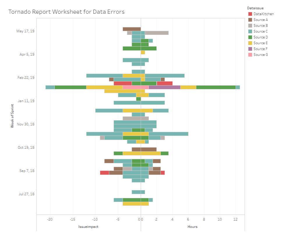
A data source-focused dashboard assesses data quality by analyzing its origin, enabling organizations to identify sources that consistently provide low-quality data and take corrective actions. This approach allows enterprises to hold data suppliers accountable or optimize their ingestion processes to ensure higher data integrity. By tracking source-level metrics such as error rates, duplication, and timeliness, these dashboards pinpoint the suppliers or systems responsible for data quality failures, which is what makes accountability stick. This is particularly valuable for organizations managing data from multiple external providers or systems, such as suppliers or third-party APIs. For example, a logistics company might use a source-focused dashboard to monitor the accuracy and timeliness of shipping data from various courier partners, ensuring reliable tracking information for customers and maintaining service quality.
Benefits and Challenges of Data Source-Focused Data Quality Dashboard Approach
Data source-focused dashboards assign accountability for data quality. Once you know which suppliers, systems, or processes are producing the bad data, you can act on it: renegotiate a vendor contract, fix an internal workflow, or add validation at the point of ingestion. That last one matters most. You cannot hold a source accountable without tests running against it at ingest, so the dashboard is only as good as the source tests underneath it. Naming the culprit is also what gets providers to care.
They also tell you where to fix your ingestion. Track error rates and timeliness per source and you know which pipeline needs work. A logistics company watching shipping data from courier partners can see which one lags and go do something about it.
“Our data suppliers don’t know that we exist, don’t care about quality, and will make arbitrary changes to our feeds at any time. It’s up to us to deal with it. We have no control over their data quality” – Data Engineer, Pharmaceuticals, DataKitchen Market Research 2024
Despite their advantages, data source-focused dashboards have notable challenges. One challenge lies in gaining cooperation from external data providers. You can monitor and report on their data quality issues, but enforcing improvements depends on the willingness and capability of suppliers to address them. They often do not care. How do you motivate them to make a change? These dashboards can become less effective when multiple sources contribute to a single dataset, making it difficult to pinpoint the root cause of data quality issues. For example, if data from various suppliers is aggregated into a central system, determining whether errors originated with a specific supplier or during the integration process requires a root cause analysis.
5. Data Consumer-Focused Data Quality Dashboards
A data consumer-focused dashboard is designed to meet the specific needs of individuals and teams who rely on data to perform their roles, such as data scientists, analysts, or business intelligence professionals. These dashboards prioritize the quality and reliability of datasets and features critical to analytics models, reports, or decision-making tools, ensuring they are fit for purpose. They are often customized to address the unique requirements of different user personas, whether for predictive model inputs or operational reporting. For instance, a healthcare company might use such a dashboard to monitor the accuracy and consistency of patient demographic data used in predictive models for patient readmission. By catering directly to the needs of data consumers, these dashboards help their data customer use their influence to make changes to improve data quality.
Benefits and Challenges of a Data Consumer-Focused Data Quality Dashboard Approach
The main benefit is that the data your analysts and scientists depend on gets verified instead of assumed. Tracking the specific datasets behind a project also hands its owner something to push with. The second benefit is fit. A BI analyst needs completeness on reporting tables. A data scientist needs timeliness and uniqueness on model input features. Those are different dashboards, and pretending otherwise is why generic quality scores get ignored.
“Our data scientists are forever complaining about the quality of data. They have high-value predictions in production. They are motivated to drive improvements to data. We need to focus our data quality reporting on the data inputs to their models, specifically.” – Data Quality Consultant, DataKitchen Market Research 2024
While highly effective, data consumer-focused dashboards present several challenges. One significant hurdle is defining and managing the diverse requirements of different user groups within an organization. Each team or individual may have distinct data needs, leading to a complex and time-intensive process of creating and maintaining customized dashboards. Balancing these needs while ensuring the scalability and manageability of the dashboard system is critical.
6. Ticket-Driven Workflow Dashboards
Tickets are another way to run data quality. A ticket is a change request that breaks a vague problem into one specific task on one data element. Fix these missing values. Correct this number. Standardize this format. Each one is small enough for a data engineer to prioritize, assign, and close. That turns data quality from an overwhelming abstraction into a queue somebody actually works.
“We don’t use a dashboard per se; we use workflow. It is about the number of tickets created and fixed during a particular period. We have specific goals around tickets, and that works for us.” – Data Quality Leader, Regional Bank, DataKitchen Market Research 2024
The dashboard then tracks the ticketing process rather than the data. Two views matter. Tickets closed over time shows your capacity. A prioritized backlog keeps the expensive problems at the top. Completion trends tell you where remediation gets stuck. It fits how your engineers already work, and it gives you something concrete to put in front of a manager.
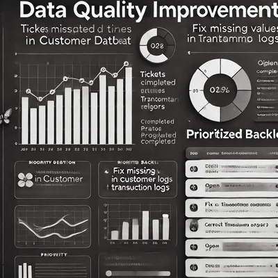
Know the one thing this type cannot tell you: it measures work done, not data quality. A team can close forty tickets in a quarter while the estate gets worse, because the tickets that got written were the ones somebody happened to notice. Ticket throughput is a real signal about your remediation capacity and a poor proxy for whether the data is correct. Run it alongside a dashboard that measures the data itself, and watch for backlogs going stale, which is the failure mode here.
Why You Need a Multi-Dashboard Approach: Maximizing Your Influence
Here is the uncomfortable fact underneath every dashboard decision. As a data quality leader you have no power, only influence. You cannot make anyone fix a data issue. Data quality is a tragedy of the commons: everyone depends on the shared resource, nobody owns its upkeep, and the person who could fix a column has ten things ranked above it. The dashboard is your instrument of persuasion, which is why picking one aimed at the wrong audience is not a cosmetic mistake.
That also makes a bad dashboard actively dangerous, because it manufactures false confidence. Data quality denial is cultural rather than careless. Teams with good intentions rationalize problems away when they lack the tools, the language, or clear ownership. A dashboard full of green scores that trace to nothing gives that denial something to point at. So do the two signals people misread as success: nobody is complaining, and the analysts have quietly built workarounds. Neither means the data is right. Both mean the feedback loop is broken. If you are not hearing about data errors, that is the finding, not the all-clear.
You will end up running more than one of these. Each type shows a different face of the same problem, and no single one covers the estate. Run several and the gaps close: nothing important goes unmeasured, priorities track the business, and every stakeholder can see the data they actually care about.
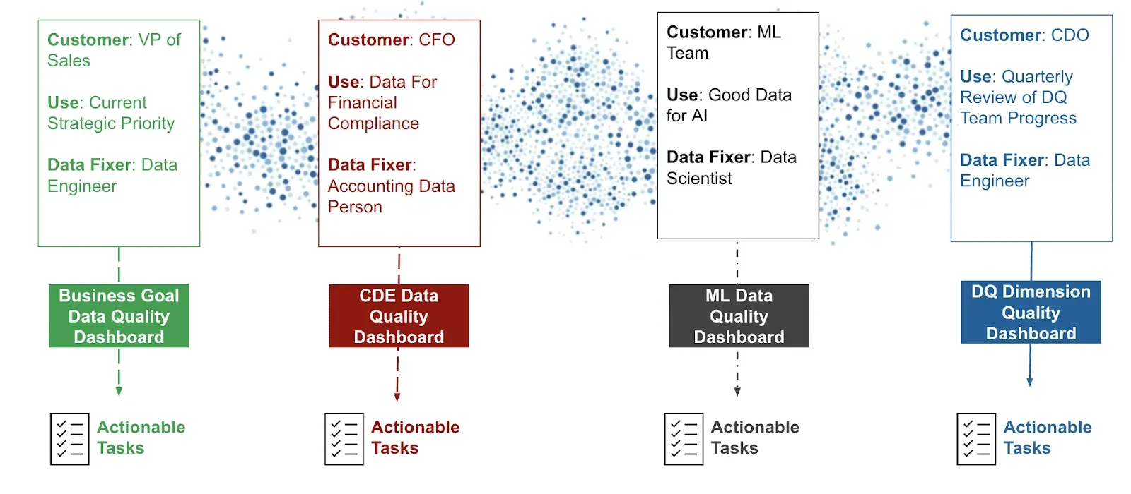
The combinations matter more than the individual picks. Dimension-focused gives you coverage and CDE gives you focus, so running both means nothing goes unwatched while the fields carrying real consequence get watched hardest. Business goal-focused buys the executive attention that funds the work, and source-focused turns that funding into pressure on whoever is actually producing the bad data.
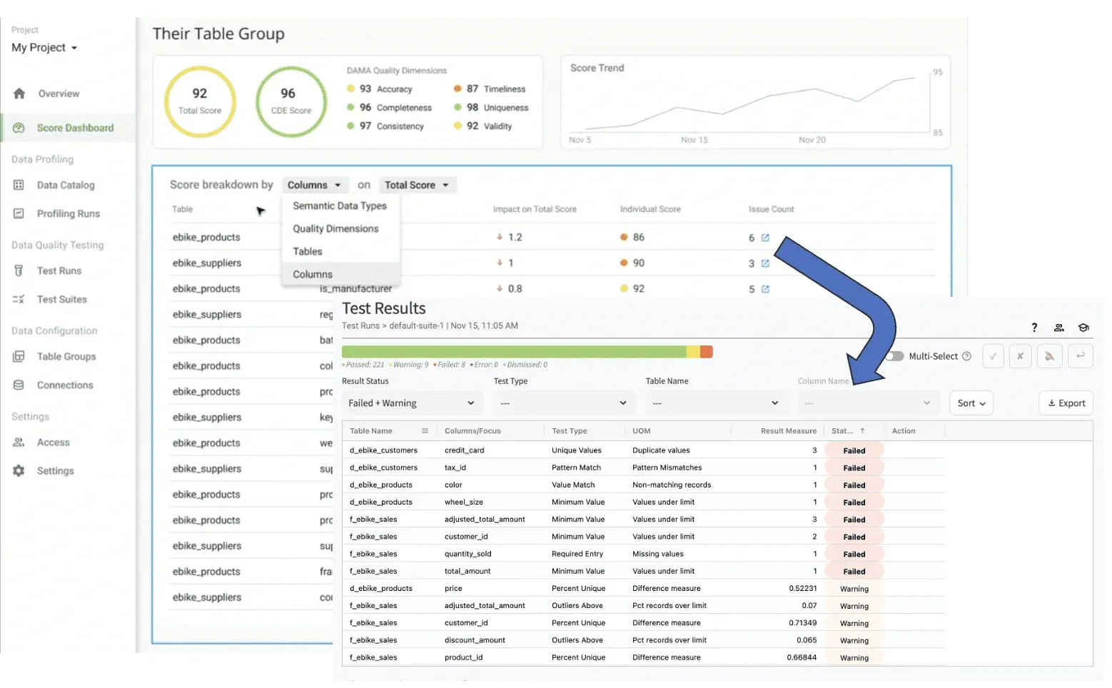
An example of a data quality dashboard drill down to specific, actionable issues from DataKitchen’s DataOps Data Quality TestGen Open Source Software.
Consumer-focused keeps the whole arrangement honest, because the analysts and data scientists at the end of the pipe notice first when a score says green and the table says otherwise. Treating quality testing as a shared resource across those roles is what keeps six dashboards from becoming six disconnected projects, and what lets you attack data quality without losing sight of the specific thing that hurts.
The Test Results Equivalence Principle
Before the best practices, one rule that decides whether any of the six works.
IMPORTANT
Every data quality dashboard must be convertible into a series of tickets somebody can fix. Once a ticket is fixed, the dashboard should improve on the next run, because the test that proved the problem is the same test that verifies the fix.
Your data quality score should be built from test results, not from fuzzy math over a profile. That distinction sounds academic until a number moves and nobody can say why. A score derived from profiling statistics reports that completeness slipped to 61%. A score derived from test results tells you which test failed, on which column, in which table, and hands the rows to the person who can correct them.
This is the difference between a dashboard people act on and a dashboard people stop opening. Every metric traces to a test. Every failing test becomes a ticket. Every closed ticket moves the number. If a number on your dashboard cannot complete that loop, it is decoration.
It also explains why test coverage is the real constraint on dashboard quality. A score computed over the tables somebody had time to configure is precise and meaningless. Generate the first pass automatically so coverage is not the bottleneck, then let the dashboard reflect an estate you actually test.
Don’t Wait Months to Deliver a Dashboard
The traditional data quality assessment is a waterfall: months of interviews and standards-setting before anybody sees a number. The DataOps alternative inverts it. Start measuring before the standards exist, then use the measurements to set the standards.
That sounds backwards and it is the whole trick. Nobody can define an acceptable null rate for a column they have never profiled. Measure first, and the argument about what “good” means becomes a conversation about real numbers instead of a committee exercise. Generate roughly 80% of your rules automatically, get a dashboard in front of a specific customer in days, and iterate from there. Each cycle is learning and value delivered rather than another month of requirements gathering. We wrote up the method in a new, more effective approach to data quality assessments.
Best Practices for Building Effective Data Quality Dashboards
Start by deciding what each dashboard is for. Compliance monitoring, an operational goal, or reliable data for one consuming team. Naming the purpose is what keeps the metrics tied to it. A dashboard with a defined objective stays focused and does not bury its audience in numbers nobody asked for.
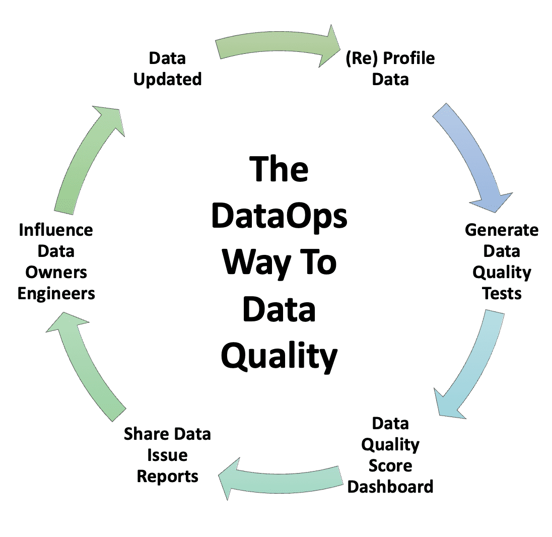
Automation is another critical element in maximizing the effectiveness of data quality dashboards. Fast updates ensure that dashboards remain responsive to the latest data conditions, reducing the need for manual intervention and improving decision-making speed. Automation also enhances scalability, making maintaining multiple dashboards across an organization easier without excessive overhead. With tools like DataKitchen’s DataOps Data Quality TestGen, teams can ensure their dashboards remain dynamic and relevant, even as data sources and business requirements change.
Accessibility is critical to ensuring that dashboards are effective for technical and non-technical stakeholders. Dashboards should be intuitive, with user-friendly visualizations and interfaces catering to end-users’ diverse needs. Clear, actionable metrics and insights allow executives, data scientists, and operations teams to understand and act on data quality issues without requiring extensive technical expertise. Dashboards must be paired with processes to act on their insights to influence data quality outcomes. Dashboards alone are diagnostic. They highlight problems and cannot solve them. Scoring is only one of four jobs data quality testing has to do, alongside monitoring, production tripwires, and deployment regression testing. Wire the dashboard to fast, motivating, “here, fix this” ticket creation so an issue it surfaces becomes work somebody is already assigned. That is what turns a diagnosis into a repair.
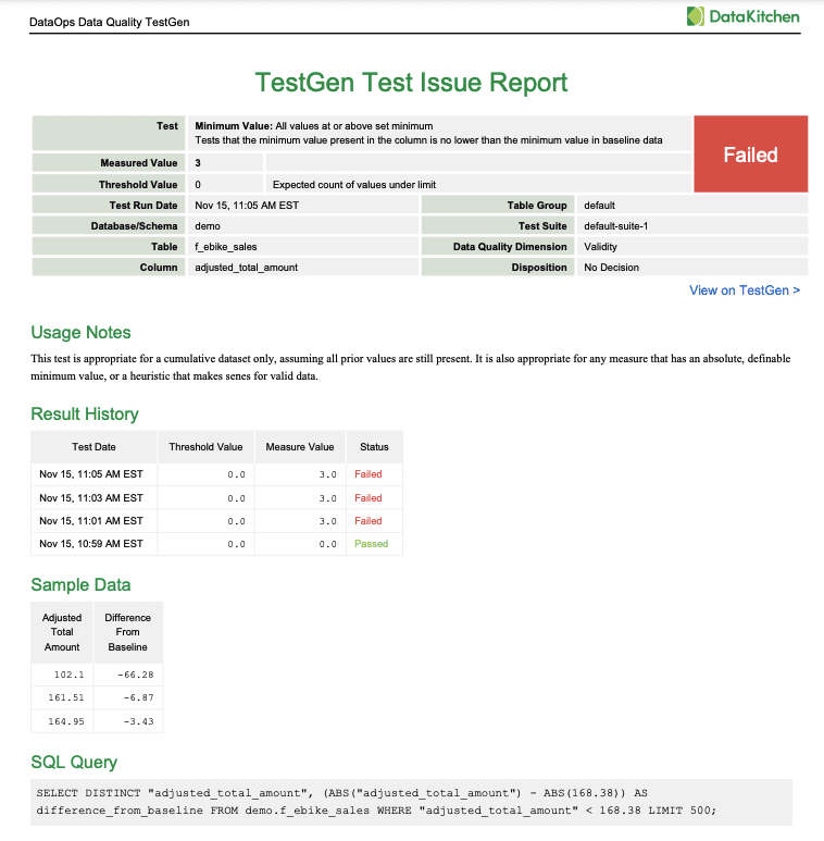
A Data Quality Issue Report from DataKitchen’s DataOps Data Quality TestGen Open Source Software
Then keep changing it. Needs move, so the dashboard and its metrics have to move too. A DataOps approach to data quality is what makes that sustainable: collaboration, automation, iteration. Each pass improves the dashboard and the metrics behind it, so it keeps tracking what people care about now instead of what they cared about a year ago.
Conclusion
A data quality dashboard is how you turn a vague complaint into a specific fix. The six types give you six ways to do it: dimension-focused, CDE, business goal-focused, data source-focused, data consumer-focused, and ticket-driven. Pick by audience, not by which one holds the most metrics. Automate the tests so coverage is never your bottleneck. Make the trade-offs explicit, cycle fast, and hand concrete actions to the people who can act on them. Do that and you stop being the person who reports bad news and start being the person who gets it fixed.
TL;DR
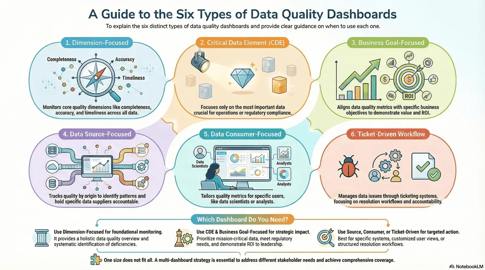
The blog explains that there is no single “data quality dashboard.” Instead, dashboards vary widely because different stakeholders need different views of data quality. The article outlines six types: dimension-focused, Critical Data Element (CDE), business goal-focused, data source-focused, data consumer-focused, and ticket-driven workflow dashboards. Each reflects a different purpose, audience, and definition of “quality.” The central message: the best dashboard is the one aligned to the user’s goals, not the one with the most metrics.
Where to learn more
Start with the masterclass, then pick the thread that matches your problem.
- A Masterclass In The Six Types of Data Quality Dashboards. Builds all six dashboard types in open-source TestGen, so you can follow along against your own tables instead of reading about them.
- Why Your Data Quality Dashboard Isn’t Working And What to Do About It. The failure modes behind a dashboard nobody opens, and how to fix each one.
- Critical Data Elements: Your Shortcut to Data Governance That Actually Works. How to pick the CDEs that dashboard type 2 above depends on, without boiling the ocean first.
- A New, More Effective Approach To Data Quality Assessments. The webinar on assessing an estate before you decide what to put on a dashboard. The white paper covers the same method in writing.
- Seven Sins of Data Quality. The failures these dashboards exist to surface. Confess your data sins, find redemption, maybe even laugh about it.
FAQ
What are the key points in this blog?
There is no single data quality dashboard. Six types exist because different stakeholders need different views: dimension-focused, Critical Data Element, business goal-focused, data source-focused, data consumer-focused, and ticket-driven workflow. The right one is aligned to a specific customer’s goals, not the one with the most metrics, and every number on it should trace to a test somebody can fix.
What are the six types of data quality dashboards?
Dimension-focused dashboards score data against completeness, accuracy, timeliness, consistency, and uniqueness. Critical Data Element (CDE) dashboards track only the fields that carry regulatory or operational consequence. Business goal-focused dashboards tie quality metrics to a named organizational objective. Data source-focused dashboards rank suppliers and upstream systems by the quality they deliver. Data consumer-focused dashboards are cut for the analysts, scientists, and report owners who depend on specific tables. Ticket-driven workflow dashboards track remediation progress rather than quality itself.
Which type of data quality dashboard should I use?
Start by asking who your customer for the data is, because that answer picks the dashboard. Regulated reporting points to CDE dashboards. Executive funding conversations point to business goal-focused dashboards. Vendor and upstream accountability points to source-focused dashboards. Most organizations end up running more than one, because one size does not fit all. What matters is that whichever you pick converts into concrete actions somebody can take.
Why do most data quality dashboards fail?
They report scores nobody can act on. A dashboard built on profiling statistics rather than test results produces numbers that cannot be converted into a fix, so the metric moves for reasons nobody can explain and the dashboard stops being opened. Every number should trace to a specific failing test, and every failing test should be resolvable as a ticket. We go deeper on this in why your data quality dashboard isn’t working.
Are there any templates available for data quality dashboards?
This article does not offer downloadable templates, sample files, or prebuilt dashboards. What it provides is a framework of six dashboard types, showing how they differ, why they differ, and which stakeholders each serves. The focus is conceptual, not template-based. Open-source DataOps TestGen generates working versions of all six from your own profiling and test results.
What are some real-world examples of data quality dashboards in Power BI?
Real-world inspirations include quality KPI dashboards showing completeness and accuracy metrics such as missing-value percentages or timeliness trends, operational monitoring dashboards that highlight failing tables, and supplier quality dashboards tracking data source health. To make these data-quality focused, swap business metrics for quality checks: completeness, validity, consistency, timeliness, and uniqueness. For what Microsoft actually gives you across Purview, Fabric, and Power BI, we mapped all nineteen features against the four jobs of data quality.
How can I monitor data quality using a dashboard in Databricks?
You can build data quality dashboards using TestGen directly on Databricks. Otherwise, build one using Databricks SQL and visualization tools: create queries that calculate data quality KPIs such as percent nulls, schema changes, and failed checks, then surface those results in a Databricks dashboard that refreshes as pipelines update.
Where can I find free resources or samples for data quality dashboards?
Microsoft Learn and the Power BI community galleries publish sample dashboards as .pbix and .pbit files, and GitHub has dashboard repositories worth cloning and reworking around quality metrics. The catch is that they are business dashboards wearing a data quality label — you still supply the tests underneath. Open-source DataOps TestGen generates those tests from your own profiling, which is the part no template can hand you.