Do you deserve a promotion? You may think to yourself that your work is exceptional. Could you prove it?
As a Chief Data Officer (CDO) or Chief Analytics Officer (CAO), you serve as an advocate for the benefits of data-driven decision making. Yet, many CDO’s are surprisingly unanalytical about the activities relating to their own department. Why not use DataOps analytics to shine a light on yourself?
Internal analytics could help you pinpoint areas of concern or provide a big-picture assessment of the state of the analytics team. We call this set of analytics the CDO Dashboard. If you are as good as you think you are, the CDO Dashboard will show how simply awesome you are at what you do. You might find it helpful to share this information with your boss when discussing the data analytics department and your plans to take it to the next level. Below are some reports that you might consider including in your CDO dashboard:
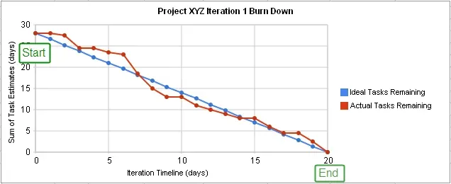
Burn Down Chart
The burn down chart graphically represents the completion of backlog tasks over time. It shows whether a team is on schedule and sheds light on the productivity achieved in each development iteration. It can also show a team’s accuracy in forecasting its own schedule.
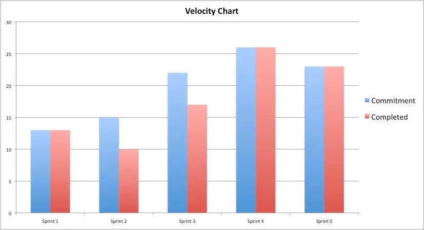
Velocity Chart
The velocity chart shows the amount of work completed during each sprint — it displays how much work the team is doing week in and week out. This chart can illustrate how improved processes and indirect investments (training, tools, process improvements, …) increase velocity over time.
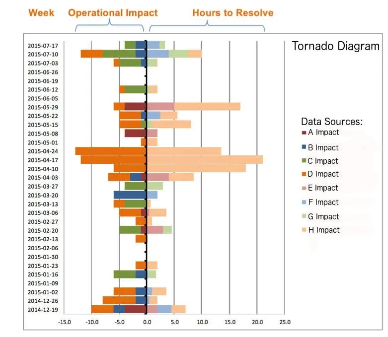
Tornado Report
The Tornado Report is a stacked bar chart that displays a weekly representation of the operational impact of production issues and the time required to resolve them. The Tornado Report provides an easy way to see how issues impacted projects and development resources.
Data Arrival Report
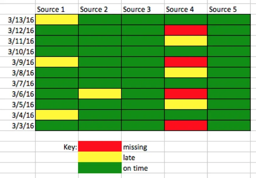
A large organization might receive hundreds of data sets from suppliers and each one could represent dozens of files. All of the data has to arrive error-free in order to, for example, build the critical Friday afternoon report. The Data Arrival report tracks how vendors perform relative to their respective service level agreements (SLA).
The Data Arrival report enables you to track data suppliers and quickly spot delivery issues. Any partner that causes repeated delays can be targeted for coaching and management. The Tornado Report mentioned above can help quantify how much time is spent managing these issues in order to articulate impact. These numbers are quite useful when coaching a peer organization or vendor to improve its quality.
Test Coverage and Inventory
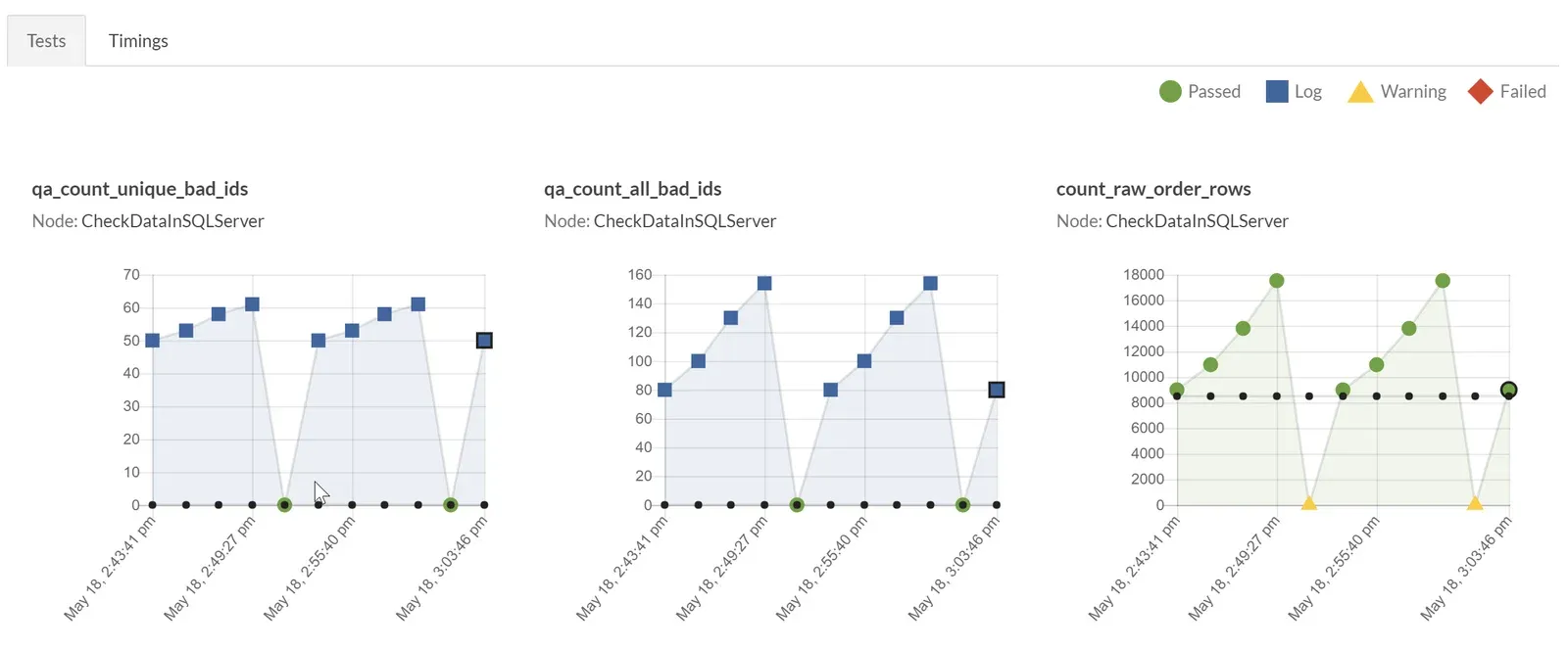
The Test Coverage and Inventory Reports show the degree of test coverage of the data analytics pipeline. It shows the percent of tables and data covered by tests and how test coverage improves over time. The report can also provide details on each test. In a DataOps enterprise, results from tests run on the production pipeline are linked to real-time alerts. If a process fails with an error, the analytics team can troubleshoot the problem by examining test coverage before or after the point of interest.
Statistical Process Controls
The data analytics pipeline is a complex process with steps often too numerous to be monitored manually. Statistical Process Control (SPC) tests inputs, outputs and business logic at each stage of the pipeline. It allows the data analytics team to monitor the pipeline end-to-end from a big-picture perspective, ensuring that everything is operating as expected.
Net Promoter Score
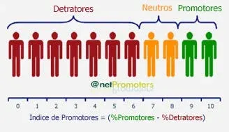
A Net Promoter Score is a customer satisfaction metric that gauges a team’s effectiveness. For a data team, this is often a survey of internal users who are served by analytics. The Net Promoter Score can show that the data analytics team is effective at meeting the needs of its internal customer constituency or that satisfaction is improving.
Conclusion
One of the main goals of analytics is to improve decision-making. The CDO DataOps Dashboard puts information at the fingertips of executives, so they have a complete picture of what is happening in the data analytics domain. When it’s time to review performance, the CDO DataOps Dashboard can help you show others that the analytics department is a well-oiled machine. Now, about that promotion…
FAQ
What are the key points in this blog?
A data leader can measure their own department the same way they measure the business. The post proposes a CDO dashboard of seven reports — burn down, velocity, Tornado, data arrival, test coverage and inventory, statistical process control, and Net Promoter Score — so that team productivity, the cost of production issues, supplier reliability, and internal customer satisfaction are all visible when performance is reviewed.
What is a CDO dashboard?
A set of internal analytics about the data organization itself: how much work gets completed, what production errors cost, how much of the pipeline is under test, how suppliers perform, and how satisfied internal users are. The argument for it is that many chief data officers are unanalytical about their own department, and evidence beats assertion at review time.
What is a Tornado Report in DataOps?
A stacked bar chart showing, week by week, the operational impact of production issues and the time required to resolve them. It makes the cost of firefighting visible: which projects were disrupted, and how much development capacity went into recovery. It also quantifies the time spent managing a particular supplier’s problems, which is useful when coaching that vendor.
How can a data team hold data suppliers accountable?
With a data arrival report that tracks how each vendor performs against its service level agreement. A large organization might receive hundreds of data sets from suppliers, each one of dozens of files, and all of it has to arrive error-free for a critical report to build. A delivery record per supplier turns a vague complaint into something you can coach against.
How do you measure test coverage in a data pipeline?
As the percent of tables and data covered by tests, reported over time so the trend is visible, with detail available on each test. In a DataOps enterprise, results from tests running on the production pipeline are linked to real-time alerts, so coverage doubles as the map an engineer uses to locate where a failure started.
What does statistical process control do in a data pipeline?
It tests inputs, outputs, and business logic at each stage, so a pipeline with more steps than anyone can watch by hand is still monitored end to end. Statistical process control gives the data team a big-picture view of whether everything is operating as expected, and it produces much of the measurement the rest of the dashboard reports.