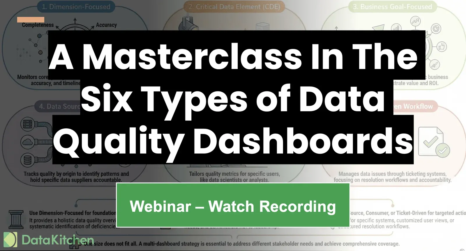
Webinar: A Masterclass In The Six Types Of Data Quality Dashboards

In A Masterclass In The Six Types of Data Quality Dashboards, you’ll learn how to build all six powerful data quality dashboard types in under an hour using 100% open source tools.

Written by Chris Bergh on January 5, 2026

DataOpsData QualityDataOps TestGenOn-Demand WebinarOpen Source
Webinar: A Masterclass In The Six Types Of Data Quality Dashboards

Key points

  • There are six dashboard types, not one: dimension-focused, critical data element, business goal, data source or provider, data consumer, and ticket-driven workflow. The right answer is usually several of them at once.
  • A data quality leader has influence, not authority. The type of dashboard you build should follow from which person you need to move — a VP of sales, a CFO facing compliance reporting, an ML team, or a chief data officer.
  • One senior practitioner DataKitchen interviewed said dimension dashboards "do nothing to motivate people to make improvements to their data". A score of 70% consistency leaves a data engineer with nothing specific to fix.
  • Every dashboard has to be built out of test results against a named table and column, so a reader can drill from the score to the failing check. Anything less arrives on someone's desk as "fix the accuracy" and gets skipped.
  • The tornado report ranks each data provider by issue severity and the hours your team spent patching their data, which turns an invisible cost into something you can put in front of the supplier.
  • Don't spend months on a dashboard. Profile the data, generate tests automatically, publish something small, get one column fixed, then rescore — the loop is where the learning and the influence come from.

In A Masterclass In The Six Types of Data Quality Dashboards, you’ll learn how to build all six powerful data quality dashboard types in under an hour using 100% open source tools. This practical, hands-on session is designed specifically for data engineers and data quality leaders who are tired of waiting on vendors, sitting through endless meetings, and staring at dashboards that look impressive but drive zero action. No waiting. No Teams. Just clarity — and dashboards that actually change behavior.

We’ll break down why traditional, broad “DAMA-style” dashboards consistently fall flat. As one senior data professional put it, “They do nothing to motivate people to make improvements to their data.” Instead, you’ll explore six focused, outcome-driven dashboard types that turn abstract data quality metrics into real business movement. From retail organizations fixing broken customer profiles for better campaigns, to healthcare teams protecting predictive models from bad data, you’ll see how purpose-built dashboards connect quality problems directly to business goals — and instantly improve stakeholder buy-in.

By the end of this masterclass, you’ll walk away with actionable steps for quickly delivering a multi-dashboard strategy that influences every level of the organization — from executive leadership to data engineers in the trenches. You’ll learn how to move beyond check-the-box metrics, overcome resistance from upstream data suppliers, and create a system that doesn’t just score issues, but drives them to resolution. Best of all, you’ll do it using free open-source tools like DataOps Data Quality TestGen, so you can start immediately after the session ends.

Watch the webinar

Fill out the form and the recording, slides, and transcript open on the next page.

Install Open Source TestGen Free, no vendor lock-in Request a Demo See TestGen Enterprise in action
Chris Bergh

Chris Bergh

CEO and Head Chef at DataKitchen. He is a leader of the DataOps movement and is the co-author of the DataOps Cookbook and the DataOps Manifesto.

LinkedIn →

Don't want to give us your email address? Go directly to the webinar recording here.