You run a Microsoft shop. Someone in compliance asked you to verify that the numbers in the report are correct. So you went looking for the data quality tool.
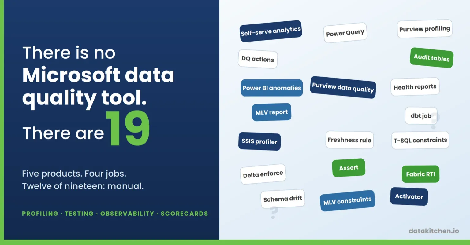
There isn’t one. There are nineteen, spread across five products, and they don’t talk to each other.
That’s not a knock on Microsoft. It’s what happens when a data quality story gets assembled from a governance catalog, a Spark feature, a dataflow transform, a Power Query panel, a T-SQL keyword, a streaming engine built for IoT, and two products that were deleted last year. Each piece is real. Each piece does something.
The trouble starts when you try to draw one line from “here are my 4,000 tables” to “here is a score I trust.”
Here’s what that line costs. You stitch six tools together, and you write every rule, every threshold, and every constraint by hand, in five different syntaxes, in portals without git. You build the scorecard yourself, on a semantic model you maintain, fed by a preview feature. Then you keep all of it alive: the thresholds nobody has revisited page you every Sunday, the person who built the dashboard changes jobs, and Microsoft offers no guidance on which of the overlapping options to pick or which one gets deleted next. Ask anyone who built on Data Quality Services.
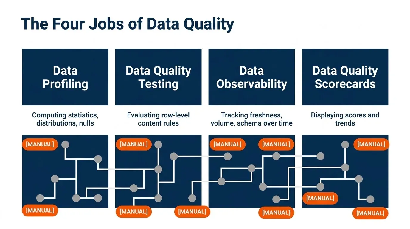
That’s the pain. This post is the map. The scope is the four jobs a data team actually has to do: data profiling, data quality testing, data observability (monitoring freshness, volume, schema, and metrics over time), and data quality scorecards. For each job, what Microsoft recommends, what the alternatives are, and the exact point where each one stops helping.
Part 1: How to do data profiling
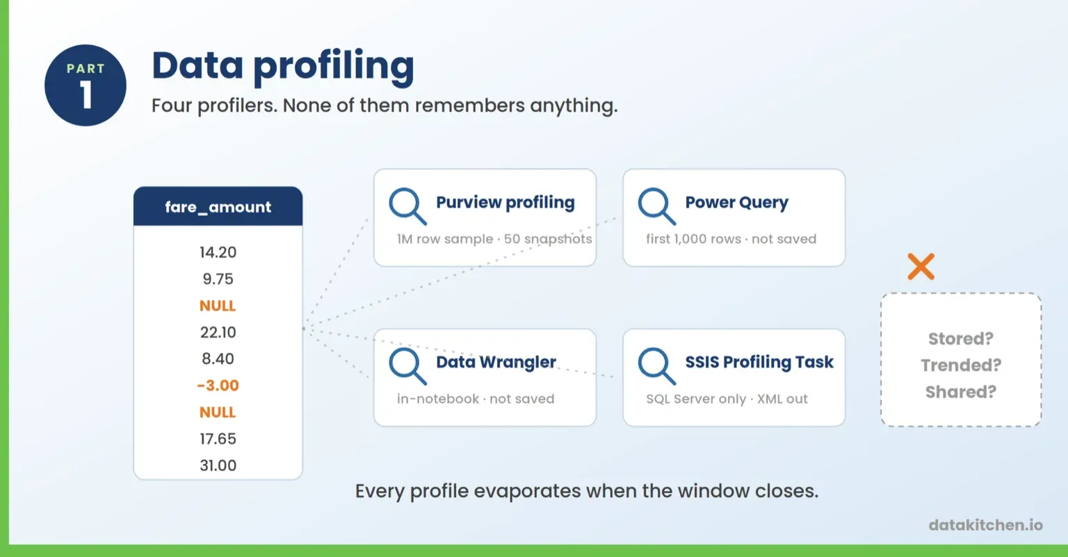
Profiling means computing statistics about what’s in your columns. Distributions, nulls, distinct counts, min and max, patterns.
It goes first because everything after it depends on it. You can’t write a sensible test until you know what’s in the column, and you can’t set a threshold until you know what normal looks like. It’s also the step most teams skip.
What Microsoft recommends: Purview data profiling, which is step five of the Purview data quality lifecycle and the basis for your rules. Power Query profiling if you’re a Power BI author. Data Wrangler if you live in a notebook. The SSIS Data Profiling Task if you’re on-prem.
| Tool | Manual or automatic | Overview |
|---|---|---|
| Purview data profiling | Manual trigger, AI column selection | Per-asset statistical snapshot on a random 1-million-row sample; 50 snapshots retained. Not supported for on-premises sources. |
| Power Query and Data Wrangler | Automatic in the editor | Live per-column statistics while a person has the tool open. First 1,000 rows by default in Power Query, and nothing is saved anywhere. |
| SSIS Data Profiling Task | Manual to configure, automatic to run | The only schedulable profiler here includes candidate keys and functional dependencies. SQL Server sources only, XML output, can’t trigger anything. |
1. Purview data profiling
In Unified Catalog, you pick a data asset and hit Profile. An AI recommendation engine preselects the columns it thinks matter, and you add or remove from there. When the job finishes, you browse a statistical snapshot per column: distribution, min, max, standard deviation, uniqueness, completeness, duplicates, and more.
This is the intended starting point. Profile first, read the results, then write rules that match what you found.
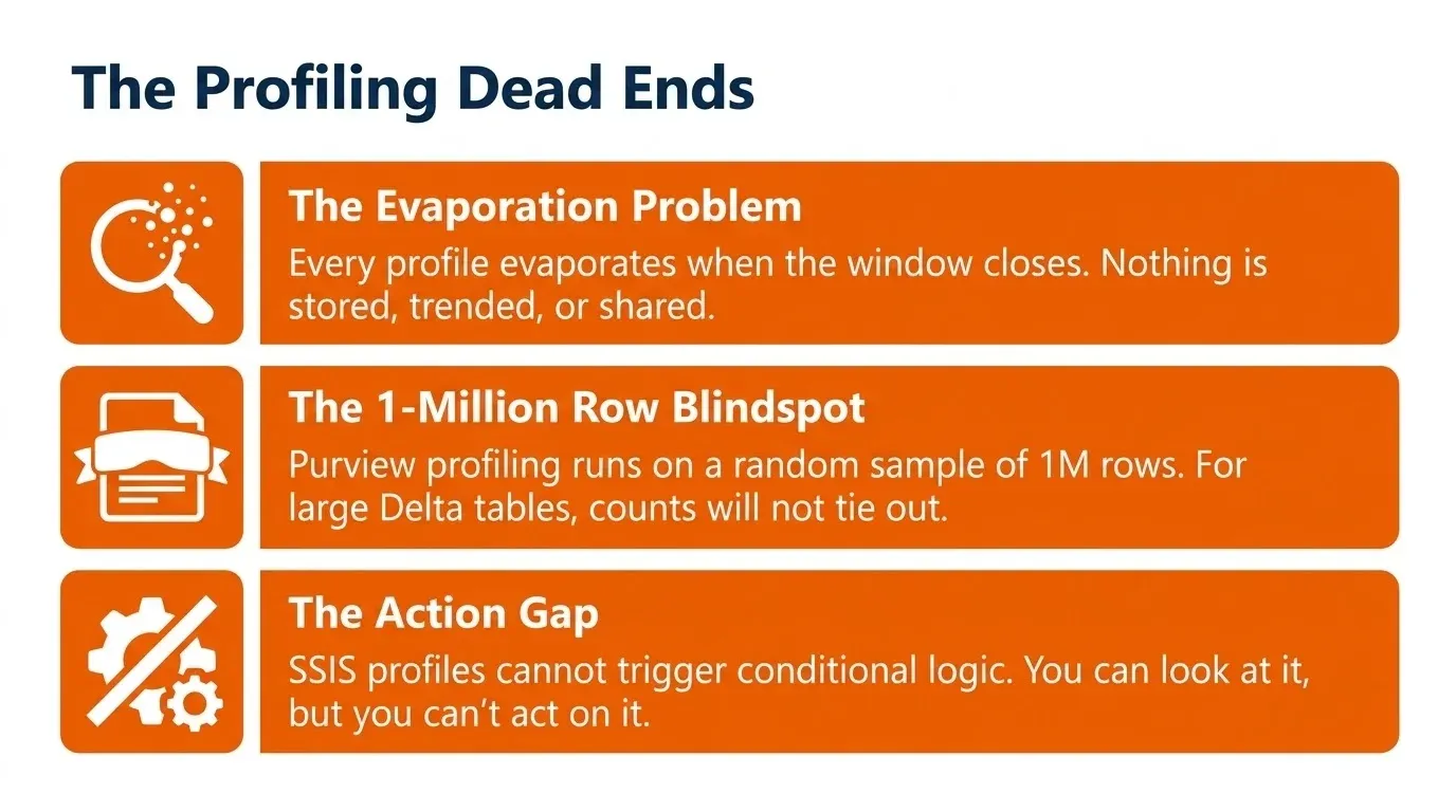
Where it stops. Profiling runs on a random sample of 1 million rows. If your Delta table is bigger than that, your counts won’t tie out to the table, and the docs say so. Purview keeps 50 snapshots of profiling and assessment history, so your trend line has a horizon. Profiling isn’t supported for on-premises sources at all. And it’s a manual button in a portal, per asset, which is fine for 20 tables and absurd for 4,000.
Worth separating from the Data Map scan, which people confuse with profiling. That scan samples the first 128 rows to classify columns and pull the schema. It tells you a column looks like a Social Security number. It tells you nothing about how many of them are blank.
2. The interactive profilers: Power Query and Data Wrangler
Every Power BI author already has profiling and half of them don’t know it. In the Power Query editor, the View ribbon has three data profiling tools. Column quality labels values valid, error, or empty. Column distribution shows a histogram plus distinct and unique counts. Column profile adds min, max, average, and standard deviation. Free, instant, and available in Power BI Desktop, Dataflow Gen2, and Excel. If you work in a Fabric notebook instead, Data Wrangler does the same job on a pandas or Spark DataFrame, and display(df, summary = true) gets you column statistics in one line.
Where they stop. Power Query profiles the first 1,000 rows by default. Switch to the full dataset and the editor rescans everything on every change, which on a few million rows is unusable, so most people leave it at 1,000 and quietly draw conclusions about a table they’ve seen 0.02 percent of. And for all of these, close the window and the profile is gone. Nothing is stored, trended, or shared.
3. The SSIS Data Profiling Task
If you’re on-prem and you’ve had SSIS since 2008, you already own this. Drop the Data Profiling Task into a package and it computes column length distributions, value distributions, null ratios, and pattern profiles. It also does two things most modern profilers skip: candidate key detection and functional dependency analysis, which tell you whether a column really is unique and whether one column actually determines another. It’s the only scheduled, repeatable profiler on this list.
Where it stops. It only works with data stored in SQL Server. Not files, not third-party sources. The output is XML that you open in a separate standalone viewer. And here’s the line from the docs that ends the conversation: the Data Profiling Task has no built-in features that let you use conditional logic to connect it to downstream tasks based on the profile output.
You can look at the profile. You can’t act on it.
Part 2: How to do data quality testing
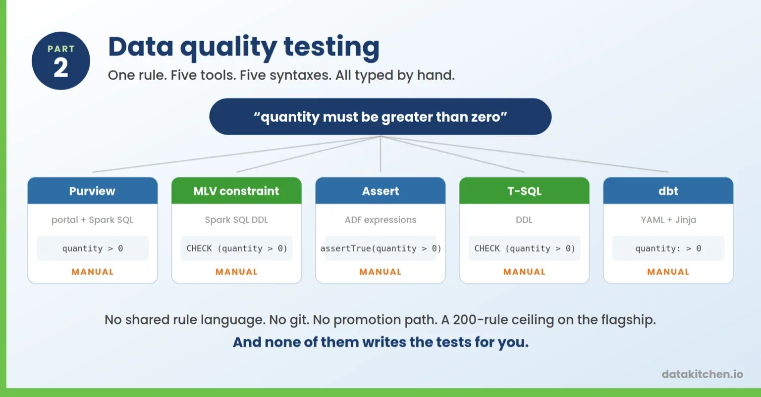
A test evaluates a rule against your rows and tells you which ones failed. Everything in this part does that. Watching the data change over time is the next part, and cleansing tools and catalogs are somebody else’s post.
One distinction runs through all of it. A row-level test examines a single row and determines whether it’s valid. An aggregate test looks at the whole set and asks a question about the set: is the null rate under 20 percent, are there at least two distinct payment types, is the average fare inside a sane range?
Most of what Microsoft ships is row-level only. That isn’t a footnote. It’s the reason most of the options below physically cannot express the checks you want most.
What Microsoft recommends: Microsoft Purview Unified Catalog data quality if you want governance and scores. Materialized lake views if you’re in Fabric and want the pipeline to stop. A dbt job if your team already writes SQL and wants tests in git. T-SQL constraints if your warehouse is still on SQL Server. You’ll probably need more than one.
| Tool | Manual or automatic | Overview |
|---|---|---|
| Purview Unified Catalog data quality | Manual rules, automatic scans | Portal-authored rules across six quality dimensions, scored and rolled up to the governance domain. Suggested rules propose some for you. |
| Fabric materialized lake view constraints | Manual rules, automatic enforcement | CHECK constraints in the view definition that drop rows or fail the refresh. Fabric only. |
| ADF and Synapse Assert | Manual | Row assertions built by hand in the mapping data flow canvas. Now in public preview inside Fabric Dataflow Gen2. |
| T-SQL constraints | Manual to declare, automatic to enforce | NOT NULL, CHECK, UNIQUE, and foreign keys rejecting bad rows at write time. Free and on-prem, and not enforced in Fabric. |
| dbt job in Fabric | Manual | dbt Core running natively in a Fabric workspace. Tests live in git next to the models. Still preview. |
1. Microsoft Purview Unified Catalog data quality
This is the flagship, and it’s the one most people mean when they say “we use Purview for data quality.”
Getting to your first test takes eight steps. You assign steward permissions, register and scan the source in Data Map, add the asset to a data product, set up a separate data source connection, run profiling, create rules, run a data quality scan, then review the results. The connection for data quality is not the same connection you used for metadata scanning. You set both up.
Once you’re in, the out-of-the-box rules cover freshness, unique values, string format match, data type match, duplicate rows, empty and blank fields, table lookup, and custom. Format match handles enumerations, LIKE patterns, and regex.
Rules map to six quality dimensions: accuracy, completeness, conformity, consistency, freshness, and uniqueness. That’s the vocabulary your governance team already speaks, and it’s a big part of why Purview wins the room before anybody looks at the SQL.
Custom rules are where the real work happens. Every custom rule has three parts. A row expression that returns true when the row passes. An optional filter expression that narrows which rows get evaluated. A null expression that decides what happens when the value is missing. You write those in one of three languages: regular expressions, the Azure Data Factory data flow expression language, or Spark SQL.
The Spark SQL option is the good one. You can write real predicates, including subqueries and window functions. A null-rate ceiling looks like (SELECT avg(CASE WHEN fareAmount IS NULL THEN 1 ELSE 0 END) FROM yourtable) < 0.20. A uniqueness check looks like COUNT(1) OVER (PARTITION BY vendorID) = 1. If you write SQL for a living, this feels normal.
One footgun from Microsoft’s own docs, and it’s a nasty one. Write a correlated subquery with an unqualified column and Spark resolves the outer reference to the inner scope, so WHERE t.payment_type = payment_type becomes t.payment_type = t.payment_type, always true, and your per-group minimum silently becomes a global minimum. The rule runs green and the answer is wrong. Alias the inner columns.
Scoring divides passed records by passed plus failed plus miscast plus empty, where miscast means the value can’t be converted to the declared type. Users can also mark rows as ignored, and ignored rows drop out of the denominator entirely. Sit with that for a second: exclude the rows that fail and the score goes up, with nothing on the scorecard saying so. Column scores roll up to the asset, then the data product, then the governance domain. Since spring you can set score thresholds at the rule level and the asset level instead of holding every column to the same bar. Failed rows can be published to a Fabric Lakehouse or ADLS Gen2 so somebody can actually go fix them.
Pricing runs on two meters. A governed asset is a table, file, or report you’ve linked to a data product or tagged as a critical data element, which is Purview’s term for a field the business has actually agreed matters. Scanned assets sitting in the Data Map are free. Governed assets are billed per asset per day, and scans consume Data Governance Processing Units billed by the compute hour, so the bill scales with how many tables you govern and how often you check them. Microsoft is upfront that the metadata scan and the quality scan are separate engines, and you pay for both, because the metadata engine samples the first 128 rows, and the quality scan reads every row in the column.
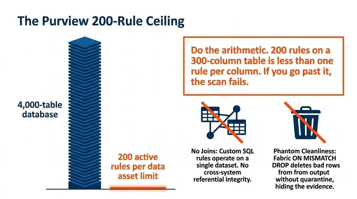
Where it stops. Custom SQL rules can’t do joins. The docs say it plainly: rules operate on a single dataset, and you can’t join multiple tables. So no source-to-target reconciliation. No cross-system referential integrity. No “did the 4.2 million rows that left SAP arrive in the warehouse?” The one cross-table escape hatch is the table lookup rule, and the reference table must reside in the same governance domain.
You also hit a hard ceiling of 200 active rules per data asset. Go past it and the scan fails. The documented workaround is to add the same table to multiple data products or toggle rules on and off, which is a scheduling problem dressed up as a feature.
Do the arithmetic. Two hundred rules on a 300-column table is less than one rule per column. That’s not a coverage strategy, and we’ve written about what real coverage actually takes.
File support is narrower than you’d expect. Data quality supports Delta, Parquet, Iceberg ORC, and Iceberg Avro. It does not support CSV, TSV, or text files. Column names with spaces aren’t supported either.
Rules live in a UI. The data quality REST API is still preview. There’s no git, no diff, no promotion from dev to prod, no code review.
And the scans run after your pipeline finishes. Purview tells you the gold table was wrong. It doesn’t stop the gold table from being wrong.
2. Fabric materialized lake view constraints
Materialized lake views went generally available at FabCon in March 2026. You define a view in Spark SQL or PySpark, Fabric materializes it as a Delta table, tracks dependencies between views, and orders the refreshes for you.
You attach quality constraints to the view definition:
CREATE OR REPLACE MATERIALIZED LAKE VIEW silver.valid_orders (
  CONSTRAINT positive_quantity CHECK (quantity > 0) ON MISMATCH DROP,
  CONSTRAINT valid_date CHECK (orderDate >= '2020-01-01') ON MISMATCH FAIL
) AS SELECT * FROM bronze.orders
DROP removes the bad rows, logs the count, and keeps going. FAIL stops the refresh at the first violation, and FAIL is the default if you leave the clause off. If you mix them, FAIL wins. Violation counts land in the lineage view and in a data quality report, which Part 4 covers.
This is the closest thing Microsoft has to a real test that runs inside the pipeline.
Where it stops. You write every constraint by hand. There’s nothing that looks at your data and suggests what to check. Constraints only fire during refresh, and only inside a materialized lake view, so the rest of your lakehouse is uncovered. It’s Fabric only.
The bigger issue is ON MISMATCH DROP. It doesn’t quarantine the row. It deletes it from the output and writes a number to a log. Your gold table now looks clean because the evidence left the building. Somebody has to be watching those counts, and nobody is watching those counts.
The harder question underneath this is how many tests each layer needs and where they belong. We worked through that in data quality test coverage in a medallion architecture.
3. The Assert transformation in ADF and Synapse
The old one, still shipping. Inside a mapping data flow you drop in an Assert transformation, pick expect true, expect unique, or expect exists, write an expression, and set a custom error message. Downstream you call hasError() and route the bad rows somewhere.
It works. People have run it for years.
Where it stops. It only exists inside a mapping data flow. If your transformation is a notebook or a stored procedure, there’s nothing to attach it to. There’s no results history, no trend, no score, no catalog. You get a run that failed and a log to read.
It does have a path into Fabric, which is newer than most write-ups reflect. Assert never got a native Dataflow Gen2 equivalent, but mapping data flow transforms hit public preview in June 2026 and bring the whole ADF canvas inside Dataflow Gen2. Assert is on the supported transformation list, described as a row modifier that defines assert rules for rows in the data stream. There’s a migration experience that converts existing ADF and Synapse pipelines into MDF transforms.
Read the preview limits before you plan around it. MDF transforms only execute through a pipeline Dataflow activity, so you can’t run one from Dataflow Gen2 directly and Save is the only option on the Save and run menu. Flowlets, the Data Flow Library, and user-defined functions aren’t supported. Execution still uses the underlying Synapse Spark runtime. And Microsoft says plainly that not all Mapping Data Flow capabilities made the preview.
4. T-SQL constraints in SQL Server and Azure SQL
The oldest data quality test in the building, and the only one on this list that’s free, on-prem, and enforced at write time. NOT NULL, CHECK, UNIQUE, and primary and foreign key constraints reject bad rows at the door. A foreign key is a referential integrity constraint that actually holds, which is the exact test Purview custom SQL rules can’t write.
If your warehouse runs on SQL Server or Azure SQL, you already have this, and you should use more of it.
Where it stops. It rejects the row instead of recording the problem, so the failure shows up as a load error at 2am rather than a quality score. It only protects the table you defined it on. It won’t tell you a column went from 2 percent null to 40 percent null, because both are legal. And check whether yours are actually on: a constraint added WITH NOCHECK never validates existing rows and the optimizer stops trusting it, and half the estates that say “we have foreign keys” have untrusted ones.
And it doesn’t come with you to Fabric. In a Fabric Warehouse, table constraints are hints, not rules. PRIMARY KEY and UNIQUE are only supported with NONCLUSTERED and NOT ENFORCED, and FOREIGN KEY is always NOT ENFORCED. Insert the same key four times and all four rows land. In a Fabric Lakehouse you can’t declare them at all. The error reads “Table constraints (Primary and Foreign key) are not supported in V2 Datasource tables.”
So the one enforced test you’ve relied on for your whole career is the one you lose on the way to the lakehouse.
5. dbt job in Fabric
For a lot of Microsoft shops, this is already the real answer, and it’s now a first-class Fabric item. Announced at Ignite 2025 and rolled out that December, dbt job runs dbt Core inside a Fabric workspace as a managed item type. No dbt Cloud account, no self-hosted Airflow, no local install. You author models, define dependencies, and run tests in one place, with Fabric handling scheduling and monitoring and run logs landing in OneLake.
The reason engineers reach for it over everything else in this part: tests live in git next to the models, and dbt build interleaves models and tests so a failed test stops the model downstream of it. That’s version control, code review, and a pipeline gate in one tool, which is three things Purview doesn’t have.
Where it stops. Still preview. Runtime v1.0 covers dbt Core 1.9 across four adapters: Fabric Warehouse, Azure SQL Database, PostgreSQL, and Snowflake. Some partner adapters aren’t supported. There’s no build caching, so every run compiles fresh from source.
The coverage problem is the same as everywhere else, just in YAML instead of a portal. dbt ships four built-in generic tests: unique, not_null, accepted_values, and relationships. Everything past that you write yourself, for every column, forever. Point it at 4,000 tables and you have 4,000 tables and no tests.
Part 3: How to do data observability
Different job from testing, and the line is worth stating precisely. Tests verify data content rules: column formats, value ranges, referential integrity. Monitors track table-level patterns over time: whether the table is updating on schedule, whether row counts are moving unexpectedly, whether the schema shifted, whether a metric is still in bounds.
Four categories. Freshness, volume, schema, and metric.
The distinction that matters is where the expected range comes from. A test compares your data to a number you typed. A monitor learns from historical patterns and flags the deviation on its own. Nobody has to know in advance that Tuesday’s load is normally 4.2 million rows.
These are the failures that catch you sideways. A pipeline that quietly stopped running. A table that doubled overnight. A column that got dropped without notice. None of them fail a test. All of them break a dashboard.
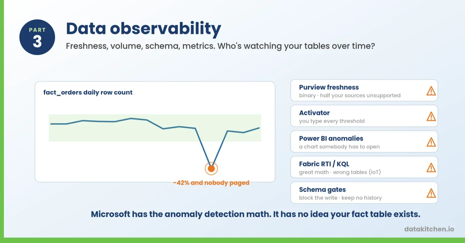
What Microsoft recommends: nothing, because there is no Microsoft data observability product. There’s one freshness rule, a rules engine where you set the thresholds yourself, a chart feature, a streaming stack built for IoT telemetry, and two schema gates that block bad writes without recording what changed. You assemble it.
| Tool | Manual or automatic | Overview |
|---|---|---|
| Purview freshness rule | Manual | The only native freshness check. Binary pass or fail at the asset level, and unsupported on several major sources. |
| Fabric Activator | Manual thresholds, automatic firing | Stateful rules including heartbeat detection for data that stopped arriving. You supply every threshold. |
| Power BI anomaly detection | Automatic | Learned expected range on a line chart, with ranked explanations. A visual, not a monitor. |
| Fabric Real-Time Intelligence anomaly detection | Automatic | The real thing: learned baselines, continuous monitoring, notifications. Requires an Eventhouse and a KQL database. |
| ADF schema drift and Delta enforcement | Automatic gates | One tolerates schema changes silently, one rejects the mismatched write. Neither records what changed. |
1. The Purview freshness rule
Freshness is one of Purview’s six dimensions and it gets one rule. You pick a last modified date column and set the expected window.
Where it stops. The score is 100 or 0. There’s no “arrived four hours late,” just pass or fail. It applies at the asset level rather than the column level. And it isn’t supported for Snowflake, Azure Databricks Unity Catalog, Google BigQuery, Synapse, or Azure SQL, which covers most of what a large shop actually runs.
Two other Purview features get pointed at this problem and neither one qualifies. The 50 retained profiling snapshots are stored results, not a monitor, and nothing compares them for you. Data quality actions fire on outliers within a profiled column and on high null counts, which is a statistic about the values in a single scan, not a comparison against last week.
So Purview covers one of the four categories, partially. Nothing in it watches row counts. Nothing in it tells you a column appeared or disappeared.
2. Fabric Activator
Activator is the closest thing Microsoft has to a monitoring layer you’d point at operational data. Rules are stateful, which is what makes them interesting here. BECOMES, INCREASES, DECREASES, and EXIT RANGE all compare a value to its previous state rather than evaluating one row in isolation.
The heartbeat rule is a genuine freshness monitor. It fires on the absence of data, so a stream that stops sends you a message. SQL query rules, in preview since March 2026, run a query against Fabric Data Warehouse on a schedule, which is how you’d build a row count monitor if you were going to build one.
Where it stops. You supply every threshold. Activator will tell you when row count drops below 4 million because you told it 4 million. It doesn’t know that 4.2 million is normal for a Tuesday, and it will page you every Sunday when the number legitimately halves. That’s the difference between alerting and observability, and it’s the whole difference.
3. Power BI anomaly detection
Add Find Anomalies from the Analytics pane on a line chart and Power BI marks the points that fall outside an expected range it works out from the series itself. Sensitivity is adjustable. It also explains the anomalies, running an analysis across fields in your model and ranking the contributing dimensions by explanatory strength.
That explanation feature is better than it sounds. Pointing at the seller and city responsible for a spike is real root cause work, and no other Microsoft tool on this list does it.
Where it stops. It’s a chart feature. Line charts only, time series on the axis, minimum four data points, no legends or multiple values, no drill-down. It doesn’t run on a schedule, doesn’t store results, and doesn’t page anybody. Somebody has to open the report and look at it, which means it catches the anomaly right after the meeting where the wrong number was presented.
4. Fabric Real-Time Intelligence
Fabric Real-Time Intelligence is where Microsoft’s actual anomaly detection lives, and almost nobody evaluating data quality tooling finds it, because it sits in the streaming stack.
KQL ships series_decompose_anomalies() natively, which runs univariate anomaly detection across thousands of time series in seconds. Pair it with make-series and you have volume monitoring in one query. There’s multivariate anomaly detection too, for when the combination of values is wrong even though each one looks fine on its own.
On top of that sits a newer anomaly detection feature in preview that runs natively on Eventhouse tables without copying data. You get interactive exploration with adjustable model sensitivity, continuous monitoring with automated notifications, and reanalysis as new data arrives. Results are published to the Real-Time Hub, where you can alert on them or hand them to a Fabric data agent.
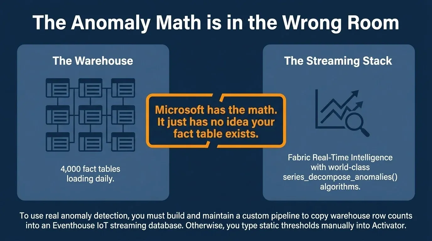
Where it stops. Your data has to be in an Eventhouse with a KQL database and the Python plugin enabled. This was built for IoT telemetry and fraud detection, not for the 4,000 tables in your warehouse. Getting a row count history for a Delta table into an Eventhouse so you can run anomaly detection on it is a pipeline you write and maintain.
Worth knowing if you built on the old Azure AI Anomaly Detector: it retires on 1 October 2026, and you haven’t been able to create new resources since September 2023. Microsoft’s own migration guidance points to Fabric, which integrates the same open-source anomaly detector.
5. Schema: two gates, no history
Microsoft gives you two ways to react to a schema change and no way to see one.
In ADF and Synapse mapping data flows, the schema drift feature exists to make schema changes not break your pipeline. Allow schema drift and new columns flow through to the sink silently. The one setting that tests schema, Validate schema on the source, fails the run rather than recording what changed.
In a lakehouse, Delta enforces schema on write by default, rejecting a write that doesn’t match the table. Real protection, free, zero configuration. Then most ETL pipelines opt into mergeSchema for additive changes, and from that moment new columns arrive silently, which is the exact event you wanted to be told about. Renamed and dropped columns aren’t covered by auto-evolution at all, so they break downstream consumers with no warning.
Where both stop. One tolerates the change, one blocks the write, and neither keeps a history. The Delta transaction log records every schema change, but nothing reads it for you and turns it into an alert. Nothing anywhere in the stack tells you what changed between Monday and Tuesday.
Where the whole observability story stops
Line up the four things this part is supposed to cover.
Freshness: one binary rule in Purview that doesn’t work on half your sources, plus a heartbeat in Activator if your data is streaming. Volume: nothing native, unless you write a SQL query rule with a threshold you picked or move row counts into an Eventhouse. Schema: two gates that block a bad write and no way to see the history of changes. Metric anomalies: genuinely good algorithms, in a chart nobody watches and a streaming engine your warehouse tables aren’t in.
The through line is that Microsoft has the math and hasn’t pointed it at your tables. series_decompose_anomalies() would tell you your fact table loaded 40 percent lighter. It just has no idea your fact table exists.
Part 4: How to build data quality scorecards
A scorecard shows scores and trends to somebody who didn’t write the tests or run the monitors. That’s the bar for this part. The remediation queue and the alerting layer sit at the end, labeled as what they are.
What Microsoft recommends: the built-in Health management reports in Purview for the standard view, and self-serve analytics in OneLake plus Power BI when you want your own.
| Tool | Manual or automatic | Overview |
|---|---|---|
| Purview Health Management reports | Automatic | Built-in scorecard with dimension scores and per-rule trend history. Not customizable, and it won’t refresh without health controls plus self-serve analytics. |
| Self-serve analytics into OneLake, then Power BI | Manual | Purview publishes governance metadata to a lakehouse and you build the semantic model and report. Still in preview. |
| Materialized lake view data quality report | Automatic | Fabric charts violation counts by constraint and by view over time. One lakehouse, engineering audience. |
| Roll your own on audit tables | Manual | Write results to your own table and point Power BI, Power BI Metrics, or SSRS at it. The only way to get more than one engine on a page. |
| Purview data quality actions | Automatic | A severity-ranked work queue generated from outliers and null counts. Not a dashboard, but the closest thing to somebody fixing something. |
| Fabric Activator | Manual rules, automatic firing | Alerting, not a dashboard. Rules fire emails, Teams messages, or Fabric jobs when a condition hits. |
1. Purview Health Management reports
Purview ships built-in reports under Health management. The data quality health report shows dimension scores and rule results across the estate. Scores roll up from column to asset to data product to governance domain, and every rule has a History tab with the trend across scan runs.
One detail that tells you something about how integrated this all is: Microsoft’s own page for the report says it helps you understand accuracy, completeness, consistency, reliability, and timeliness. The rules feeding it use accuracy, completeness, conformity, consistency, freshness, and uniqueness. Reliability and timeliness aren’t rule dimensions, and conformity and uniqueness aren’t in the report’s description. The scorecard and the rules that populate it don’t use the same vocabulary.
This is the real scorecard, and it’s good.
Where it stops. The out-of-the-box reports aren’t customizable. And the data quality health report won’t refresh unless you’re running data health controls and you’ve subscribed your Unified Catalog metadata to self-serve analytics.
Data health controls are a separate feature from data quality rules, and people conflate them constantly. Controls score your governance posture, things like whether assets have owners, descriptions, and classifications. They run on their own schedule and consume their own DGPUs. Your data quality dashboard depends on a governance feature you might not have turned on, and if you skip it you get a stale report that doesn’t tell you it’s stale.
2. Self-serve analytics into OneLake, then Power BI
For anything custom, you use self-serve analytics, still in preview. Purview publishes a third normal form model of your governance metadata into a Fabric Lakehouse or ADLS Gen2. You get governance domains, data products, data assets, glossary terms, data quality rules, dimensions, the pass and fail counts behind every score, and the health actions somebody opened to fix them.
From there, it’s a Fabric semantic model and a Power BI report you design and maintain yourself. Point the error records feed at the same lakehouse, and your dashboard can drill from a score down to the rows that failed.
That’s a real dashboard, and it’s a project. Budget for a data model, a semantic layer, and somebody who owns the refresh.
3. The materialized lake view data quality report
Fabric keeps its own quality reporting for materialized lake views, separate from Purview. The lineage view shows dropped row counts per constraint, and the data quality report shows counts by constraint, by view, over time. A rule that normally drops a tenth of a percent and suddenly drops fifteen shows up as a spike you can see.
Where it stops. It covers materialized lake views in that lakehouse and nothing else. It doesn’t roll up to a data product, a domain, or a business owner. Nobody outside the engineering team opens it.
4. Roll your own on audit tables
Plenty of teams skip all of the above, write test results to their own audit table, and point Power BI at it. It’s the only way to get results from more than one engine onto the same page. Power BI Metrics fits here for SLA-shaped tracking, and SSRS does the job on-prem.
Where it stops. You designed it, you built it, you own it, and the person who wrote it is going to change jobs.
And the alerting layer, which isn’t a dashboard
Two more things get pointed at this job. Activator fires emails, Teams messages, or Fabric jobs when a condition you defined is met, and Microsoft’s own docs frame its data quality role as reacting to problems found elsewhere. Purview data quality actions auto-generate a severity-ranked work queue from outliers and null counts and roll it up to the governance domain. The first is a pager; the second is a to-do list. Both are useful. Neither shows a score to a stakeholder.
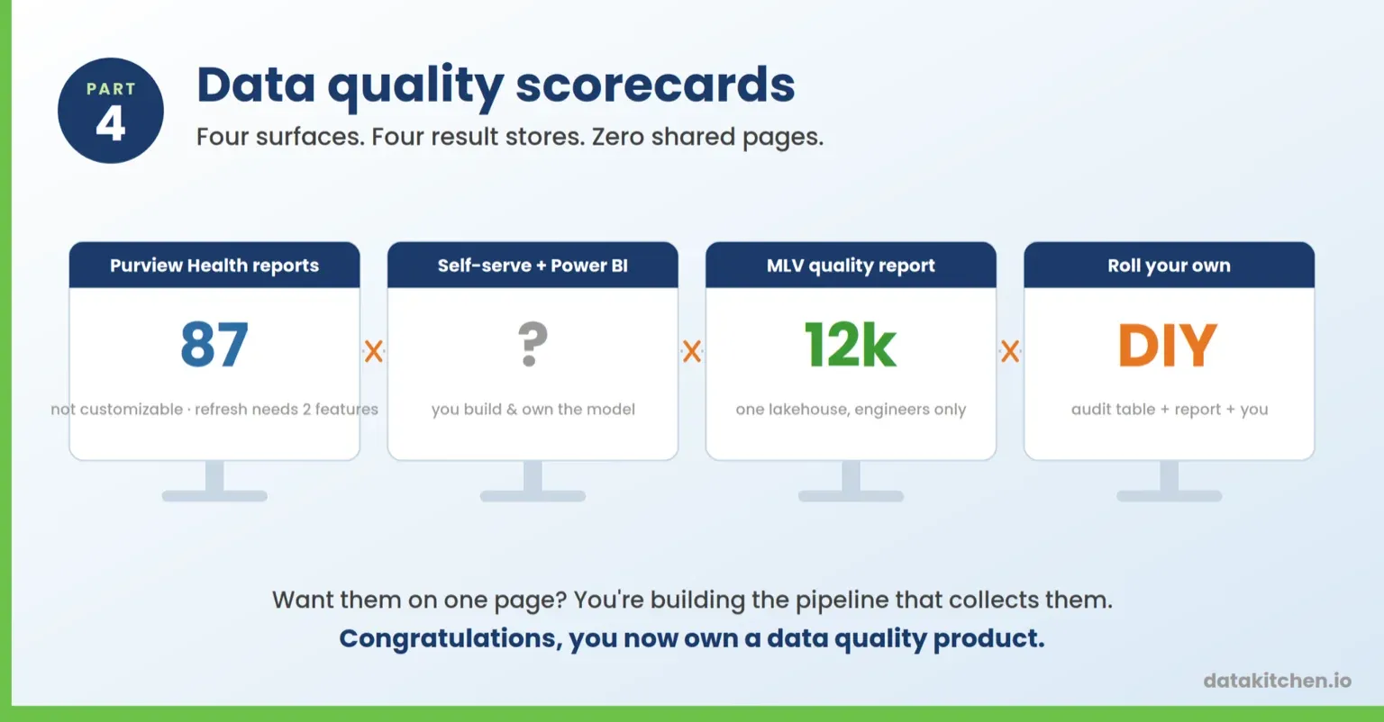
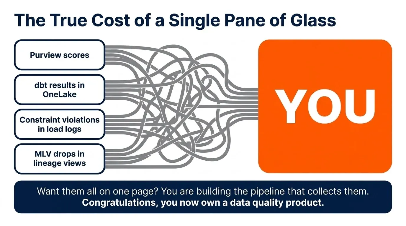
Where the whole scorecard story stops. Four surfaces produce data quality results, and each one keeps its own. Purview scores live in Purview. Materialized lake view violations live in the Fabric lineage view. dbt test results live in run artifacts in OneLake. Constraint violations are a load error in a job log. Want them on one page? You’re building the pipeline that collects them, and now you own a data quality product.
The category Microsoft exited: cleansing, matching, and mastering
Everything above measures. Nothing above fixes.
For fifteen years, the fixing was Microsoft’s job too. Data Quality Services did cleansing, matching, standardization, and de-duplication against a knowledge base, with reference data from external providers and profiling built into the tasks. Master Data Services did mastering, with business rules that validated members before a version could be committed.
Between them, they covered a whole category: cleansing, fuzzy matching, survivorship, golden records, reference data. Nothing in the current Microsoft stack does any of it.
Both were removed in SQL Server 2025. Not deprecated with a runway. Removed. They’re still supported in SQL Server 2022 and earlier, and if you’re running DQS today, you have to uninstall it before you can even upgrade.
If you built on DQS, the migration guidance points to Purview, which measures quality and cannot cleanse, match, or master anything. That isn’t a like-for-like replacement. It’s a different product for a different job.
Worth being straight about this: TestGen doesn’t remediate either. Measuring and fixing are separate problems and require separate tools. The point isn’t that Microsoft lacks a remediation story. It’s that Microsoft had one, deleted it, and is now pointing displaced customers at a measurement tool.
The on-prem problem nobody puts on the slide
Most of this post assumes you’re in Fabric or Azure. A lot of Microsoft data isn’t.
You’ve got Azure SQL Database and Azure Synapse Analytics in the cloud. You’ve also got Microsoft SQL Server and a stack of SQL Server 2019 boxes in a rack, holding the data the business actually runs on. SQL Server 2025 adds EXPOSE TO FABRIC and OneLake is coming for more of this, but “coming” isn’t a test plan for the quarter you’re in.
Here’s the list from the rack. Materialized lake views need Fabric. Activator needs Fabric. Real-Time Intelligence anomaly detection needs an Eventhouse. Delta schema enforcement needs Delta tables. The dbt job needs a Fabric workspace, though dbt Core on your own machine has always worked against SQL Server. Data Wrangler needs a Fabric notebook. DQS and MDS are gone. T-SQL constraints work and always have, but they reject rows rather than score them. The SSIS Data Profiling Task profiles but can’t trigger anything. Nothing on the list watches whether last night’s load arrived.
That leaves Purview. Purview data quality does support on-premises SQL Server and Oracle, and here’s what that takes: you stand up a Kubernetes cluster to host the scanning runtime, because the data stays on your premises. Profiling isn’t supported for on-prem sources at all. The ADF-style custom expressions don’t work there either, only custom SQL. The freshness rule isn’t supported for SQL Server.
So the answer to “how do I test the data in my on-prem warehouse” is: run a Kubernetes cluster, skip profiling, and don’t ask about freshness.
Meanwhile, the Purview scan engine reads your rows into its own managed Spark service. For many pharma and financial services teams, that conversation with security ends the evaluation.
The conclusion: it’s complicated, and it’s manual
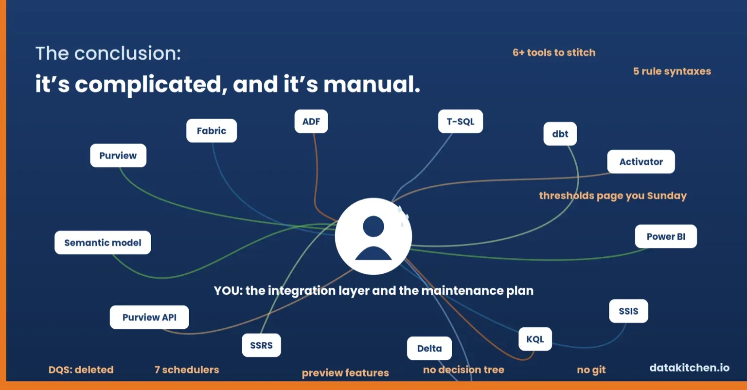
There is no Microsoft data quality product. There are nineteen rows across the four tables in this post, and Activator appears in two of them because it does two different jobs. Doing all four jobs means stitching six or seven of those rows together.
Here’s the realistic stack. Purview for profiling and scores. Materialized lake view constraints if you want the pipeline to stop. The Assert transformation for anything running through a mapping data flow. T-SQL constraints on whatever is still in SQL Server. Activator for alerts. A Power BI report you design yourself, on a semantic model you build, over metadata from a preview feature you subscribed to. Six tools, four jobs, no shared rule language, no shared scheduler, no shared results store.
Then look at the middle column of those tables. The word manual appears in twelve of the nineteen rows. Every quality rule, every threshold, every constraint, every semantic model is something a person writes and then owns forever. The person who built the scorecard changed jobs. The thresholds nobody has revisited since the pipeline was rewritten keep firing every Sunday.
That’s before the overlap. There are five different ways to assert that a row is valid, and they use five different syntaxes. Four different ways to profile a column, and none of them store a result that the others can read. Two gates that block a bad schema and none to show you its history. Two genuinely good anomaly detection engines, neither of which knows your warehouse tables exist. Four paths to a scorecard, one of which is “build it yourself.”
Then there’s the question nobody answers on a slide, which is what runs all this and when. Purview quality scans are scheduled inside Purview, bill their own compute, and reread every row in the column each time, while constraints evaluate only what’s being written. Materialized lake views run on their own schedules. The dbt job is scheduled in Data Factory. Assert runs whenever its data flow runs. Activator evaluates continuously. Power Query profiling runs when a person has the editor open. Six or seven schedulers, no shared calendar, and no single place to see whether last night’s quality checks actually ran.
Microsoft ships all of it and tells you nothing about which one to pick. There is no decision tree. There is no page that says use this for a lakehouse, use that for on-prem, and here’s what to do when your estate is both.
And nothing tells you what’s about to disappear. Ask the teams who built on Data Quality Services and Master Data Services, both removed in SQL Server 2025 with no deprecation runway. Or the ones on Azure AI Anomaly Detector, which retires on 1 October 2026 and stopped accepting new resources in September 2023. Synapse Link is discontinued in SQL Server 2025 and you’re pointed at Fabric mirroring. Purview access policies are discontinued there too. The Assert transformation never got a native Dataflow Gen2 equivalent and instead got a preview migration path six years after it shipped.
The pattern isn’t that Microsoft ships bad tools. Purview’s scoring model is good. series_decompose_anomalies() is good. Materialized lake view constraints are the right idea. The pattern is that you’re the integration layer, and you’re also the maintenance plan.
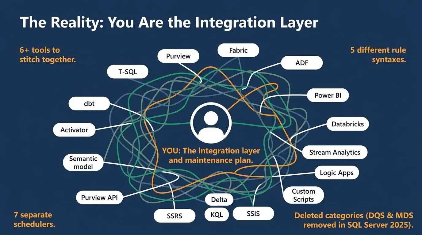
There’s also a dimension nobody can cover anymore. Purview scores across accuracy, completeness, conformity, consistency, freshness, and uniqueness. Uniqueness is well served. Completeness and conformity are fine. Freshness is one binary rule that doesn’t work on half the sources you own.
Accuracy is the interesting one, because accuracy means comparing your data against a source of truth. That was the job of DQS knowledge bases and reference data. With those deleted, Microsoft ships a scorecard with an accuracy dimension on it and no tool that can honestly populate it.
One more thing, and it’s the one that matters most. A score is only worth as much as the tests underneath it. If a fraction of your tables have rules, your domain score measures the tables somebody had time to configure. It’s precise and it’s meaningless. Nothing on this list writes tests at scale or connects profiling to testing automatically. Scoring, monitoring, production tripwires, and deployment regression testing are four separate jobs. Each Microsoft option serves one or two.
Where TestGen fits
We built DataOps Data Quality TestGen to close exactly the gaps above. It’s Apache 2.0 licensed, so you can confirm that this afternoon. It does all four jobs from one install, connected, instead of six or seven tools and a person in the middle.
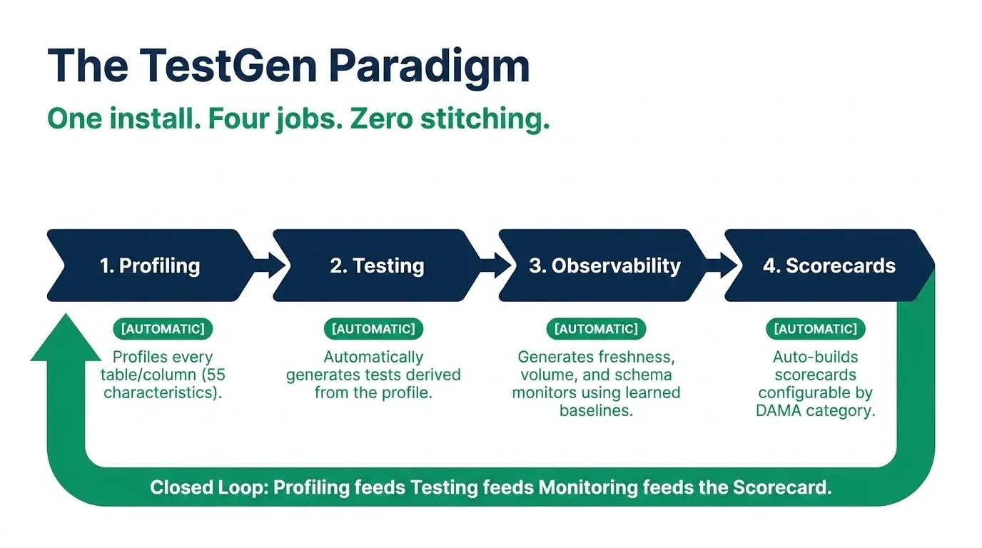
You point it at a database, and it generates the tests. It profiles every table and column, analyzes 55 column characteristics, derives validation tests from its findings, and flags hygiene issues along the way. No YAML, no portal, no 200-rule ceiling. Freshness, volume, and schema monitors auto-generate from the same profiling run, with baselines learned from each table’s history, so there’s no threshold to guess at and no Eventhouse to load first. That’s the loop nothing in the Microsoft stack closes: profiling feeds testing feeds monitoring feeds the scorecard, automatically.
It does join. Custom conditions cover row-level business rules, and full custom SQL covers cross-table validation, so source-to-target reconciliation is a test you write instead of a gap you explain. To be precise, that’s a join within a single connection, which is exactly where Purview custom SQL rules stop. And it gates the pipeline: a tripwire task between two layer transforms runs the suite and exits with a non-zero code on failure, so your orchestrator stops the next transform and production stays on the last good data.
It covers the databases you actually have. Snowflake, Databricks, DuckDB, Azure Synapse, Azure SQL, SQL Server, Microsoft OneLake, BigQuery, Redshift, Aurora PostgreSQL, Oracle, SAP HANA, PostgreSQL, and Salesforce Data 360, all in both open-source and enterprise editions. On-prem SQL Server is a supported database, not a Kubernetes project, and everything runs behind your firewall.
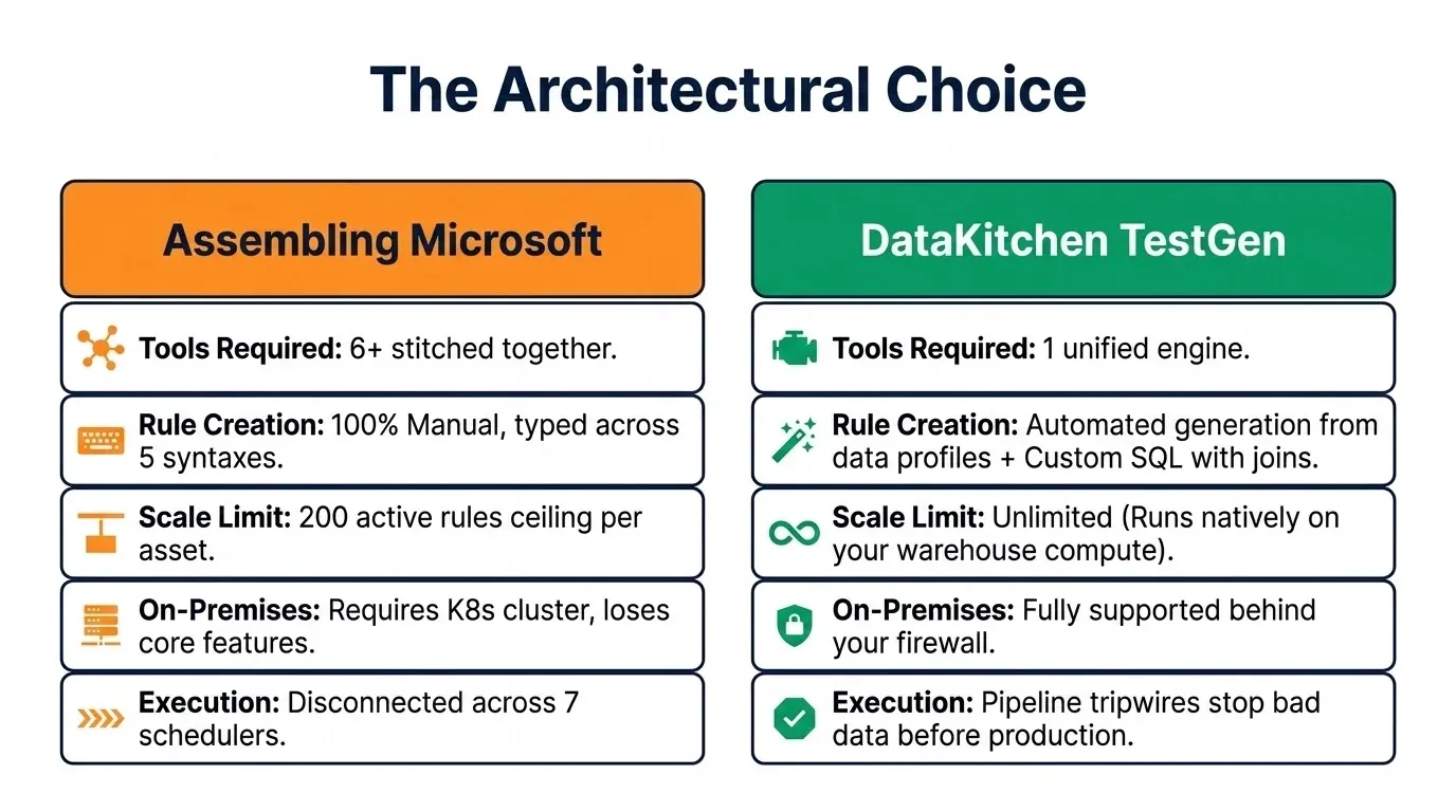
And the pricing is flat. No per-table fee, no per-asset-per-day meter, no compute units that scale with how thorough you decided to be this month. One thing to be straight about: the tests run as SQL inside your warehouse, so you pay your warehouse for that compute. It’s just compute you already sized, instead of a second Spark service reading every row across the wire and billing separately for the privilege.
Here’s the same table for TestGen. One install, four jobs, and each row feeds the next one.
| Job | Manual or automatic | Overview |
|---|---|---|
| Data profiling | Automatic | Point it at a database, and it profiles every table and every column, 55 characteristics each, on a schedule. Results are stored and trended instead of disappearing when you close a window. |
| Data quality testing | Automatic | Tests get generated from the profile rather than typed into a portal one column at a time. Custom conditions and full custom SQL are there when you need a business rule or a cross-table join. |
| Data observability | Automatic | Freshness, volume, and schema monitors are auto-generated from the profiling run, along with metric monitors you define. Baselines are derived from each table’s history and run against warehouse tables rather than an event stream. |
| Data quality scorecards | Automatic | Scorecards build themselves for every table group, configurable by DAMA category, critical data elements, or whatever you’re being measured on this quarter. |
Install it, point it at a schema, and see how many tests it writes before lunch.
TIP
Start here: Install Open Source TestGen.
TL;DR
Microsoft has no single data quality product in 2026. Data quality work in a Microsoft shop spans nineteen features across five products: Microsoft Purview, Microsoft Fabric, Azure Data Factory and Synapse, SQL Server, and Power BI. Twelve of the nineteen are manual. This post maps all of them against the four jobs of data quality: data profiling, data quality testing, data observability (freshness, volume, schema, and metric monitoring over time), and data quality scorecards.
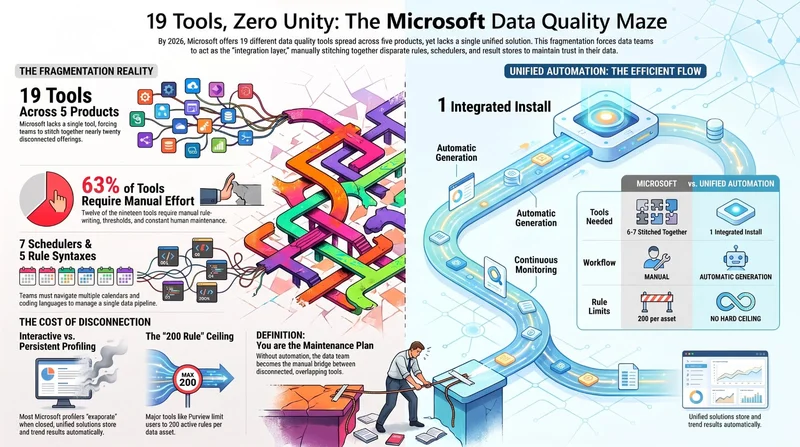
Key findings. Profiling: Purview, Power Query, Data Wrangler, and SSIS all profile columns, but no profile is stored, trended, or connected to test creation. Testing: Purview data quality rules, materialized lake view constraints, the Assert transformation, T-SQL constraints, and dbt jobs use five different syntaxes, share no rule repository, and every rule is written by hand; Purview custom SQL cannot join tables and caps at 200 rules per asset. Observability: there is no Microsoft data observability product; Purview offers only one binary freshness rule, Activator requires manually set thresholds, and Microsoft’s genuinely good anomaly detection lives in Power BI charts and Fabric Real-Time Intelligence Eventhouses, not on warehouse tables. Scorecards: Purview health reports are not customizable and results from the other tools stay siloed. Microsoft removed Data Quality Services and Master Data Services in SQL Server 2025, exiting cleansing, matching, and mastering entirely, so no Microsoft tool can populate the accuracy dimension its own scorecard displays.
The alternative discussed is DataOps TestGen, an open-source (Apache 2.0) data quality tool from DataKitchen that generates tests automatically from profiling, runs freshness, volume, schema, and metric monitors with learned baselines, scores every table, and gates pipelines, across a dozen warehouses including Snowflake, Databricks, Azure Synapse, Azure SQL, SQL Server, BigQuery, and Redshift, with flat pricing.
FAQ
What are the key points in this blog?
Microsoft has no single data quality product. Data quality work in a Microsoft shop spans nineteen features across five products: Purview, Fabric, Azure Data Factory and Synapse, SQL Server, and Power BI. Twelve of the nineteen are manual. The post maps all of them against four jobs: profiling, testing, observability, and scorecards.
What is the Microsoft data quality tool?
There isn’t one. Nineteen separate features across five products do pieces of the job, and none of them talks to the others. Purview handles governance and scoring, Fabric materialized lake views enforce constraints, Assert works inside mapping data flows, T-SQL constraints reject rows at write time, and dbt jobs run tests from git. Most teams end up stitching six together.
Does Microsoft Purview do data quality testing?
Yes, but with real limits. Purview rules are authored by hand in a portal across six quality dimensions, and custom SQL rules cannot join tables, so source-to-target reconciliation is impossible. There is a hard ceiling of 200 active rules per data asset, and scans run after your pipeline finishes, so Purview tells you the gold table was wrong rather than preventing it.
Does Microsoft have a data observability product?
No. There is one binary freshness rule in Purview that is unsupported on Snowflake, Databricks, BigQuery, Synapse, and Azure SQL. Fabric Activator fires on thresholds you set yourself. The genuinely good anomaly detection, including series_decompose_anomalies(), lives in Real-Time Intelligence and expects an Eventhouse, not your warehouse tables.
How do you do data quality on-premises with Microsoft?
Purview supports on-premises SQL Server and Oracle, but the cost is high: you stand up a Kubernetes cluster to host the scanning runtime, profiling is not supported for on-prem sources at all, only custom SQL expressions work, and the freshness rule is unsupported for SQL Server. Materialized lake views, Activator, and Real-Time Intelligence all require Fabric.
What happened to Data Quality Services and Master Data Services?
Both were removed in SQL Server 2025, with no deprecation runway. Between them they covered cleansing, fuzzy matching, survivorship, golden records, and reference data. Nothing in the current Microsoft stack does any of it, and the migration guidance points to Purview, which measures quality and cannot cleanse or master anything.