Two Types of Organizational Complexity
Organizational complexity creates significant problems, but executives in a McKinsey Survey showed little understanding of the types of complexity that create or destroy shareholder value. In their research, McKinsey identified two types of complexity:
- Institutional complexity — includes regulatory environments, geographies, new markets, number of business units and their diverse interactions. Executives focus almost exclusively on this type of complexity.
- Individual complexity — how hard it is for employees and managers to “get things done” due to inadequate role definitions, ambiguous accountability, inefficient processes, and lack of skills and capabilities. Executives rarely understand the factors that create this type of complexity and how to address them.
While these two are related, McKinsey found that companies reporting low levels of individual complexity have higher returns and lower costs. Furthermore, lowering individual complexity enables organizations to meet the challenges of additional institutional complexity that often accompanies growth. The message is that reducing and managing organizational complexity at the level of individual contributors and first-level managers can serve as a competitive advantage and a foundation for successful growth.
The Complexity of Data Teams
No group within the modern enterprise faces a higher level of individual complexity than the data organization. With its cacophony of tools, mission-critical deliverables, and interaction with nearly every other group in the organization from marketing to accounting to the CEO, the data organization has become incredibly challenging to lead and manage. Despite their valuable expertise, data professionals are routinely dealing with project failures, slipping schedules, busted budgets and embarrassing errors. It has become increasingly hard to “get things done” in data organizations.
Sources of Data Organization Complexity
There is a wide range of roles and functions, in the data organization of a typical enterprise, that share the mandate to use data in descriptive and predictive analytics. The team includes data scientists, business analysts, data analysts, statisticians, data engineers, architects, database administrators, governance, self-service users and managers. Each of these roles has a unique mindset, specific goals, distinct skills, and a preferred set of tools.
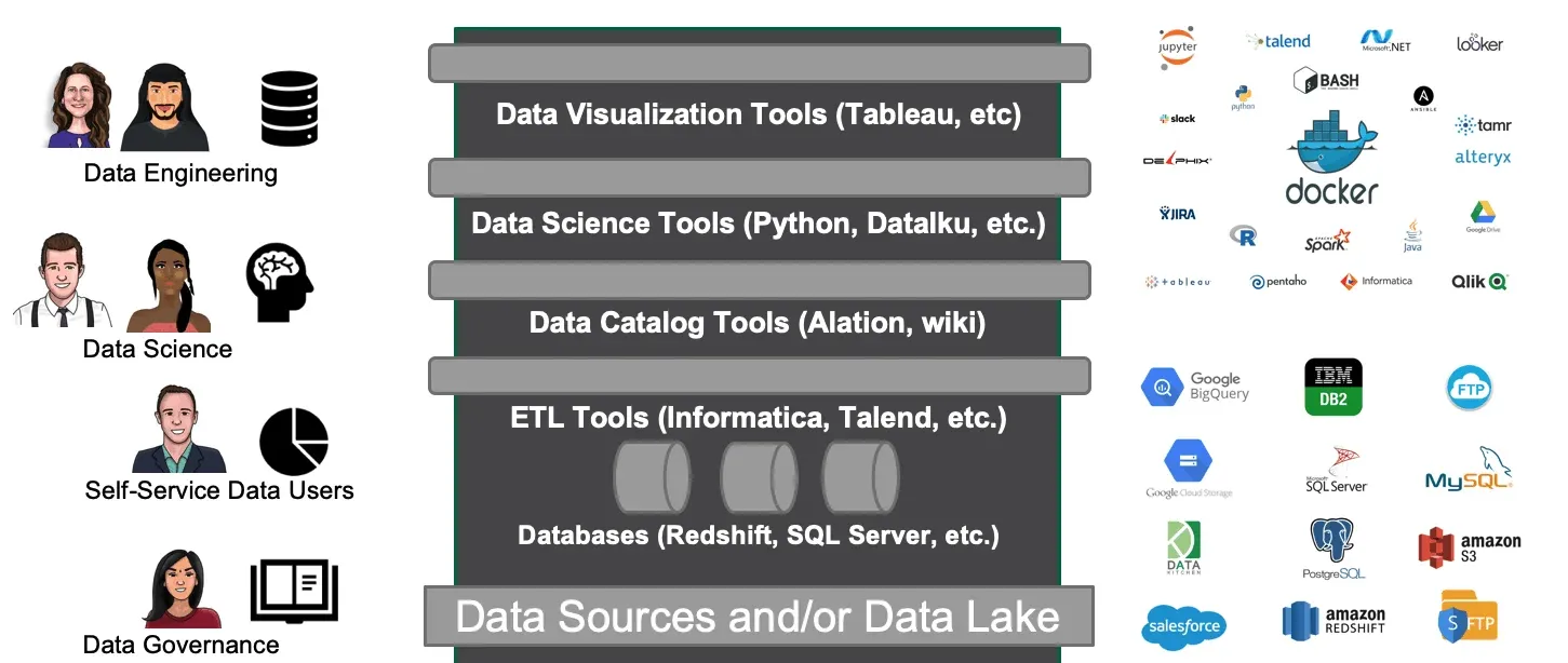
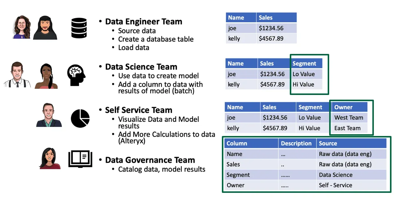
Despite all of the complexity and diversity which pushes them apart, the roles of the data team are tightly and intricately woven together. Each stage of the data pipeline builds upon the work of previous stages. In the figure below, the data engineering team pre-processes and integrates data from internal and external sources into a data lake. They then create a data warehouse loaded with sales data. The data science team creates a model that segments the raw customer data, identifying high-value opportunities. Business analysts, working for sales/marketing, use the model results to develop charts and graphs that serve their user constituents.
While the work of each functionary is distinct, they are linked together in a value chain. To make matters more interesting, the members of the data team, in most cases, do not report to the same boss. Some will report into a shared, technical services team. Others fall under a line of business. The various functions may be centralized or decentralized, and individuals and teams may be geographically dispersed. All of these variables affect the communication patterns and workflow of the data team.
The Dev & Ops Relationship in Data Organizations
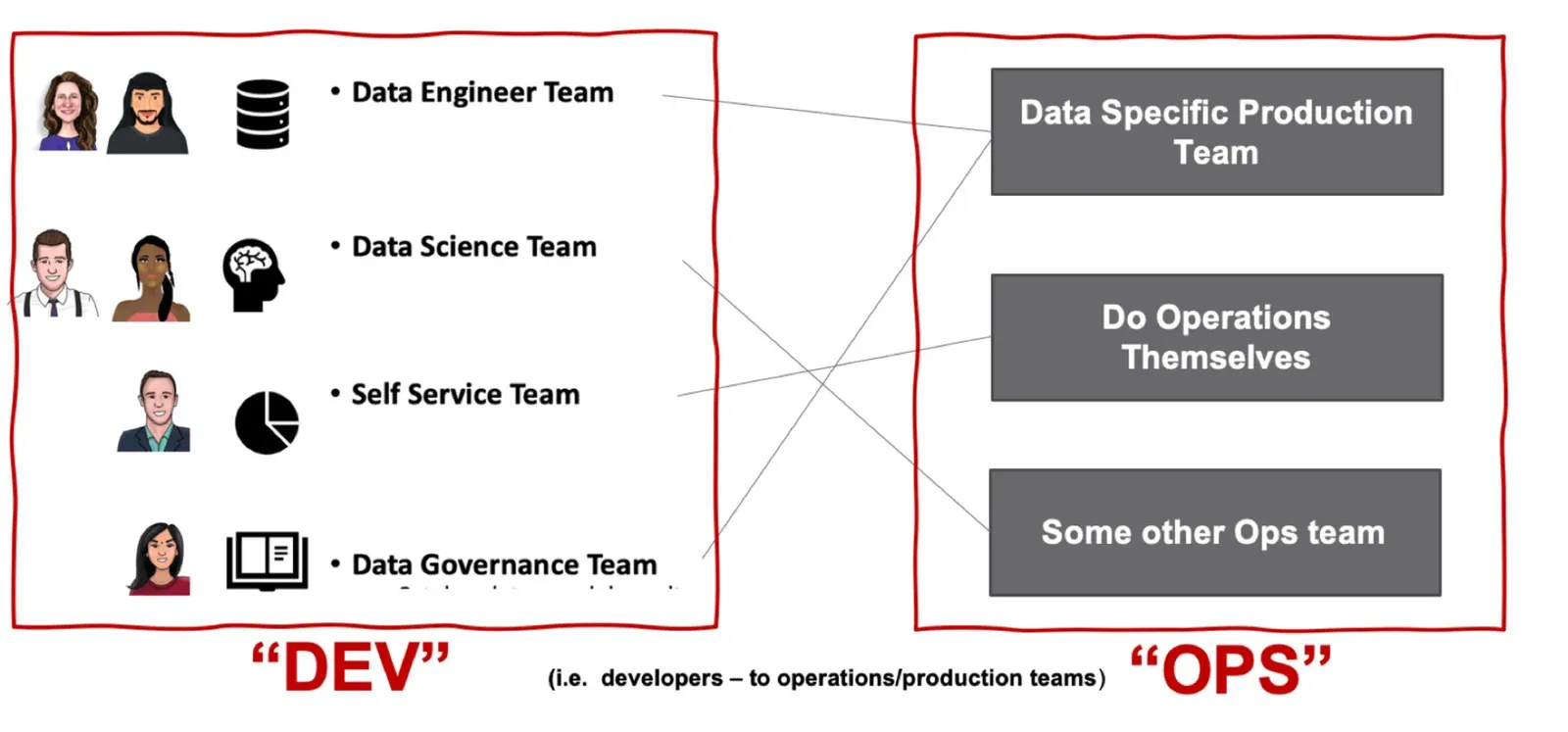
Since data science is performed while quietly sitting at a workstation, outsiders sometimes assume that data analytics is exactly like software development. This is an understandable misconception. In software, there is a development team that writes code and an operations team (IT) that manages that code in production. Conceptually, there is a straight pipeline from development (Dev) flowing into production or operations (Ops). Only the simplest data organizations function in this manner.
In many data teams, the Dev to Ops relationship is many to many. Each analytics requirement has specific needs, so data engineering and data science may be feeding multiple Ops requirements within groups or dispersed across units of business. The self-service users must be conceptualized as independent Ops pipelines in their own right. If we think of software DevOps as a pipeline, then data analytics is many interwoven pipelines.
In most software applications, code changes and data is static once it is input. In data analytics, both code and data change. Data flows in continuously from sources through processing and transformation steps to the analytics spread across the enterprise. The DevOps pipeline updates code. Data analytics requires two pipelines, one for code and one for data.
We liken the process of moving source data (raw materials) through processing steps (work in progress) into analytics (finished goods) to a manufacturing process, i.e. the data factory. The graph of graphs mapping how data sources converge and diverge through various stages, culminating in charts and graphs, would be enormously complex. Yet that’s only half the story. We mentioned that in data analytics, both code and data change. The graph of graphs showing the workflows of new and updated analytics would be equally elaborate, and it converges with the data factory. For more on the differences between software engineering and data science, please see, “DataOps is NOT Just DevOps for Data.”
The organization and workflow of Dev and Ops (production) can assume many forms. Every organization boils down to centralized and decentralized teams, or more commonly, a hybrid of the two. The figure below illustrates some simple Dev and production (Ops) workflow graphs. Each topology faces unique questions and challenges. The centralized Dev team organizes to accomplish a common task. It must create processes that enable team members to produce work that fits together without conflict. The team seeks to transfer code (new analytics) to production efficiently and without creating unwanted side effects. The decentralized Dev team faces these same concerns with the added challenge of managing the delicate balance between centralization and freedom.
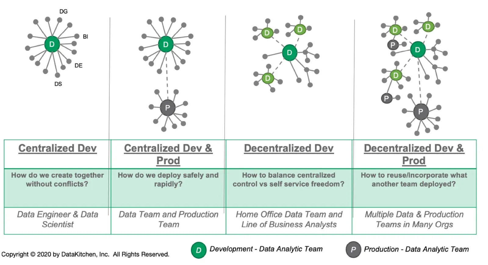
The four topologies in that figure each pose a different governing question, and each involves a different set of people:
| Topology | The question it has to answer | Who is involved |
|---|---|---|
| Centralized Dev | How do we create together without conflicts? | Data Engineer & Data Scientist |
| Centralized Dev & Prod | How do we deploy safely and rapidly? | Data Team and Production Team |
| Decentralized Dev | How to balance centralized control vs self service freedom? | Home Office Data Team and Line of Business Analysts |
| Decentralized Dev & Prod | How to reuse/incorporate what another team deployed? | Multiple Data & Production Teams in Many Orgs |
The right diagram shows a mix of centralized and decentralized development and production. This would be typical of a large organization that relies heavily upon data. Some groups create infrastructure that publishes, manages and governs data. Some teams apply data to business problems, and some individuals create their own self-service analytics. Imagine mapping out all of the development pipelines that represent the flow of new and updated analytics passing through the various organizations, teams, groups and individuals. Then imagine mapping out the data flowing into the organization and through the code created by all those entities, ultimately powering charts, graphs, models, predictions, etc. The tracking and management of so many moving parts are beyond the capabilities of a single person.
One of the significant challenges in managing a data organization is how to determine that everything is OK. Millions of data points flow through the system. Is there any corrupt data? A multitude of developers and self-service users are creating new analytics. Did anyone break anything? Create regressions? The last thing you want is for your customer or business colleague to find your errors.
These innumerable converging and diverging data and development pipelines may be far too complex for any single person to understand. It’s important to reflect upon how all of this complexity arose. It certainly wasn’t by express design, but it isn’t random either. According to Conway’s Law, systems exactly reflect the intrinsic structure of the data organization.
Conway’s Law
In a 1968 paper and conference presentation, Melvin Conway made some observations that later became known as the “mirroring hypothesis” or Conway’s Law.
Any organization that designs a system will inevitably produce a design whose structure is a copy of the organization’s communication structure.
Melvin E. Conway
Large, complex organizations produce large, complex systems, but further than this, a system design will match the “org chart” or communication pattern of the designers or the target end-users. To explain, Conway shared some anecdotes:
A contract research organization had eight people who were to produce a COBOL and an ALGOL compiler. After some initial estimates of difficulty and time, five people were assigned to the COBOL job and three to the ALGOL job. The resulting COBOL compiler ran in five phases; the ALGOL compiler ran in three.
Two military services were directed by their Commander-in-Chief to develop a common weapon system to meet their respective needs. After great effort they produced a copy of their organization chart as shown in the figure below.
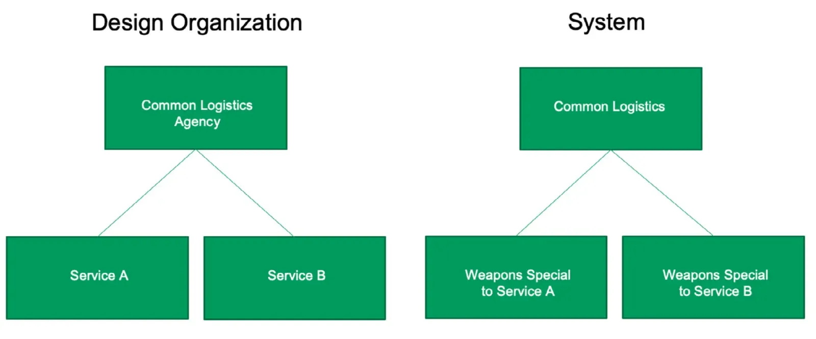
Conway’s Law is often cited with humorous intent, but it has also been the subject of serious research. Studies of software development teams showed that tightly coupled teams produce highly integrated designs while distributed teams produce more modular designs.
Team Structure and Pipeline Structure
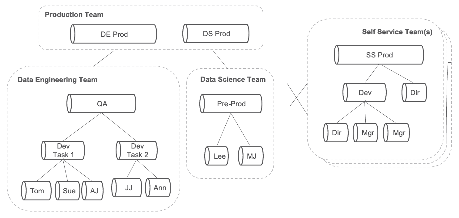
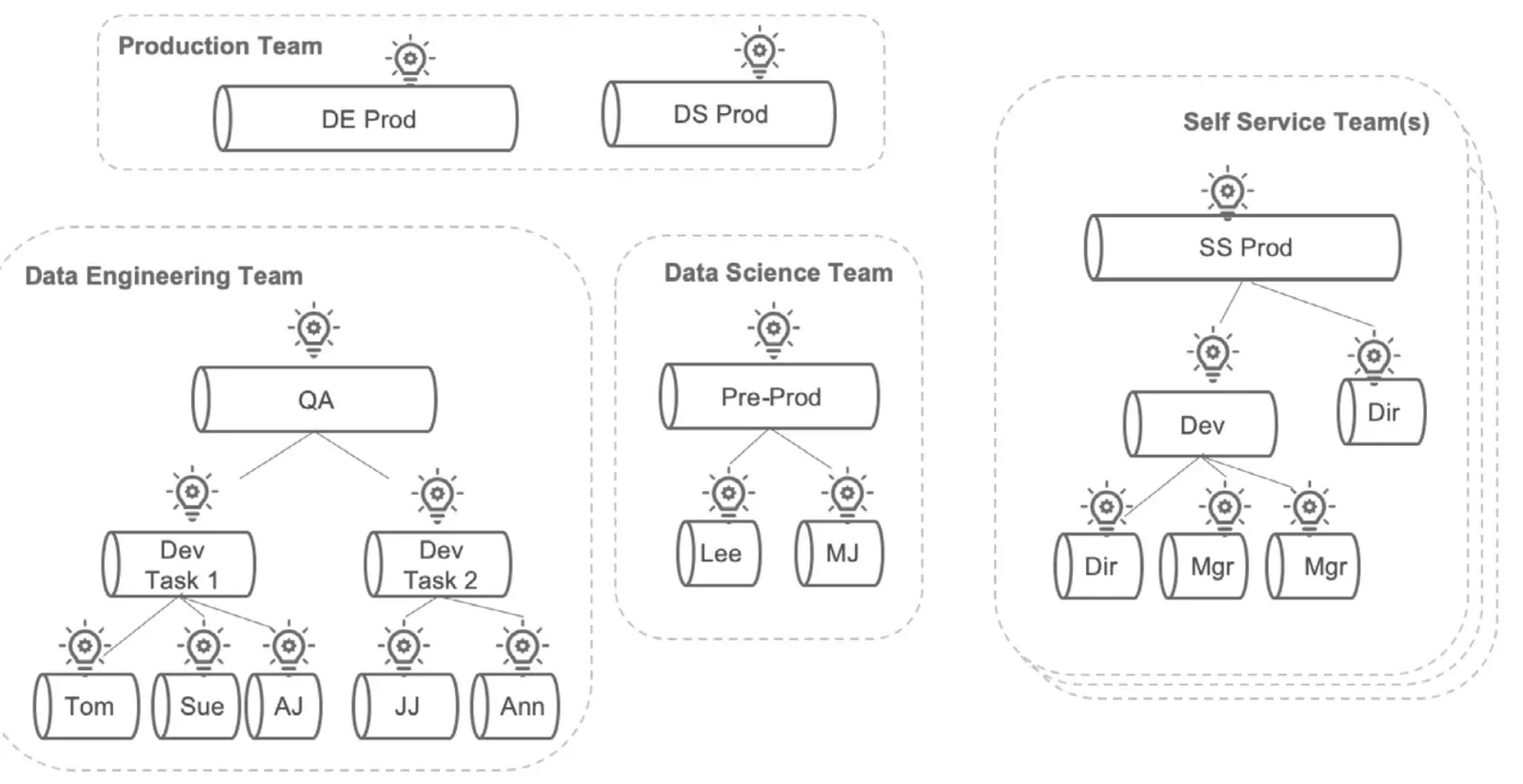
Team structure and pipeline structure reflect each other. Let’s look at a simple example. The organization below includes three teams: production, data engineering and data science. The data engineering and data science teams create analytics which deploy into production. Data engineering has a pipeline that produces new analytics and a mechanism to deploy those analytics into the production pipeline. Same for the data scientist team. The production team rightly handles those deployments as separate activities, as if they have a “data engineering” production pipeline and a separate “data science” production pipeline.
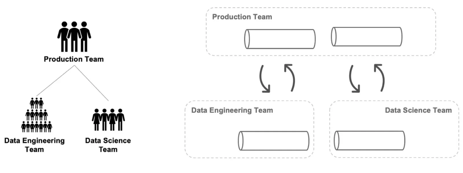
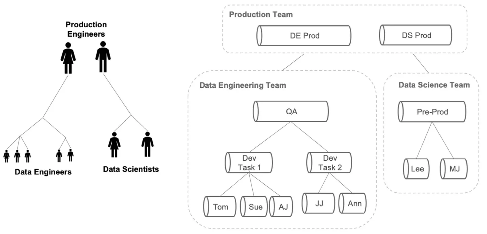
If we look inside each team, we can examine each team’s pipeline. Data engineering has five individuals organized into two development tasks. The work product of Tom, Sue and AJ is consolidated into Dev Task 1. JJ and Ann work together on Dev Task 2. Dev tasks 1 and 2 will pass through a quality assurance (QA) phase before deployment into the data engineering production pipeline. Data science similarly has two members who publish models to production via a pre-production phase. The production engineering team has two members, one managing the data engineering production pipeline and one managing the data science pipeline. Analytics-creation pipelines emerge from the organization that creates them. The pipeline structure aligns with the structure of the team.
The communication and task coordination patterns become a little more complicated when we remember to include the self-service data users. They not only represent more points of interface for the other teams, but they also consume data and publish new analytics in their own right.
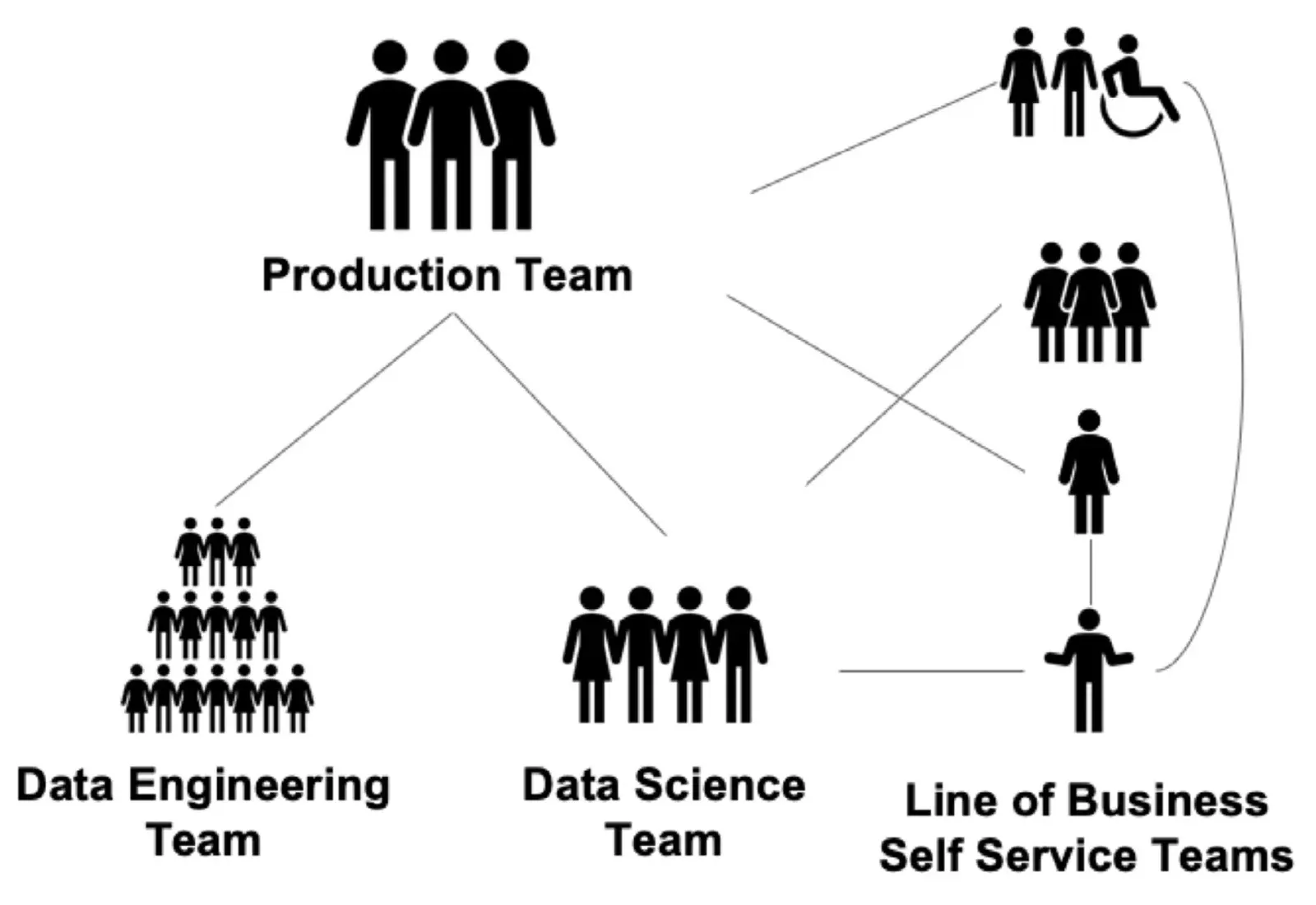
With the self-service team included, we have to update our development and data flow pipelines accordingly. The diagram shows a stack of self-service teams — each one presumably different. The one on the top shows two directors and two managers producing analytics for themselves and their department. The pipeline connections between the self-service teams and the other groups is shown by a couple lines, symbolic of numerous connections to each of the various teams and sub-teams.
Managing Complexity with DataOps
If one were to actually map out these communication and task coordination patterns in a real organization, the resulting diagram would quickly exceed the space allowed here. Imagine having to manage these groups, keeping them on track and under budget. Imagine what would happen if corrupted data entered the bloodstream of the organization and then dispersed throughout the data pipelines. These are real challenges faced by data team managers daily. This is the type of internal organizational complexity that can destroy shareholder value or prevent an enterprise from meeting its objectives.
We’ve helped numerous organizations tackle these challenges using a methodology called DataOps. You can build DataOps capabilities by yourself using our widely shared guidelines (“The Seven Steps of DataOps”). (Author’s note: we’ve learned some things since we first published. There are now ten steps. More on that later.) DataKitchen produces a DataOps Platform that will help move your DataOps capabilities from the whiteboard into the data center in the shortest amount of time possible. Whether you buy a DataOps Platform or build one from scratch, we believe that DataOps is the best way to manage the complexity of the data and analytics-development pipelines. DataOps utilizes automation to govern workflows, coordinate tasks and define roles. It creates teamwork out of chaos and makes it easier to “get things done.” DataOps greatly simplifies the level of individual complexity in an organization.
Analytics-development cycle time measures the rate of new analytics creation. This is the metric that indicates how easy it is to “get things done” in the organization. The organizations that take months to make a simple change to analytics have a long cycle time and a high level of individual complexity. DataOps reduces analytics development cycle time by improving workflow efficiency and by eliminating code and data errors that cause unplanned work.
Kitchens
NOTE
The product this paper calls the DataOps Platform is now DataOps Automation. Kitchens are still how it works — isolated, production-like workspaces that merge like Git branches — so everything below still applies; only the product name has changed.
DataOps Platforms support virtual workspaces called Kitchens, which fundamentally transform the data and analytics pipelines described above. Kitchens bring together workflow management, source control, reusable components, containers, tests, pipelines, tools, access control and data into one coherent development environment. You can use Kitchens to map the people in your organization into clear roles and workflows guided by automation. Kitchens eliminate the role ambiguity, bureaucracy, inefficiency and lack of coordination that cause organizational complexity. Kitchens significantly reduce cycle time by minimizing the manual work required for analytics to move from stage to stage in the development pipelines.
Kitchens can be created using on-demand cloud infrastructure so they can be instantiated or erased immediately based on projects or tasks. Kitchens are built on technologies, toolchains and data that match production, so issues surface early, and code migrates seamlessly from development into production. Kitchen creation tightly couples with source control branches, so the organization effectively tracks its code and manages change. Kitchen merges correspond to source control merges staging features for release. When it’s time to move code into production, the development Kitchen simply merges into the production Kitchen.
Kitchens are stocked with reusable components and containerized functionality. These are shared and leveraged between teams and team members, so individuals minimize duplicated effort. Kitchens also orchestrate the creation of new analytics and orchestrate and automate shared data pipelines.
Finding Your Errors
DataOps subjects data to normative filters and business logic tests at the input and output of each stage of processing in the vast circulatory system that is your data pipeline. It provides the production team with sensors at every artery and capillary of the data pipeline. These sensors can be rolled up into one indicator that confirms that data is error-free, and the production pipeline is functioning without anomalies.
If erroneous data enters the pipeline, for example a negative value for a field that must be positive, the DataOps tests will detect that problem and, depending on the severity, can flip the top level indicator from green (all systems good) to yellow (warning) or red (problem detected). If a critical error occurs, the flow of data from the offending data source can be stopped just like an Andon Cord in a manufacturing facility.
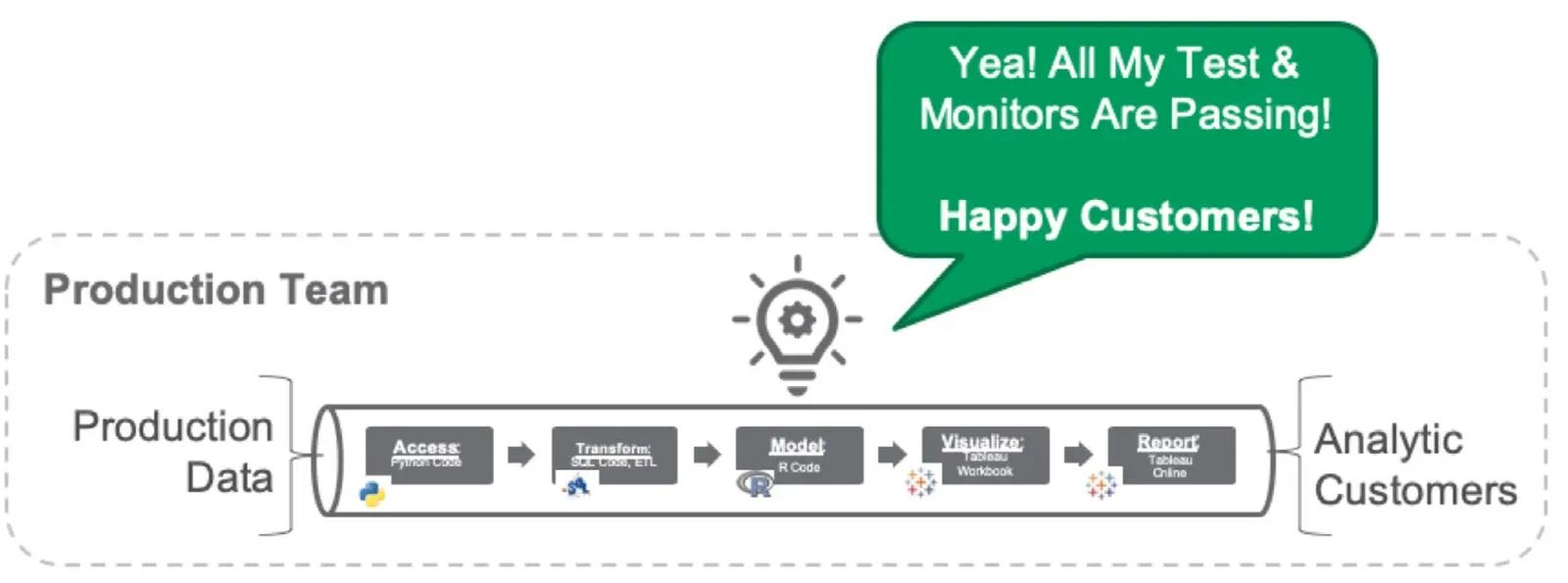
Additionally, DataOps applies this same error-checking philosophy to code. The creation of new analytics is also a pipeline. Before code is deployed, tests make sure that it hasn’t created any side effects or regressions. If tests pass, the sensor indicator light stays green, and the code can be deployed into production.
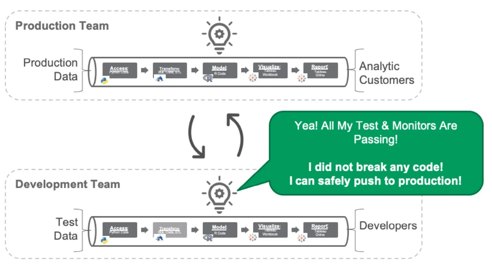
The diagram below shows how sensor indicators monitor and reflect the status of every stage of the development and production pipelines. Ultimately, DataOps rolls all the various statuses into one top-level indicator that confirms that everything in the data operations and development domains is copacetic.
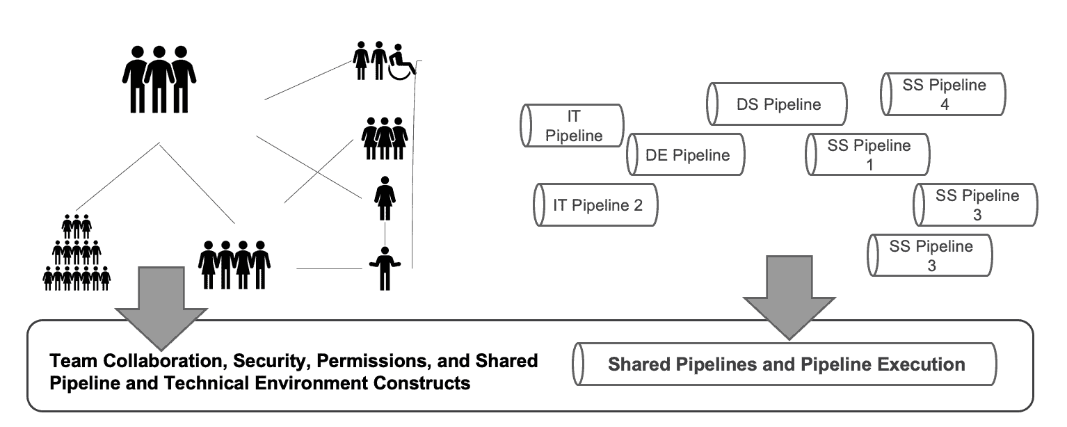
A DataOps Platform attacks the problem of organizational complexity from multiple sides. It eliminates data and coding errors by applying tests at all pipeline stages. These tests drive sensor indicators which provide unprecedented transparency into data operations and analytics development. The DataOps platform also defines, manages and coordinates all the data pipelines, so teams collaborate better, and new analytics move into deployment with greater ease.
Cycle Time at the Speed of Ideation
Fundamentally, the quantities and uses of data are expanding and proliferating so rapidly that enterprises are unable to use conventional management methods to “tame the beast.” To reduce individual complexity in an organization, you first need to measure it. The key metric that reflects complexity is analytics cycle time — the time it takes to transition an idea into working analytics. The challenge here is that your business users want cycle time to be as fast as ideation. That may sound impossible, but DataOps delivers on that goal.
Kitchens reduce workflow inefficiencies, encourage reuse and bring transparency to data pipelines. Tests clamp down on data errors, eliminating unplanned work that saps productivity. The key to reducing complexity in your data organization is DataOps. The key to implementing DataOps is a DataOps Platform that enforces DataOps methods across data teams and self-service users.
TIP
For more information on DataOps, download our free book, The DataOps Cookbook. To put the testing side of this paper into practice today, install open source DataOps TestGen.
Related Reading
- What is DataOps? — the methodology this paper applies to organizational complexity
- Warring Tribes into Winning Teams — the companion paper from the same era, on coordination between the groups this one counts
- 7 Steps to Implement DataOps — the engineering practices behind the platform described here
- Reducing Organizational Complexity with DataOps — the short blog edition of this paper
- DataOps is More Than Just DevOps for Data — why code-only pipelines don’t fit analytics
- DataOps is Not Just a DAG for Data — the graph-of-graphs problem in detail
- Improving Teamwork in Data Analytics with DataOps — task coordination inside a single team
- The Five Organizational Sins of Data Teams — the structural failures this complexity produces
- Accelerating Analytic Cycle Time with DataOps — the metric that measures individual complexity
- What is a DataOps Engineer? — the role that owns the automation
FAQ
What is the main point of this paper?
The data organization carries more individual complexity than any other group in the enterprise, and that complexity is a design consequence rather than an accident. Conway’s Law explains it: pipelines mirror the communication structure of the teams that build them. DataOps reduces the complexity by automating workflows, coordinating tasks, defining roles, and testing every stage so errors surface before a customer finds them.
What is the difference between institutional and individual complexity?
Institutional complexity covers regulatory environments, geographies, new markets, the number of business units, and their diverse interactions. Individual complexity is how hard it is for employees and managers to get things done, given inadequate role definitions, ambiguous accountability, inefficient processes, and missing skills. McKinsey found executives focus almost exclusively on the first and rarely understand the second.
Why does individual complexity matter to financial performance?
McKinsey found that companies reporting low levels of individual complexity have higher returns and lower costs. Lowering individual complexity also enables an organization to absorb the additional institutional complexity that usually accompanies growth. Reducing complexity at the level of individual contributors and first-level managers is therefore both a competitive advantage and a foundation for growth.
Why does the data organization face more individual complexity than other groups?
It combines a cacophony of tools, mission-critical deliverables, and interaction with nearly every other group in the company, from marketing to accounting to the CEO. The team spans data scientists, business analysts, statisticians, data engineers, architects, database administrators, governance, self-service users, and managers, each with a distinct mindset, goals, skills, and preferred toolset.
How is the Dev and Ops relationship different in data analytics?
In software there is a development team writing code and an operations team managing it in production, so Dev flows into Ops as a straight pipeline. In data teams the relationship is many-to-many: data engineering and data science feed multiple Ops requirements within groups and across business units, and self-service users act as independent Ops pipelines in their own right.
Why does data analytics need two pipelines instead of one?
In most software applications the code changes and the data is static once input. In data analytics both code and data change. Data flows continuously from sources through processing and transformation into analytics across the enterprise, while new and updated analytics flow through their own development graph. One pipeline handles code, the other handles data, and the two converge.
What is Conway’s Law and how does it apply to data pipelines?
Melvin Conway observed in 1968 that any organization designing a system will inevitably produce a design whose structure copies the organization’s communication structure. Applied to data, it means the pipelines an enterprise ends up with mirror its org chart. Studies of software teams confirmed it: tightly coupled teams produce highly integrated designs while distributed teams produce more modular ones.
How do team structure and pipeline structure mirror each other?
In the paper’s example, data engineering has five people organized into two development tasks that pass through a QA phase before deploying to the data engineering production pipeline, and data science has two members publishing models through pre-production. The production team keeps one engineer per pipeline. Analytics-creation pipelines emerge from the organization that creates them.
Why do self-service data users complicate the picture?
Self-service users are not only additional points of interface for the other teams, they also consume data and publish new analytics in their own right. That makes each self-service team both a consumer and a producer, adding its own development and production stages to the graph of graphs and its own connections to every other team and sub-team.
What are Kitchens in a DataOps Platform?
Kitchens are virtual workspaces that bring workflow management, source control, reusable components, containers, tests, pipelines, tools, access control, and data into one coherent development environment. They map people into clear roles and workflows guided by automation, run on on-demand cloud infrastructure, and couple tightly to source-control branches so a development Kitchen merges into the production Kitchen.
How does DataOps detect errors in data and code?
DataOps applies normative filters and business logic tests at the input and output of every processing stage, giving the production team sensors at every artery and capillary of the pipeline. A negative value in a must-be-positive field flips the top-level indicator from green to yellow or red, and a critical error can stop the offending source entirely, like an Andon Cord in a factory.
What is analytics cycle time and why is it the key metric?
Analytics cycle time is how long it takes to transition an idea into working analytics, and it is the metric that reflects individual complexity. Organizations that take months to make a simple change have a long cycle time and high complexity. Business users want cycle time as fast as ideation, and DataOps gets there by improving workflow efficiency and eliminating unplanned work.
Get the PDF
The full paper is on this page. Fill in the form for a PDF copy to keep or share.