A Common Misconception
One common misconception about DataOps is that it is just DevOps applied to data analytics. While a little semantically misleading, the name “DataOps” has one positive attribute. It communicates that data analytics can achieve what software development attained with DevOps. That is to say, DataOps can yield an order of magnitude improvement in quality and cycle time when data teams utilize new tools and methodologies. The specific ways that DataOps achieves these gains reflect the unique people, processes and tools characteristic of data teams (versus software development teams using DevOps). Here’s our in-depth take on both the pronounced and subtle differences between DataOps and DevOps.
The Intellectual Heritage of DataOps
DevOps is an approach to software development that accelerates the build lifecycle (formerly known as release engineering) using automation. DevOps focuses on continuous integration and continuous delivery of software by leveraging on-demand IT resources (infrastructure as code) and by automating integration, test and deployment of code. This merging of software development and IT operations (“DEVelopment” and “OPerationS”) reduces time to deployment, decreases time to market, minimizes defects, and shortens the time required to resolve issues.
Using DevOps, leading companies have been able to reduce their software release cycle time from months to (literally) seconds. This has enabled them to grow and lead in fast-paced, emerging markets. Companies like Google, Amazon and many others now release software many times per day. By improving the quality and cycle time of code releases, DevOps deserves a lot of credit for these companies’ success.
Optimizing code builds and delivery is only one piece of the larger puzzle for data analytics. DataOps seeks to reduce the end-to-end cycle time of data analytics, from the origin of ideas to the literal creation of charts, graphs and models that create value. The data lifecycle relies upon people in addition to tools. For DataOps to be effective, it must manage collaboration and innovation. To this end, DataOps introduces Agile Development into data analytics so that data teams and users work together more efficiently and effectively.
In Agile Development, the data team publishes new or updated analytics in short increments called “sprints.” With innovation occurring in rapid intervals, the team can continuously reassess its priorities and more easily adapt to evolving requirements. This type of responsiveness is impossible using a Waterfall project management methodology which locks a team into a long development cycle with one “big-bang” deliverable at the end.
Studies show that Agile software development projects complete faster and with fewer defects when Agile Development replaces the traditional Waterfall sequential methodology. The Agile methodology is particularly effective in environments where requirements are quickly evolving — a situation well known to data analytics professionals. In a DataOps setting, Agile methods enable organizations to respond quickly to customer requirements and accelerate time to value.
Agile development and DevOps add significant value to data analytics, but there is one more major component to DataOps. Whereas Agile and DevOps relate to analytics development and deployment, data analytics also manages and orchestrates a data pipeline. Data continuously enters on one side of the pipeline, progresses through a series of steps and exits in the form of reports, models and views. The data pipeline is the “operations” side of data analytics. It is helpful to conceptualize the data pipeline as a manufacturing line where quality, efficiency, constraints and uptime must be managed. To fully embrace this manufacturing mindset, we call this pipeline the “data factory.”
In DataOps, the flow of data through operations is an important area of focus. DataOps orchestrates, monitors and manages the data factory. One particularly powerful lean-manufacturing tool is statistical process control (SPC). SPC measures and monitors data and operational characteristics of the data pipeline, ensuring that statistics remain within acceptable ranges. When SPC is applied to data analytics, it leads to remarkable improvements in efficiency, quality and transparency. With SPC in place, the data flowing through the operational system is verified to be working. If an anomaly occurs, the data analytics team will be the first to know, through an automated alert.
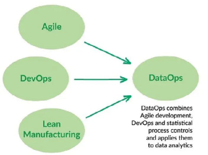
While the name “DataOps” implies that it borrows most heavily from DevOps, it is all three of these methodologies — Agile, DevOps and statistical process control — that comprise the intellectual heritage of DataOps. Agile governs analytics development, DevOps optimizes code verification, builds and delivery of new analytics and SPC orchestrates and monitors the data factory. The figure above illustrates how Agile, DevOps and statistical process control flow into DataOps.
You can view DataOps in the context of a century-long evolution of ideas that improve how people manage complex systems. It started with pioneers like Deming and statistical process control — gradually these ideas crossed into the technology space in the form of Agile, DevOps and now, DataOps.
DevOps vs. DataOps — The Human Factor
As mentioned above, DataOps is as much about managing people as it is about tools. One subtle difference between DataOps and DevOps relates to the needs and preferences of stakeholders.
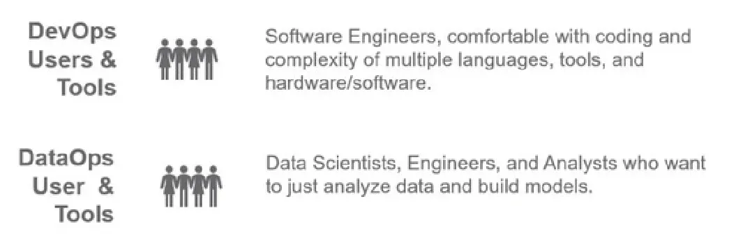
DevOps was created to serve the needs of software developers. Dev engineers love coding and embrace technology. The requirement to learn a new language or deploy a new tool is an opportunity, not a hassle. They take a professional interest in all the minute details of code creation, integration and deployment. DevOps embraces complexity.
DataOps users are often the opposite of that. They are data scientists or analysts who are focused on building and deploying models and visualizations. Scientists and analysts are typically not as technically savvy as engineers. They focus on domain expertise. They are interested in getting models to be more predictive or deciding how to best visually render data. The technology used to create these models and visualizations is just a means to an end. Data professionals are happiest using one or two tools — anything beyond that adds unwelcome complexity. In extreme cases, the complexity grows beyond their ability to manage it. DataOps accepts that data professionals live in a multi-tool, heterogeneous world and it seeks to make that world more manageable for them.
DevOps vs. DataOps — Process Differences
We can begin to understand the unique complexity facing data professionals by looking at data analytics development and lifecycle processes. We find that data analytics professionals face challenges both similar and unique relative to software developers.
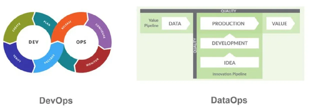
The DevOps lifecycle is commonly illustrated using a diagram in the shape of an infinite symbol — see the figure below. The end of the cycle (“plan”) feeds back to the beginning (“create”), and the process iterates indefinitely.
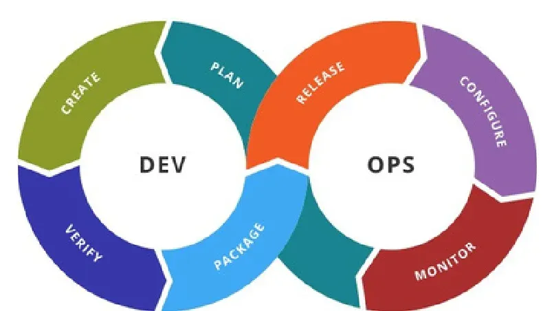
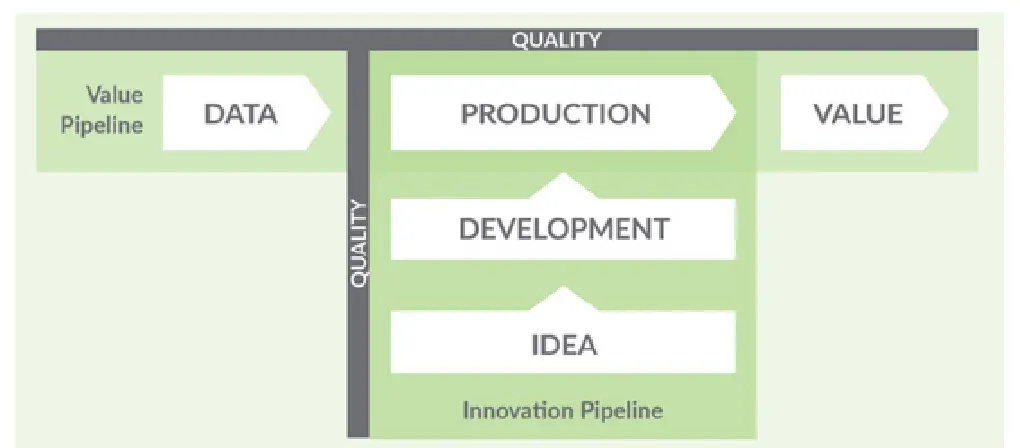
The DataOps lifecycle shares these iterative properties, but an important difference is that DataOps consists of two active and intersecting pipelines. The data factory, described above, is one pipeline. The other pipeline governs how the data factory is updated — the creation and deployment of new analytics into the data pipeline.
The data factory takes raw data sources as input and through a series of orchestrated steps produces analytic insights that create “value” for the organization. We call this the “Value Pipeline.” DataOps automates orchestration and, using SPC, monitors the quality of data flowing through the Value Pipeline.
The “Innovation Pipeline” is the process by which new analytic ideas are introduced into the Value Pipeline. The Innovation Pipeline conceptually resembles a DevOps development process, but upon closer examination, several factors make the DataOps development process more challenging than DevOps. The figure below shows a simplified view of the Value and Innovation Pipelines.
DevOps vs. DataOps — Development and Deployment Processes
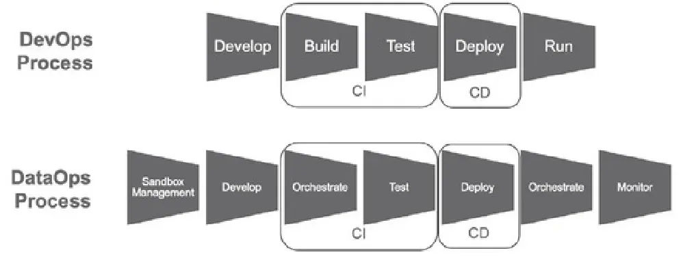
DataOps builds upon the DevOps development model. As shown in the figure below, the DevOps process flow includes a series of steps that are common to software development projects:
- Develop — create/modify an application
- Build — assemble application components
- Test — verify the application in a test environment
- Deploy — transition code into production
- Run — execute the application
DevOps introduces two foundational concepts: Continuous Integration (CI) and Continuous Deployment (CD). CI continuously builds, integrates and tests new code in a development environment. Build and test are automated so they can occur rapidly and repeatedly. This allows issues to be identified and resolved quickly. The figure below illustrates how CI encompasses the build and test process stages of DevOps.
CD is an automated approach to deploying or delivering software. Once an application passes all qualification tests, DevOps deploys it into production. Together CI and CD resolve the main constraint hampering Agile development. Before DevOps, Agile created a rapid succession of updates and innovations that would stall in a manual integration and deployment process. With automated CI and CD, DevOps has enabled companies to update their software many times per day. That is also where DevOps tooling alone stops being enough for a data team, because a data pipeline keeps running after the deployment succeeds.
The Data Journey Is First in DataOps
When your data team is in crisis from errors in production, complaining customers, and uncaring data providers, we all wish we could be unshaken as the Buddha. Our recent survey showed that 97% of data engineers report experiencing burnout in their day-to-day jobs. Perhaps we could just chill out in those stressful situations and “let go,” as the Buddha suggests. The spiritual benefits of letting go may be profound, but finding and fixing the problem at its root is, as Samuel Florman writes, “existential joy.”
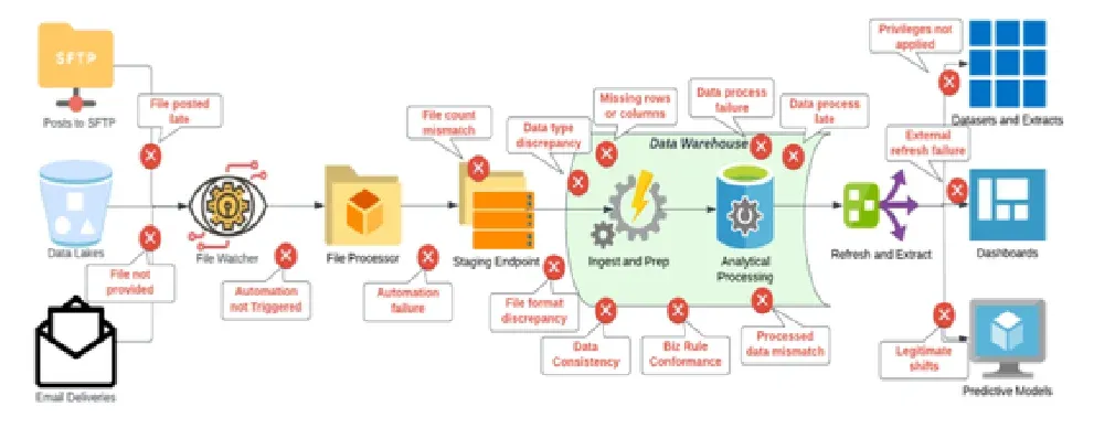
Finding problems before your customers know they exist helps your team’s happiness, productivity, customer trust, and customer data success. Given the complicated distributed systems we use to get value from data and the diversity of data, we need a simplifying framework. That idea is the Data Journey. In an era where data drives innovation and growth, it’s paramount that data leaders and engineers understand and monitor the five pillars of a Data Journey. The key to success is the capability to understand and monitor the health, status, and performance of your data, data tools, pipeline, and infrastructure, both at a macro and micro level. Failures on the Data Journey cost organizations millions of dollars.
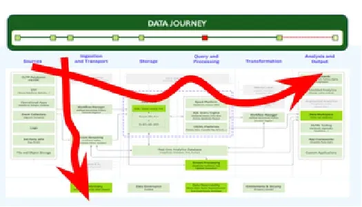
Data Journey First DataOps requires a deep and continuous understanding of your production data estate. It provides a dynamic understanding of how your data flows, transforms, gets enriched, and is consumed. It allows you to trust through active verification. By observing Data Journeys that make up your Value Pipeline, you can detect problems early, streamline your processes, and lower embarrassing errors in production.
Data quality validation testing of data at rest and data in use is critical. Checking data at rest involves looking at syntactic attributes such as freshness, distribution, volume, schema, and lineage. You also need robust testing and evaluation processes throughout the last mile of the Data Journey when data is integrated and used in tools such as predictive models or visualization tools.
The Duality of Testing in DataOps
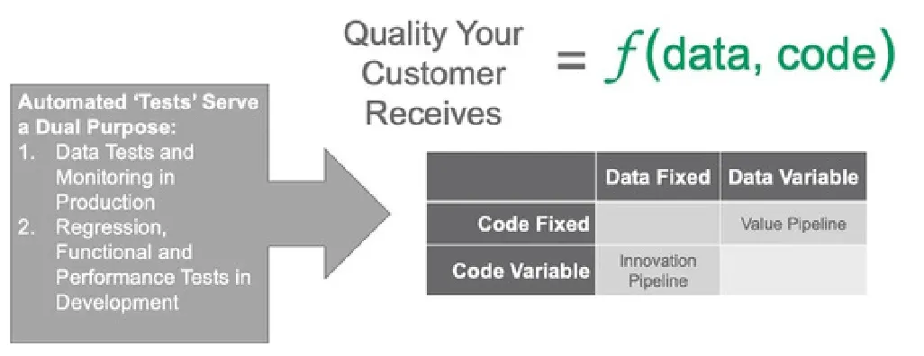
Tests in DataOps have a role in both the Value and Innovation Pipelines. In the Value Pipeline, tests monitor the data values flowing through the data factory to catch anomalies or flag data values outside statistical norms. In the Innovation Pipeline, tests validate new analytics before deploying them.
In DataOps, tests target either data or code. In a recent blog, we discussed this concept using the figure below. Data that flows through the Value Pipeline is variable and subject to statistical process control and monitoring. Tests target the data which is continuously changing. Analytics in the Value Pipeline, on the other hand, are fixed and change only using a formal release process. In the Value Pipeline, analytics are revision controlled to minimize any disruptions in service that could affect the data factory.
In the Innovation Pipeline code is variable and data is fixed. The analytics are revised and updated until complete. Once the sandbox is set-up, the data doesn’t usually change. In the Innovation Pipeline, tests target the code (analytics), not the data.
What is held constant, and what each pipeline therefore tests
| Data fixed | Data variable | |
|---|---|---|
| Code fixed | — | Value Pipeline |
| Code variable | Innovation Pipeline | — |
All tests must pass before promoting (merging) new code into production. A good test suite serves as an automated form of impact analysis that runs on any and every code change before deployment.
Some tests are aimed at both data and code. For example, a test that makes sure that a database has the right number of rows helps your data and code work together. Ultimately both data tests and code tests need to come together in an integrated pipeline, as in the Value and Innovation Pipelines figure above. DataOps enables code and data tests to work together so all around quality remains high.
DataOps Complexity — Sandbox Management
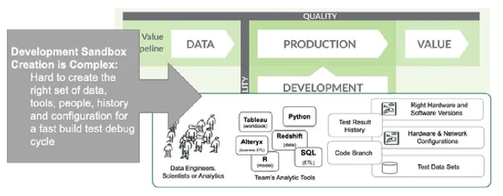
When an engineer joins a software development team, one of their first steps is to create a “sandbox.” A sandbox is an isolated development environment where the engineer can write and test new application features, without impacting teammates who are developing other features in parallel. Sandbox creation in software development is typically straightforward — the engineer usually receives a bunch of scripts from teammates and can configure a sandbox in a day or two. This is the typical mindset of a team using DevOps.
Sandboxes in data analytics are often more challenging from a tools and data perspective. First of all, data teams collectively tend to use many more tools than typical software dev teams. There are literally thousands of tools, languages and vendors for data engineering, data science, BI, data visualization, and governance. Without the centralization that is characteristic of most software development teams, data teams tend to naturally diverge with different tools and data islands scattered across the enterprise.
DataOps Complexity — Test Data Management
In order to create a dev environment for analytics, you have to create a copy of the data factory. This requires the data professional to replicate data which may have security, governance or licensing restrictions. It may be impractical or expensive to copy the entire data set, so some thought and care is required to construct a representative data set. Once a multi-terabyte data set is sampled or filtered, it may have to be cleaned or redacted (have sensitive information removed). The data also requires infrastructure which may not be easy to replicate due to technical obstacles or license restrictions.
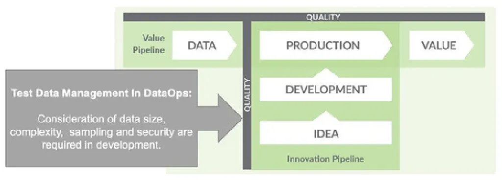
The concept of test data management is a first order problem in DataOps whereas in most DevOps environments, it is an afterthought. To accelerate analytics development, DataOps has to automate the creation of development environments with the needed data, software, hardware and libraries so innovation keeps pace with Agile iterations.
DataOps Connects Organizations
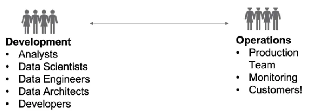
DevOps strives to help development and operations (information technology) teams work together in an integrated fashion. In DataOps, this concept is depicted in the figure below. The development team are the analysts, scientists, engineers, architects and others who create data warehouses and analytics.
In data analytics, the operations team supports and monitors the data pipeline. This can be IT, but it also includes customers — the users who create and consume analytics. DataOps brings these groups together so they can work together more closely.
Freedom vs. Centralization
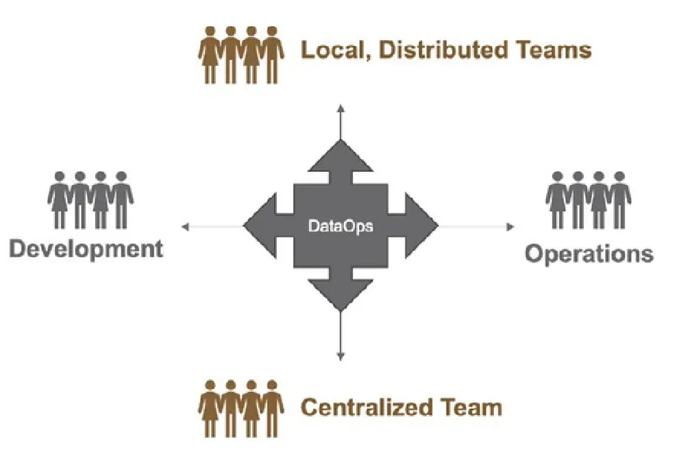
DataOps also brings the organization together across another dimension. A great deal of data analytics development occurs in remote corners of the enterprise, close to business units, using self-service tools like Tableau, Alteryx, or Excel. These local teams, engaged in decentralized, distributed analytics creation play an essential role in delivering innovation to users. Empowering these pockets of creativity maintains the enterprise’s competitiveness, but frankly, a lack of top-down control can lead to unmanaged chaos.
Centralizing analytics development under the control of one group, such as IT, enables the organization to standardize metrics, control data quality, enforce security and governance, and eliminate islands of data. The issue is that too much centralization chokes creativity.
A critical benefit of DataOps is its ability to harmonize the back-and-forth between the decentralized and centralized development of data analytics — the tension between centralization and freedom. In a DataOps enterprise, new analytics originate and undergo refinement in the local pockets of innovation. When an idea proves helpful or worthy of wider distribution, it is promoted to a centralized development group that can more efficiently and robustly implement it at scale.
DataOps brings localized and centralized development together, enabling organizations to reap the efficiencies of centralization while preserving localized development — the tip of the innovation spear. DataOps brings the enterprise together across four dimensions, as shown in the figure below.
DataOps and the Five Pillars of Data Journeys
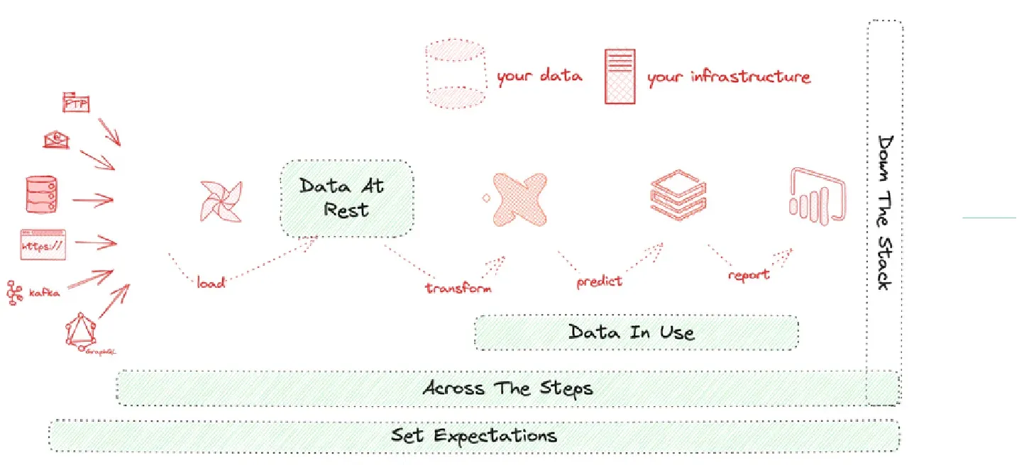
Putting the first step of DataOps, the Data Journey, into five pillars is a great way to organize and share the concept. The table below gives an overview:
| Across the steps | Down the stack | Data at rest | Data in use | Set expectations | |
|---|---|---|---|---|---|
| What is checked and observed? | Check runs, order of operations, schedule | Monitor metrics, logs, and cost | Validate data quality automatically with business domain tests | Test the results of models, visualization, delivery, and utilization | Compare expected against reality, alert, analyze |
| Examples | Orchestrator schedule, overlapping jobs, delays | Error message, server CPU, disk size, run cost | Schema, freshness, volume; percentage regional sales growth | RMS error from model; PowerBI dashboard values | Order of steps, timing, data test results, costs, metrics |
| Value | Process reliability | Technology status | Data quality | User experience | Incident alerting |
Another way to look at the five pillars is to see them in the context of a typical complex data estate. You may have four steps your data takes from its source to customer use, or twenty. However, every Data Journey spans many “little boxes” like the diagram below.
Pillar 1. Across the Steps
Things will break along your Data Journey. The question is, where did it happen? In our experience, the locus of those problems changes over time. Initially, the infrastructure is unstable, but then we look at our source data and find many problems. Our customers start looking at the data in dashboards and models and then find many issues. Putting the data together with other data sets is another source of errors. After data systems start to get used, changes will introduce more problems.
The critical question is where the problem is. This pillar emphasizes the need to continually monitor the execution of each process within every step data takes on its journey to your customer to ensure that the order of operations is correct, tasks execute according to schedule, and the data itself is correct. The Data Journey, in this sense, provides transparency about the status and outcomes of individual tasks, offers insights into potential bottlenecks or inefficiencies in the sequence of operations, and helps ensure that scheduled tasks are executed as planned. Consider a data pipeline orchestrated by Airflow — and note that a DAG is not the same thing as a Data Journey.
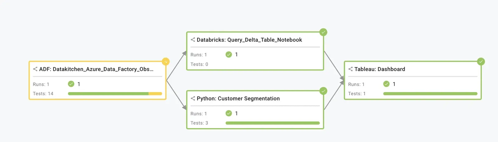
Observability in this context involves monitoring the orchestrator’s schedule and identifying potential issues like overlapping jobs that could cause bottlenecks or delays due to resource contention. Did the Airflow job complete before the dashboard was loaded? Was it on time? The value here is increased process reliability. With such observability, you can quickly pinpoint process issues, minimize downtime, notify downstream, and ensure a smoother, more reliable end-to-end Data Journey.
Pillar 2. Down the Stack
Monitoring is another pillar of Data Journeys, extending down the stack. It involves tracking key metrics such as system health indicators, performance measures, and error rates and closely scrutinizing system logs to identify anomalies or errors. Moreover, cost monitoring ensures that your data operations stay within budget and that resources are used efficiently. These elements contribute to a fuller understanding of the operational landscape, enabling proactive management and issue mitigation. Going down the stack could involve checking error messages to identify faulty processes, monitoring server CPU usage to spot potential performance issues, assessing disk sizes to ensure sufficient storage capacity, and tracking run costs to ensure your operations stay within budget.
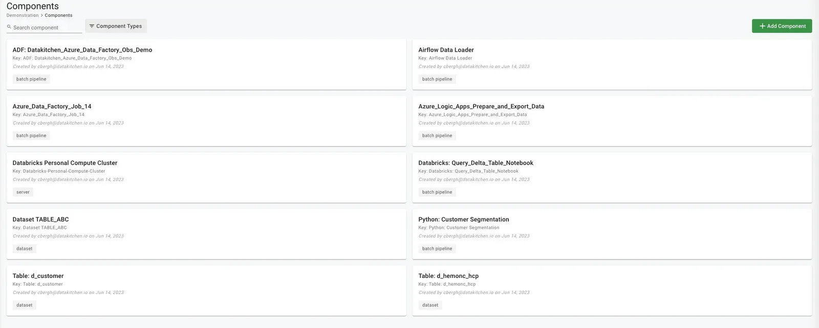
The major value here is a clear and comprehensive understanding of your technology’s status. You can proactively spot and address issues before they escalate and ensure your technology stack runs smoothly and cost-effectively.
Pillar 3. Data at Rest
Validating data quality at rest is critical to the overall success of any Data Journey. Using automated data validation tests, you can ensure that the data stored within your systems is accurate, complete, consistent, and relevant to the problem at hand. This pillar emphasizes the importance of implementing thorough data validation tests to mitigate the risks of erroneous analysis or decision-making based on faulty data.
Checking data at rest involves looking at syntactic attributes such as freshness, distribution, volume, schema, and lineage. Start checking data at rest with a strong data profile. Then the ingestion-focused data tests can look for validations by checking incoming data schema, assessing data row counts, load data, evaluating data volume, or specific column values for anomalies.
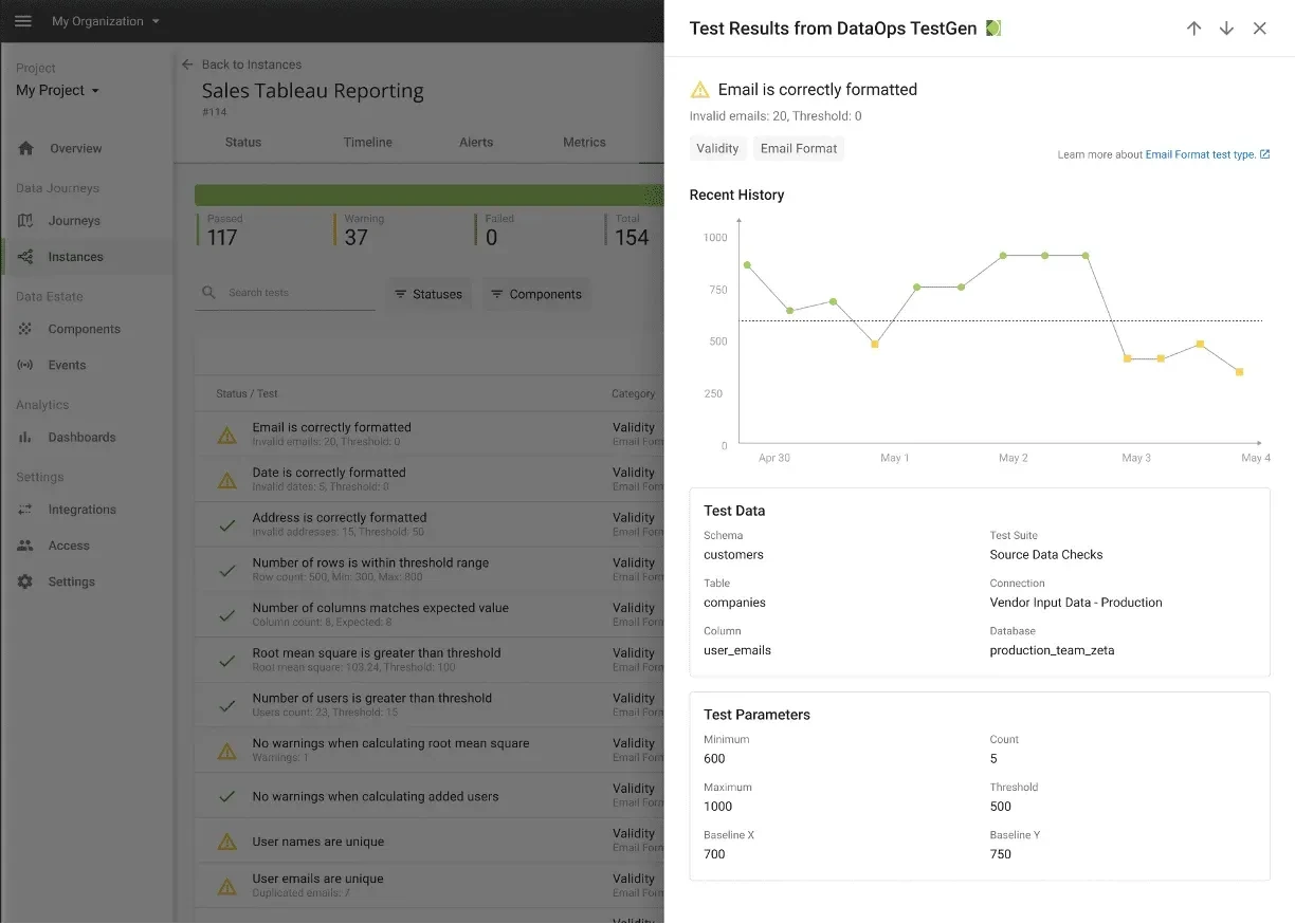
Checking data at rest also involves looking at domain-specific or business rules that are meaningful to your organization. These tests can rely upon historical values to determine whether data values are reasonable (or within the reasonable range). For example, a test can check the top fifty customers or suppliers. Did their values unexpectedly or unreasonably go up or down relative to historical values? What is the acceptable range? 10%? 50%? Data engineers are unable to make these business judgments. They must rely on data stewards or their business customers to “fill in the blank” on various data testing rules.
The central value here is ensuring trust through data quality. By conducting these checks, you can catch data issues early, ensuring that your downstream analyses and decisions are based on high-quality data.
Pillar 4. Data in Use
Monitoring and testing the data to ensure its reliability continually is crucial. This action involves testing the results of data models for accuracy and relevance, evaluating the effectiveness of data visualizations, ensuring that data delivery mechanisms are operating optimally, and checking the data utilization to ensure it meets its intended purpose. This pillar underscores the need for robust testing and evaluation processes throughout the “last mile” of the Data Journey.
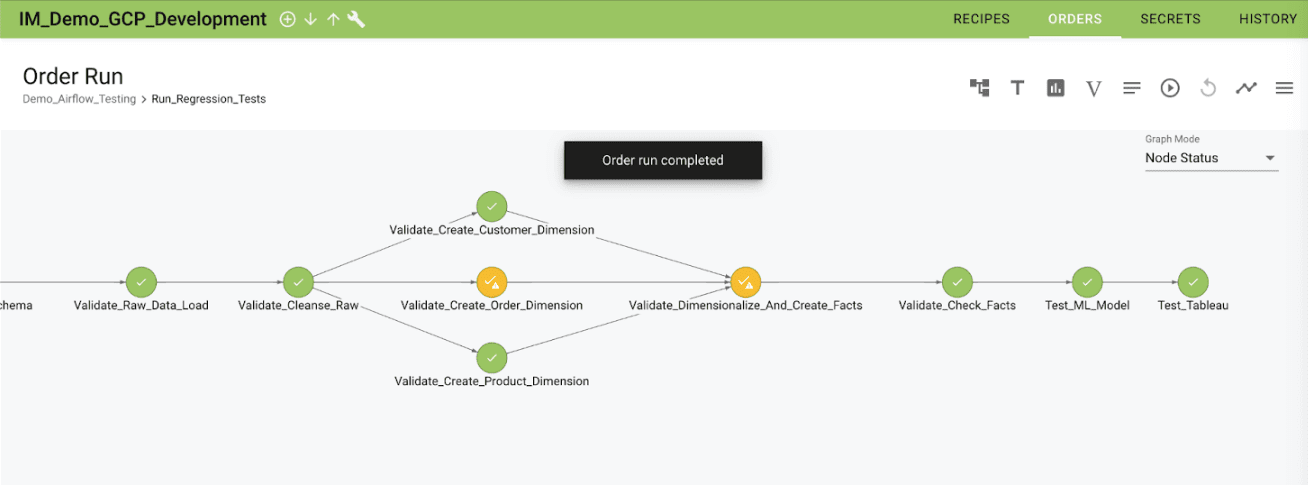
The value here is improved end-user experience. Conducting these tests ensures that your data products (like predictive models or visualizations) are accurate, relevant, and valuable to your end users. After all the hard work and multiple systems data took to get to your customer, isn’t value the key to judging success?
Pillar 5. Set Expectations
The final pillar of Data Journeys involves setting and managing expectations. A Data Journey is a collection of expectations of how your data world should be. Of course, the world never meets our expectations.
A Data Journey allows you to compare anticipated outcomes against reality, set up alert mechanisms to notify stakeholders when discrepancies arise, and analyze results to understand what led to the outcome. It emphasizes the need for a systematic approach to understanding and managing deviations from expected outcomes. Data problems often come with a “blast radius.” For example, what reports, models, and exports are affected if an ingested file is too small? Data Journeys are the “process lineage” that can help you find the full extent and impact of a problem and notify those who may be impacted.
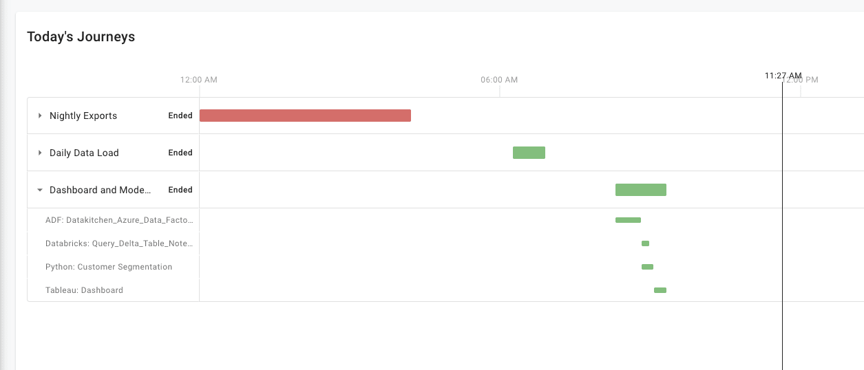
Trust building between the data team and their customer is vital. The more your data team knows about problems before they occur, the more trust your customers will have in your team. Data Journeys with incident alerting provided the bridge to build that trust.
Where to Go Next
For more information on Data Journeys and DataKitchen’s products:
Companion papers take the argument further. DataOps Observability: Taming Chaos covers what a complete observability solution needs; 7 Steps to Implement DataOps sequences the transformation; and Data Quality: The DataOps Way applies the same thinking to data quality specifically.
TIP
Want to start on the data-at-rest pillar today? Install Open Source TestGen and profile a database before you write a single test.
FAQ
What is the main point of this paper?
DataOps is not DevOps applied to data analytics. It draws on three methodologies rather than one: Agile development, DevOps and statistical process control. Its lifecycle consists of two active, intersecting pipelines rather than a single loop. The differences are concrete: different users, different sandbox and test data problems, tests aimed at data as well as code, and observation of the Data Journey as the first step.
Is DataOps just DevOps for data?
No. The name communicates the ambition, which is the order-of-magnitude gain in quality and cycle time that DevOps brought to software. It misstates the method. Optimizing code builds and delivery is only one piece of the puzzle for data analytics, because DataOps also manages people, orchestrates a production data pipeline, and applies statistical process control to the data flowing through it.
What is the intellectual heritage of DataOps?
Three methodologies. Agile development governs how analytics get built, so teams publish in short sprints and can reassess priorities as requirements evolve. DevOps optimizes code verification, builds and delivery of new analytics. Statistical process control, borrowed from lean manufacturing, orchestrates and monitors the data factory so anomalies raise an automated alert.
How do DataOps and DevOps users differ?
DevOps was created for software engineers, who love coding and treat a new language or tool as an opportunity rather than a hassle. DataOps serves data scientists and analysts focused on domain expertise, models and visualizations, for whom technology is a means to an end. They are happiest using one or two tools; anything beyond that adds unwelcome complexity.
What are the Value Pipeline and the Innovation Pipeline?
The Value Pipeline is the data factory: it takes raw data sources as input and through orchestrated steps produces analytic insights that create value. The Innovation Pipeline is the process by which new analytic ideas are introduced into the Value Pipeline. Both are active at once, and they intersect, which is the structural difference between the DataOps and DevOps lifecycles.
How does the DataOps process differ from the DevOps process?
The DevOps process runs develop, build, test, deploy and run, with continuous integration covering build and test and continuous deployment covering delivery. The DataOps process adds sandbox management at the front, replaces build with orchestrate, and adds a second orchestrate plus monitor after deployment, because a data pipeline keeps running in production after the code ships.
Why does testing in DataOps have a dual role?
Because DataOps tests two different things in two different places. In the Value Pipeline, data is variable and analytics are fixed, so tests monitor data values for anomalies and readings outside statistical norms. In the Innovation Pipeline, code is variable and data is fixed, so tests validate new analytics before deployment. Quality the customer receives is a function of both.
Why is sandbox management harder in DataOps than in DevOps?
A software engineer usually receives a set of scripts from teammates and configures a sandbox in a day or two. Data teams use far more tools: thousands of languages, vendors and products across engineering, science, BI, visualization and governance. Without the centralization typical of software teams they diverge, leaving tools and data islands scattered across the enterprise.
Why is test data management a first-order problem in DataOps?
Creating a dev environment for analytics means creating a copy of the data factory, and that means replicating data that may carry security, governance or licensing restrictions. Copying an entire multi-terabyte set is often impractical, so the data has to be sampled or filtered, then possibly cleaned or redacted, on infrastructure that may itself be hard to replicate.
How does DataOps connect development and operations?
The development team in data analytics is the analysts, scientists, engineers and architects who create data warehouses and analytics. The operations team supports and monitors the data pipeline, and it includes IT and the customers who create and consume analytics. DataOps brings these groups together so they work more closely, in the same way DevOps joined developers and IT operations.
How does DataOps resolve the tension between centralization and freedom?
New analytics originate and get refined in local pockets of innovation close to business units, which keeps the enterprise competitive. When an idea proves worthy of wider distribution, it is promoted to a centralized group that can implement it robustly at scale. That harmonizes the two: the efficiencies of centralization without losing the tip of the innovation spear.
What are the five pillars of a Data Journey?
Across the steps, which checks runs, order of operations and schedule. Down the stack, which monitors metrics, logs and cost. Data at rest, which validates data quality automatically with business domain tests. Data in use, which tests the results of models, visualizations, delivery and utilization. And set expectations, which compares expected against reality, alerts and analyzes.
Why is the Data Journey the first step in DataOps?
Because a deep and continuous understanding of the production data estate has to come before improving it. Observing the Data Journeys that make up the Value Pipeline shows how data flows, transforms, gets enriched and is consumed, which lets a team detect problems early, streamline processes and lower embarrassing errors in production.
Get the PDF
The full paper is on this page. Fill in the form for a PDF copy to keep or share.