(Not financial advice. I run a DataOps data quality company.)
At 10:50 on a Tuesday morning I typed one sentence into Claude Code: “can you build a dashboard for the data on my machine for adventure works?”
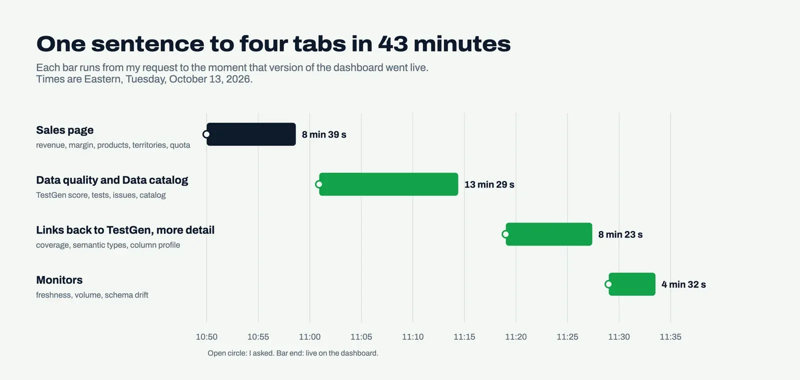
AdventureWorks is Microsoft’s public sample data warehouse: the sales records of Adventure Works Cycles, a bike company that doesn’t exist. I had a copy in Postgres on my laptop. I didn’t tell Claude where it was. Claude found it, read its 28 tables, and wrote six queries. Then it published a Sales page with revenue by month, product category, sales territory, the top 15 product models, and reseller quota attainment. That took 8 minutes and 39 seconds.
I never opened a BI tool. Nobody built a semantic layer, and nobody dragged a measure onto a canvas and fought with the axis settings.
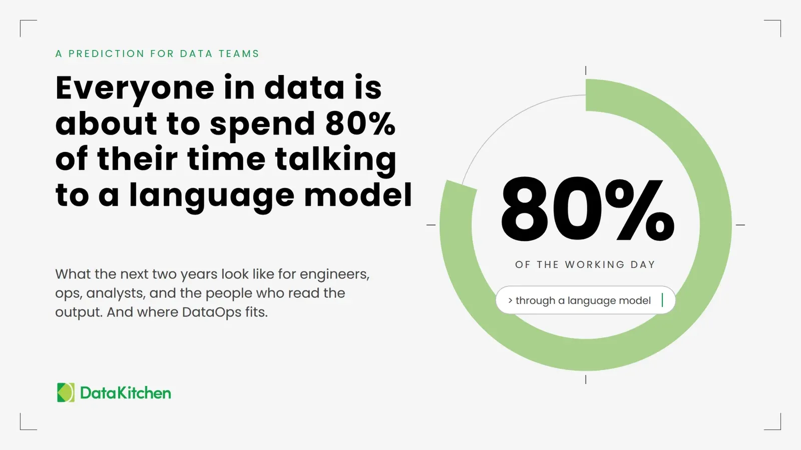
For twenty-odd years the pitch for BI software has been the canvas. Drag, drop, publish, pay per seat. When a language model writes the whole page from a sentence, the canvas is the slow part. I wrote a few weeks ago that everyone in data is about to spend 80% of their day talking to a language model. This is what that looks like for a report.
To be fair to the BI vendors, my version is a snapshot. Everyone who can open it sees the same rows, and it refreshes when somebody reruns the export. You won’t close a public company’s quarter on it yet.
Then I kept going. Over the next 35 minutes of elapsed time, Claude added three more tabs, built from TestGen: data quality, monitors, and a data catalog. That’s the part this post is about. You can click through the finished dashboard yourself.
Every number starts an argument
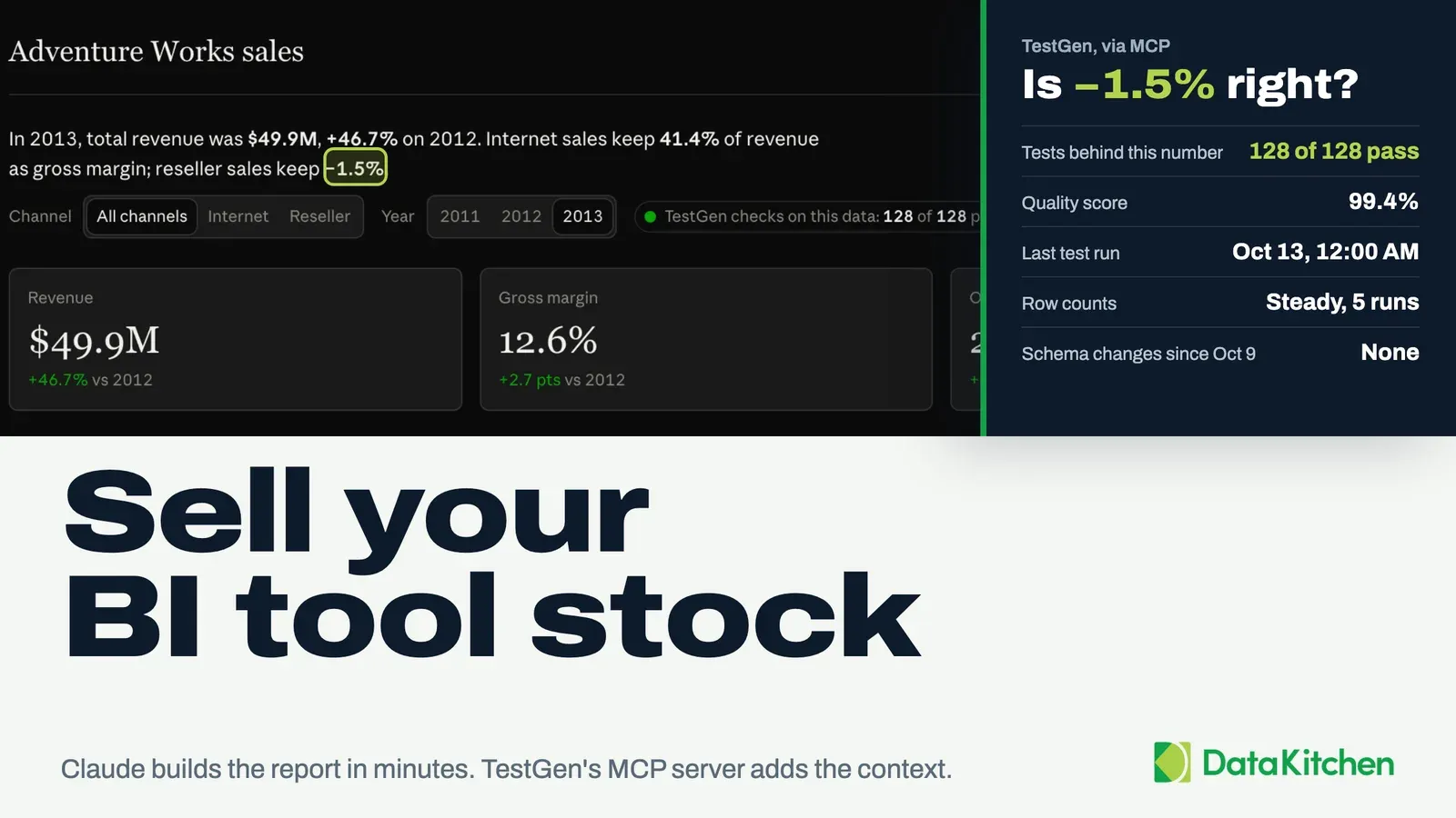
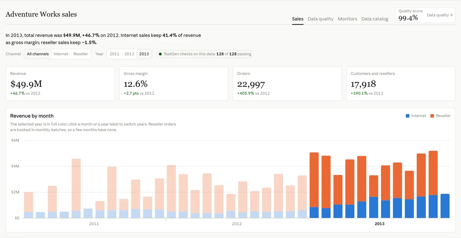
Even sample data starts an argument. In AdventureWorks’ 2013 numbers, internet sales kept 41.4% of revenue as gross margin. Reseller sales kept −1.5%. The reseller channel brought in two-thirds of the revenue and lost money doing it. Nobody runs Adventure Works Cycles, so nobody had to explain that to anyone.
Now picture that number on your own company’s dashboard, in front of your VP of sales. Nobody asks about resellers. They ask if the number is right. Then where it came from, when the data last loaded, and whether anything failed last night.
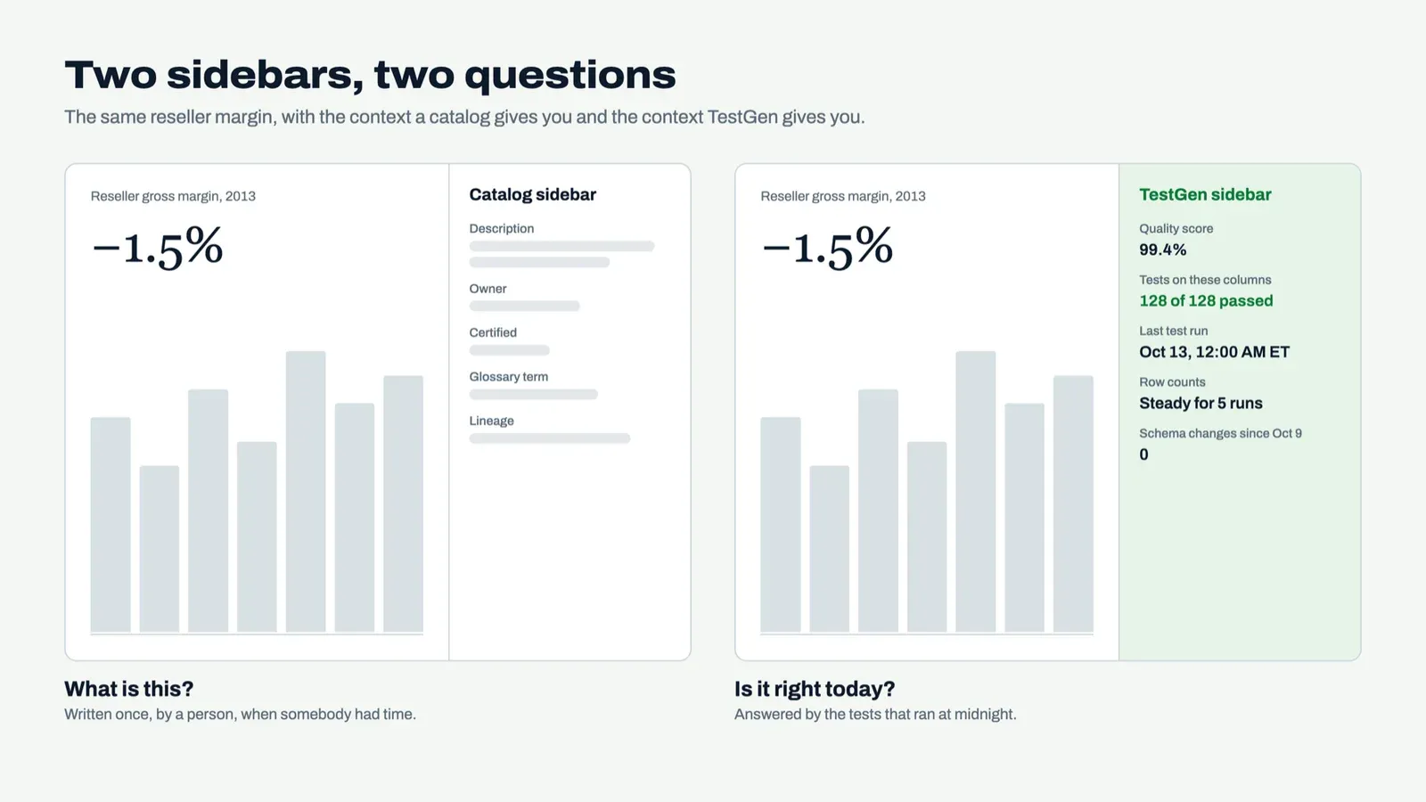
That’s the job of a metadata sidebar on a report. It answers the second question right next to the first number, before somebody opens a Slack thread to ask it. Analysts stop spending Monday defending the dashboard. Engineers stop getting pinged about tables that are fine. And the boss gets to argue about resellers, which is the argument they should be having.
The catalog vendors figured this out first
Atlan ships a Chrome extension that puts Atlan’s metadata inside the tools where people read data. The Chrome Web Store lists about 20,000 users as of October 2026. Alation Anywhere does the same for Tableau, Chrome, Slack, and Microsoft Teams, with previews of Power BI, Looker, and Snowsight assets and data quality flags alongside.
They’re right about where context belongs. Next to the number.
Here’s where I’d push. Most catalog sidebars are better at “what is this?” than “is it right today?” A description gets written once, by a person, when somebody had time. The data changes every night. The sidebar I wanted answers from the tests that ran at midnight, the monitors that ran this morning, and a profile of every column.
And with a Claude dashboard you don’t install anything to get one. You ask for another tab.
Data quality
This tab is the trust question on one page. TestGen scores the warehouse at 99.4%, and the page shows the math in large type: a 99.58% profiling score times a 99.82% testing score. By impact dimension, Conformance is the weak spot at 93.43%, with 37 issues pulling it down. (If impact dimensions are new to you, start here.)
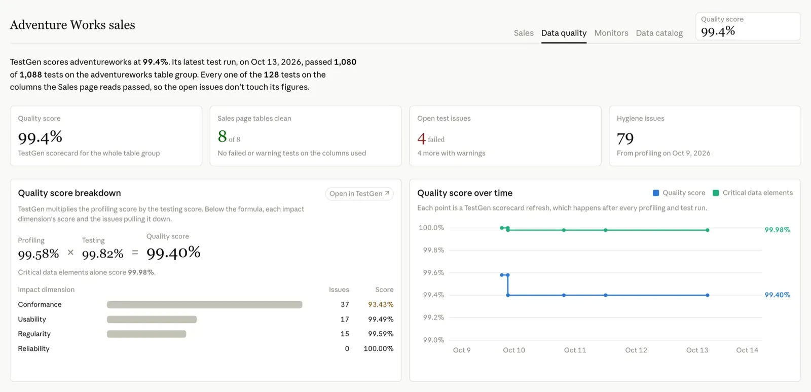
Nobody wrote these tests by hand. TestGen generated all 1,088 of them from its profile of the data, across 24 test types and six quality dimensions. Of the 344 columns, 334 have at least one. Each test type on the page links to its definitions in TestGen.
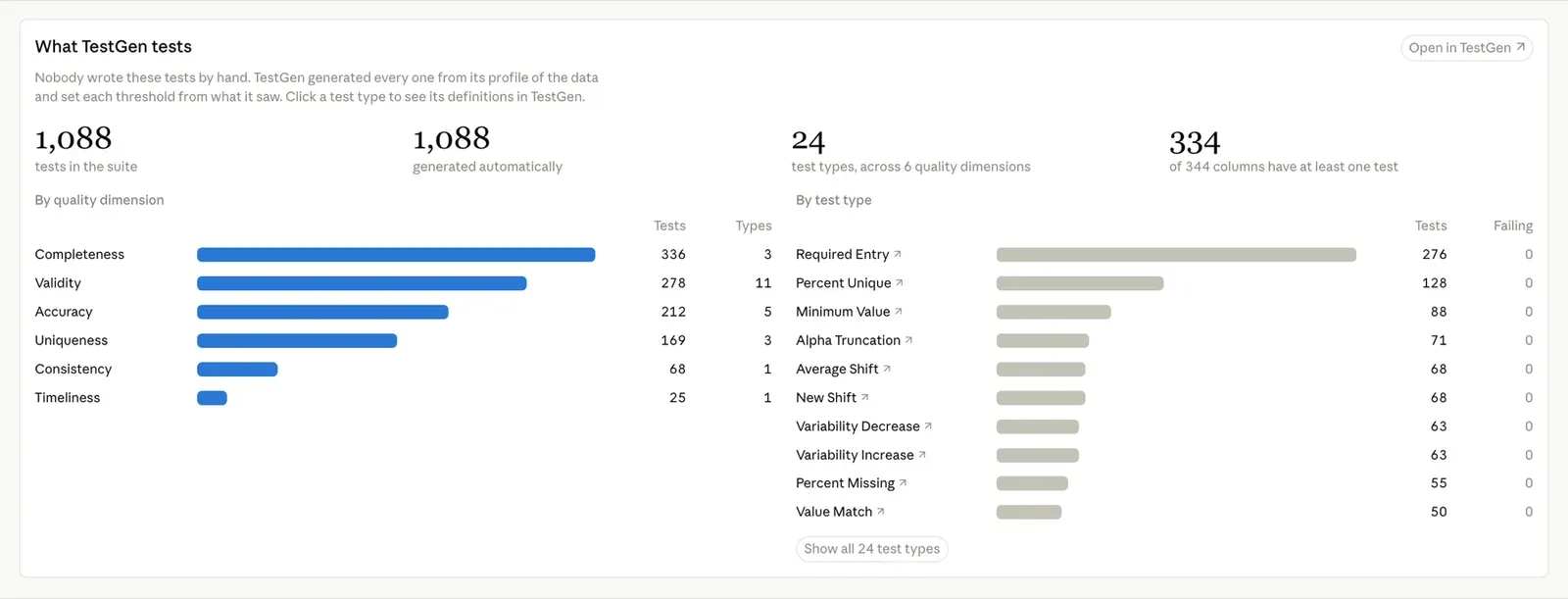
Then the line that would settle that argument, if it were your data. Every one of the 128 tests on the columns the Sales page reads passed, across all eight tables behind it. The latest run’s 4 failures and 4 warnings live somewhere else. Three of the failures are bad email addresses: 105 in prospectivebuyer, 39 in dimcustomer, 2 in dimemployee. The fourth is a currency-rate table that turns out to be the same 10 rows five times over. The warnings are outliers and 27 malformed zip codes. None of it touches revenue.
One detail I like: factinternetsales scores 97.64% even though every test on it passed. Two of its columns, customerponumber and carriertrackingnumber, are empty in all 60,398 rows. The Sales page doesn’t read either one, and a green checkmark would never have told you they’re empty.
Monitors
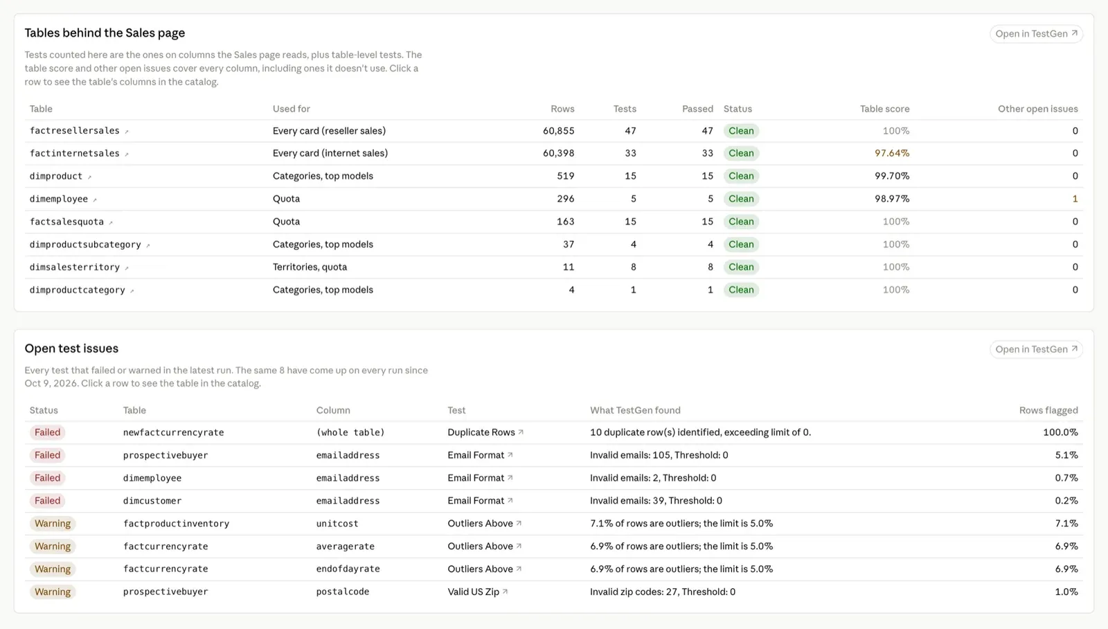
This is the least interesting tab in the demo, and that’s the data’s fault. AdventureWorks is a static sample database. It hasn’t taken an order since January 2014, and nothing loads into it overnight. Monitors exist to catch change, and here there’s none to catch.
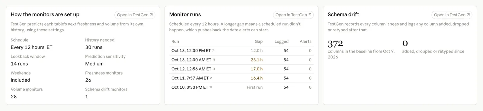
TestGen watches all 28 tables anyway: 26 for freshness, 28 for volume, and the whole schema for drift. After five runs, no row count has moved and no column has changed since the 372-column baseline TestGen recorded on October 9. On a static database, that’s the correct answer. Point the same prompt at a warehouse that loads every night and this tab is where you’d see a late table or a dropped column first.
The monitors learn each table’s normal pattern and only log results until they have 30 runs of history. So the tab keeps the “Late” pills grey and says alerts can start October 26 at the earliest. My first version painted 26 of them orange. Claude’s design review caught it: alarm colors on monitors that can’t alarm yet teach people to ignore the color.
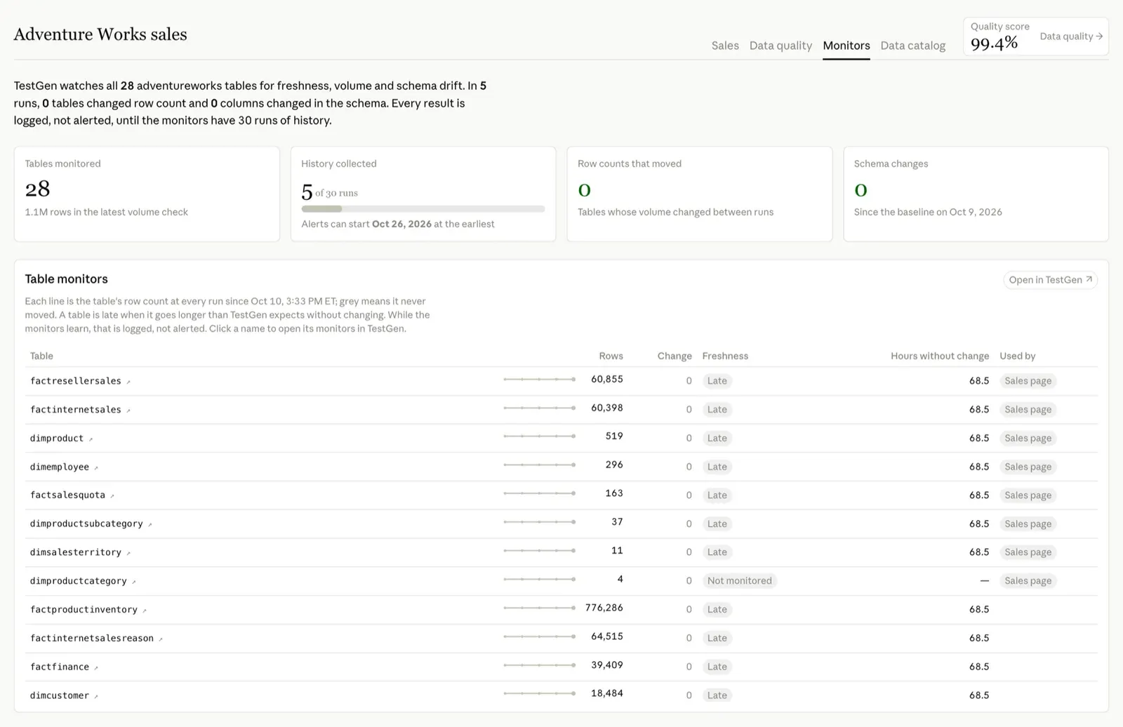
The tab also caught something about my own setup. The monitors are scheduled every 12 hours, and three of the gaps between runs were 16.4, 17.0, and 23.1 hours. Scheduled runs didn’t happen, and every missed run pushes the alert date back. I haven’t chased down why yet.
Data catalog
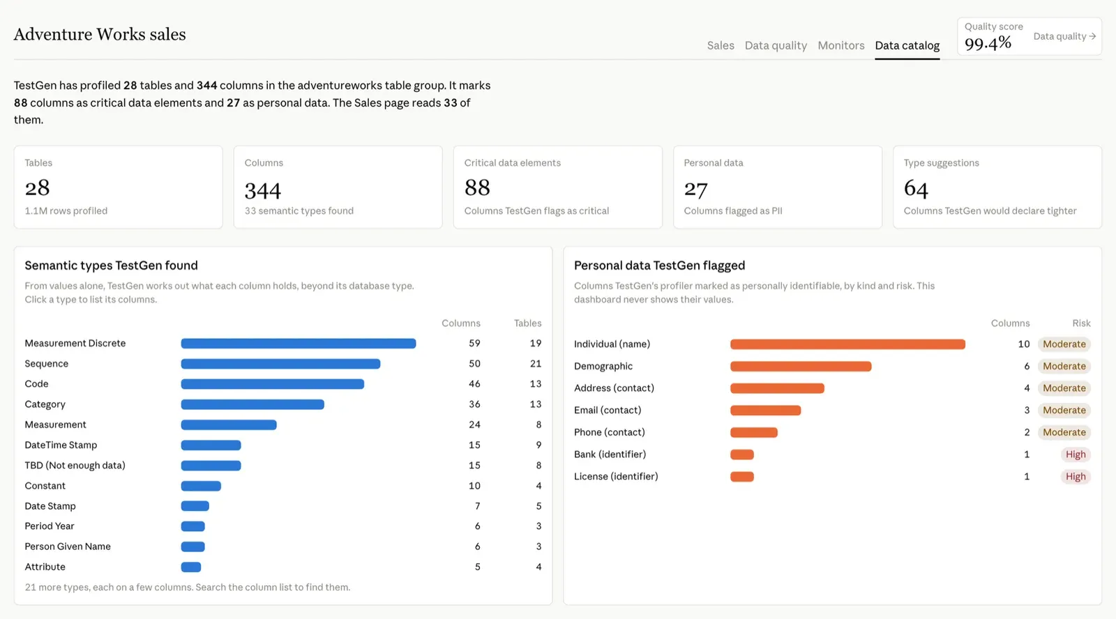
This tab is what TestGen learned when it profiled the warehouse. It covers 28 tables, 344 columns, and 1.1 million rows. TestGen marks 88 columns as critical data elements and flags 27 as personal data. Every customer and employee in AdventureWorks is made up, but TestGen can’t know that from the values, and it shouldn’t. It calls two of those high risk: a reseller’s bank name, and a column of accounting operators it read as license numbers. The second one is wrong, which is why a person still reviews the flags. It found 33 semantic types from the values alone. And it would declare 64 columns tighter than they are: dimcustomer.lastname is a varchar(50), and TestGen says VARCHAR(30) fits.
It also flagged 15 tables for having no dates in the last year. Fair. The newest order is from January 2014.
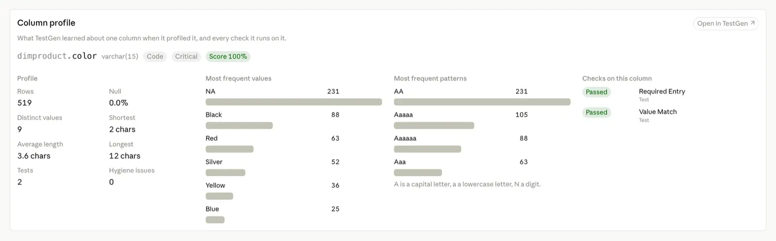
Click any column and you get its TestGen profile, plus every test and hygiene finding on it. dimproduct.color has 519 rows, 9 distinct values, and “NA” 231 times. Columns flagged as personal data show counts only. The dashboard never shows their values.
Catalogs tell you what a column is. Tests tell you whether it’s behaving. I’ve argued before that coverage beats lineage when something breaks, and this tab puts both on the same page.
How I built it with TestGen’s MCP server
Three things ran on my laptop: Postgres with AdventureWorks, TestGen in Docker, and Claude Code. Claude Code queried Postgres for the Sales page. For the sidebar it needed TestGen’s view of the same data: the scorecard, the latest test results, hygiene issues, monitor history, and the catalog.
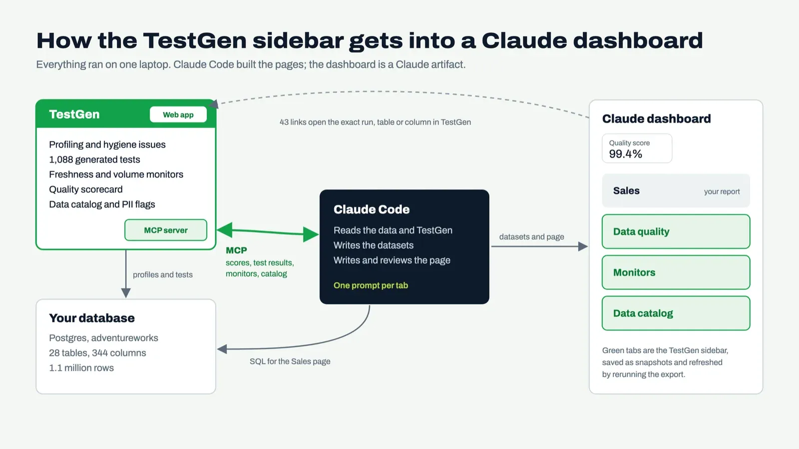
TestGen’s MCP server is the front door for exactly that. It’s open source under Apache 2.0, it ships 96 tools across the whole data quality loop, and it authenticates as you. Claude, Cursor, Copilot, or an agent you build can call it.
This is the pattern I wrote about in Stop Burning Tokens. Keep data quality as a deterministic service, let the model call it, and put the model at the center where it can see everything.
The prompt
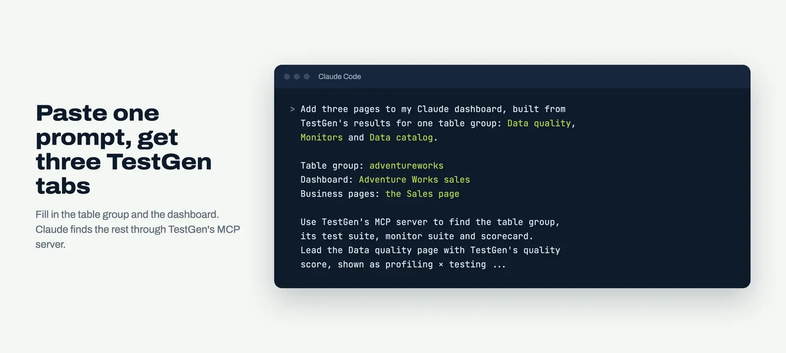
Here it is, cut down to fit a blog post. Paste it into Claude Code on the machine where TestGen runs, and fill in the first three lines.
The prompt
Add three pages to my Claude dashboard, built from TestGen's results for one table group: Data quality, Monitors and Data catalog.
Table group: <your TestGen table group>
Dashboard: <link to an existing Claude dashboard, or "create a new one">
Business pages: <the pages these should vouch for, with a label such as "Sales page", or "none">
Use TestGen's MCP server to find the table group, its test suite, its monitor suite and its scorecard. If the MCP server isn't connected, read TestGen's metadata database, read-only. The dashboard can't reach TestGen on localhost, so save each dataset as a JSON snapshot with a title and a description.
Data quality: lead with TestGen's quality score and show it as profiling x testing. Show how many tests TestGen generated, by quality dimension and test type. List every failed or warning test with TestGen's finding, the test runs, and the hygiene issues by likelihood. If I named business pages, list the tables behind them and say whether every test on the columns they read passed.
Monitors: what's watched, a row-count sparkline per table, freshness, the monitor settings, the gaps between runs, and schema drift since the baseline. Keep colors neutral until the monitors have enough runs to alert, and say when that will be.
Data catalog: tables and columns profiled, critical data elements, personal data, semantic types, type suggestions, and a profile for any column I click. Never show values from a column TestGen flags as personal data.
Every card links back to the matching page in TestGen. Put the tabs on the right with a quality-score badge in the corner. Render it in light and dark mode at desktop and phone widths, fix what you find, then publish.
Your report, with its context next to it
Catalog vendors built browser extensions to put context next to your reports. With a Claude dashboard and TestGen’s MCP server, the context is three more tabs, and it took me 35 minutes of elapsed time. Your report gets a quality score, the tests behind every column it reads, monitors on every table, and a catalog of what’s in there, one click from the number.

Run it on your own warehouse, and the next time your VP asks whether a number is right, the answer is already on the page.
TIP
Open the working dashboard: all four tabs, with the AdventureWorks data and the TestGen snapshot from this post.
FAQ
What are the key points in this blog?
Claude Code built a sales dashboard from Microsoft’s public AdventureWorks sample warehouse on a laptop in 8 minutes and 39 seconds. TestGen’s MCP server then gave it data quality, monitors, and data catalog tabs within 35 minutes of elapsed time. Those tabs answer whether a number is right today, right next to the number, and all 128 tests on the columns the Sales page reads passed.
What is a report metadata sidebar?
A report metadata sidebar puts context about a number next to the number itself: what the data is, where it came from, and whether it can be trusted today. Catalog tools such as Atlan’s Chrome extension and Alation Anywhere add one to BI tools. The TestGen tabs in this example add one to a Claude dashboard, built from data quality test results, monitors, and column profiles.
Can Claude build a dashboard from a database on my laptop?
Yes. In this example Claude Code found Microsoft’s public AdventureWorks sample warehouse in local Postgres, read its 28 tables, and published a Sales page in 8 minutes and 39 seconds from a one-sentence request. Nobody opened a BI tool or built a semantic layer. The data is a snapshot that refreshes when the export is rerun.
What does TestGen’s MCP server give an AI assistant?
TestGen’s MCP server exposes 96 tools covering the data quality loop: discovery, profiling, hygiene issues, tests, test runs, monitors, quality scores, and operations. It is open source under Apache 2.0, authenticates as the person using it, and works with any MCP client, including Claude, Claude Code, Cursor, and Copilot.
How long did the three TestGen tabs take?
The data quality, monitors, and data catalog tabs went live 35 minutes after the Sales page, in elapsed time. The data quality and catalog tabs took 13 minutes and 29 seconds, linking every card back to TestGen took 8 minutes and 23 seconds, and the monitors tab took 4 minutes and 32 seconds. Those three steps add up to about 26 minutes; the rest was time between them.
Do the TestGen tabs update on their own?
No. A Claude dashboard can’t reach a TestGen instance running on localhost, so the three tabs read 17 JSON snapshots of TestGen’s results, saved when the dashboard was built. Refreshing them means exporting the results again and uploading the new files to the dashboard.
How is this different from Atlan’s Chrome extension or Alation Anywhere?
Those tools put catalog metadata, such as descriptions, glossary terms, and in Alation’s case data quality flags, inside existing BI tools. The TestGen tabs answer from the latest test run, the monitor history, and a profile of every column, so they say whether the data behind a number is right today.
How do I add TestGen tabs to my own Claude dashboard?
Install TestGen, profile and test a table group, and connect Claude Code to TestGen’s MCP server. Then paste the prompt from this post with your table group, your dashboard, and the business pages filled in. Claude finds the test suite, monitor suite, and scorecard, saves the results as JSON snapshots, builds the three tabs, and reviews them before publishing.
What else has DataKitchen written about AI and data quality?
DataKitchen has written about the tools in TestGen’s MCP server, an agent that fixed data quality failures overnight, generated tests on public data, and why data quality belongs in a deterministic system of record that a model calls. Other posts cover impact dimensions, test coverage versus lineage, and how data teams will spend their days talking to a language model.
- TestGen MCP Cheat Sheet: 96 Tools, One Page, Zero Excuses
- While You Slept, an Agent Fixed 14 Data Quality Failures
- I Wrote Data Quality Tests for 3 Million NYC Taxi Rides in Five Minutes
- Put Your AI At The Center Of Your Data Quality And Observability Decision-Making Process
- Stop Burning Tokens: Data Observability and Quality as Your AI’s System of Record
- Context As Infrastructure: The Six-Category Framework for AI-Ready Data Analysis
- Impact Dimensions Cure A Data Quality Blind Spot
- The Blueprint or the Fire Alarm Panel: Why Data Test Coverage Beats Data Lineage
- Everyone in data is about to spend 80% of their time talking to a language model
- Webinar: Stop Clicking, Start Asking, the AI Playbook for Data Quality